

Under the Red Top
making the best of life & wood


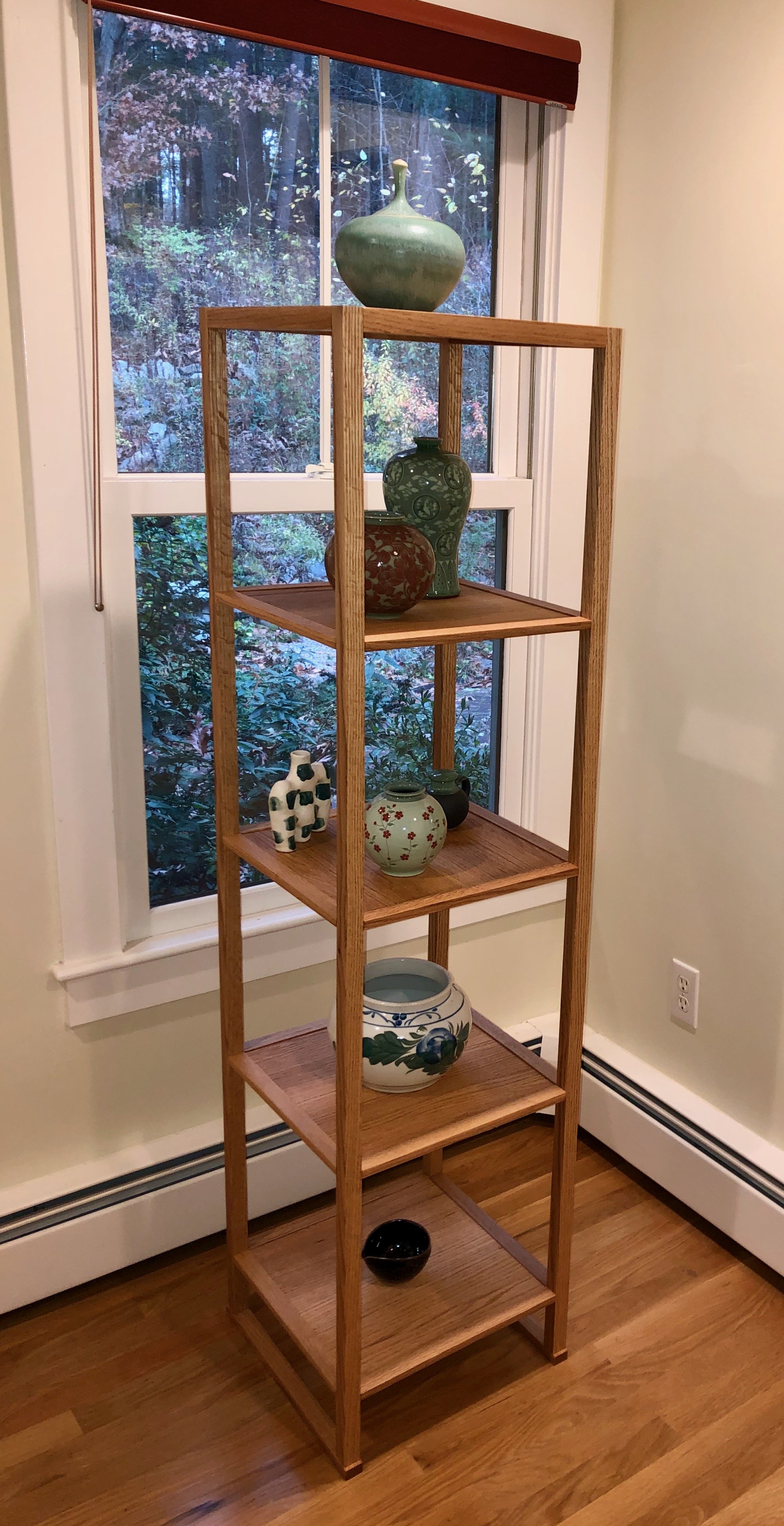
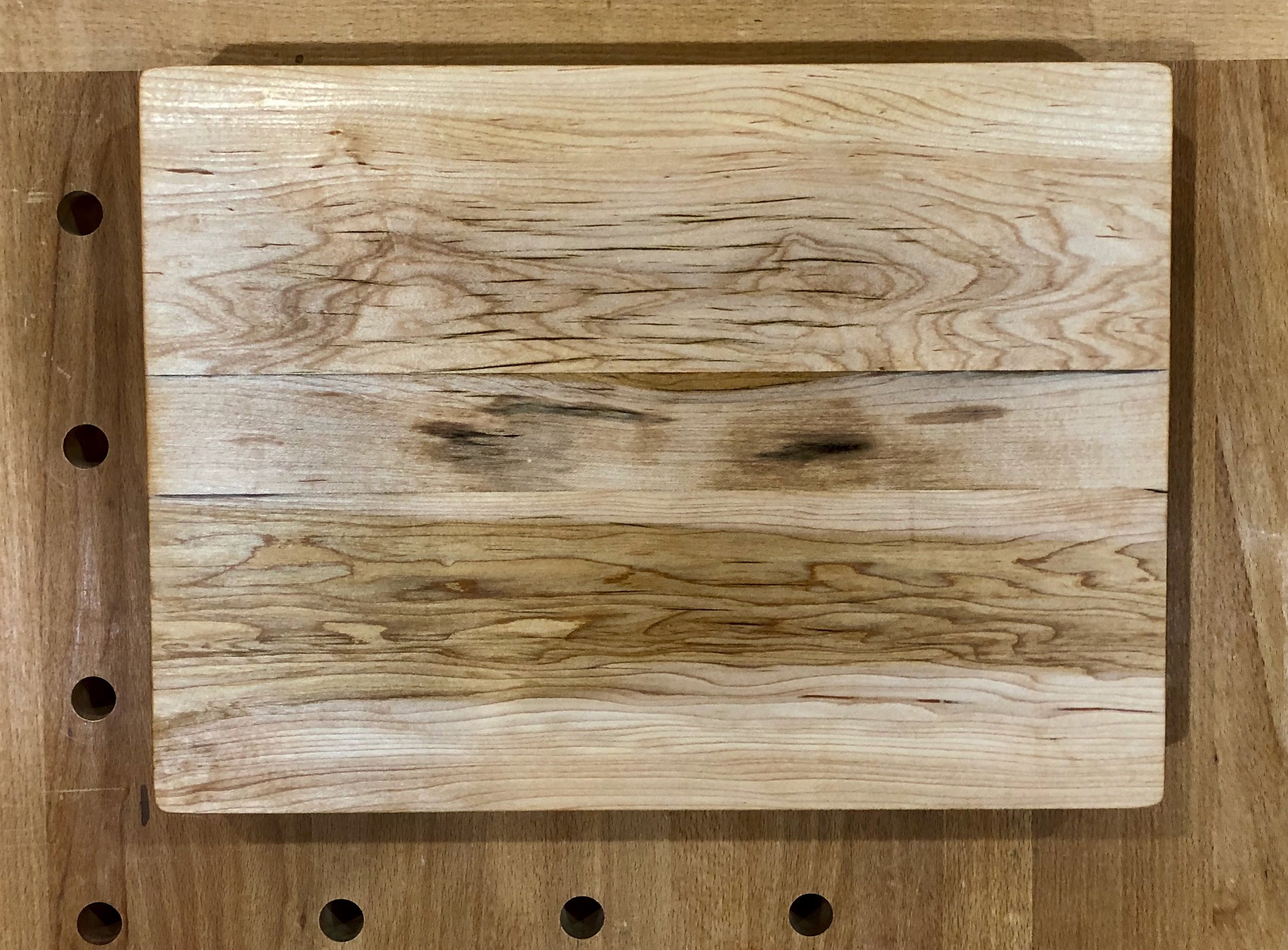
The Bento Board

Here’s the story: We wanted to create a Holiday gift for some dear friends. It needed to be small and, since this idea only occurred to us a couple weeks ago, it also needed to be easily made. Recalling their fondness for Japanese culture and looking over a few scrap boards from past Projects I had the idea to build a charcuterie board in the form of a bento box. And here’s how it turned out.
Design
No doubt we have all enjoyed a bento box lunch, made up of small entrees tucked neatly into their own compartments. The Japanese term bento is thought to come from biàndāng, a Chinese word which means “convenience”, and it describes a single portion take-out lunch. In Japan the container for this lunch, also called a bento or bento box, has been around since at least the sixteenth century. This box is a clever invention that utilizes partitions to keep the individual flavors pure and, over the years, design evolution has brought forth dozens of box configurations. What I was looking for was a traditional form that would evoke a bento, even if no compartments were present. If gotten right, this would be a flat serving board that felt like a bento. Searching online I found a picture of a lacquered bento box from The Japan Times that both looked the part and could be replicated with ease.

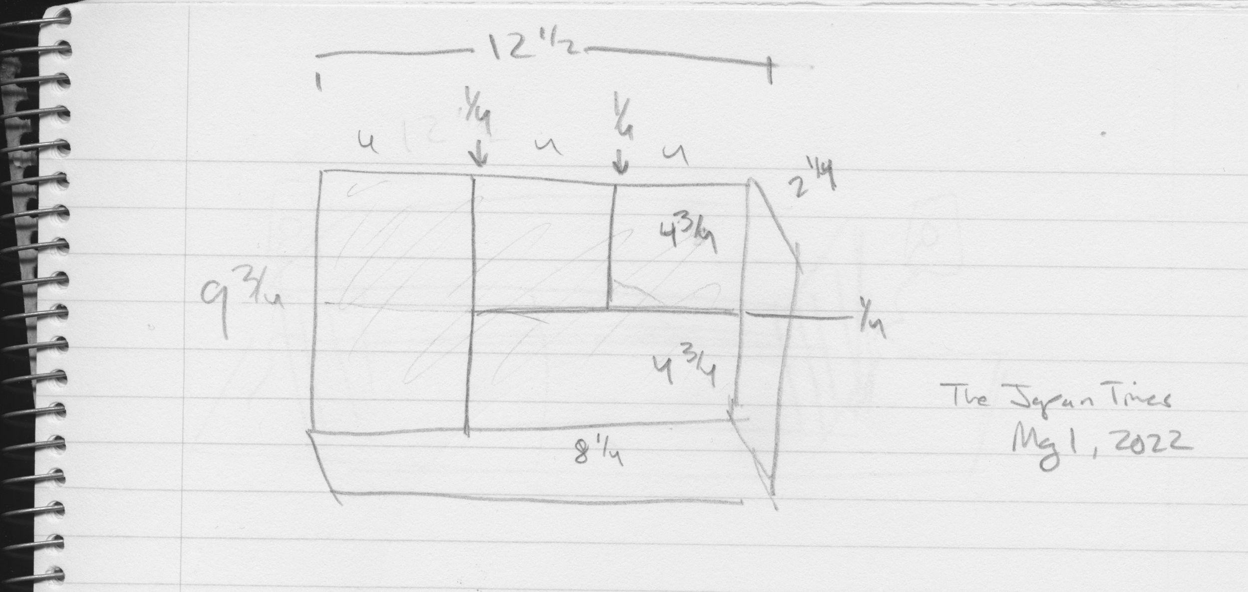
Bento box exemplar
As far as plans go, a simple reference sketch with dimensions was all that was required.
Make this.
Materials
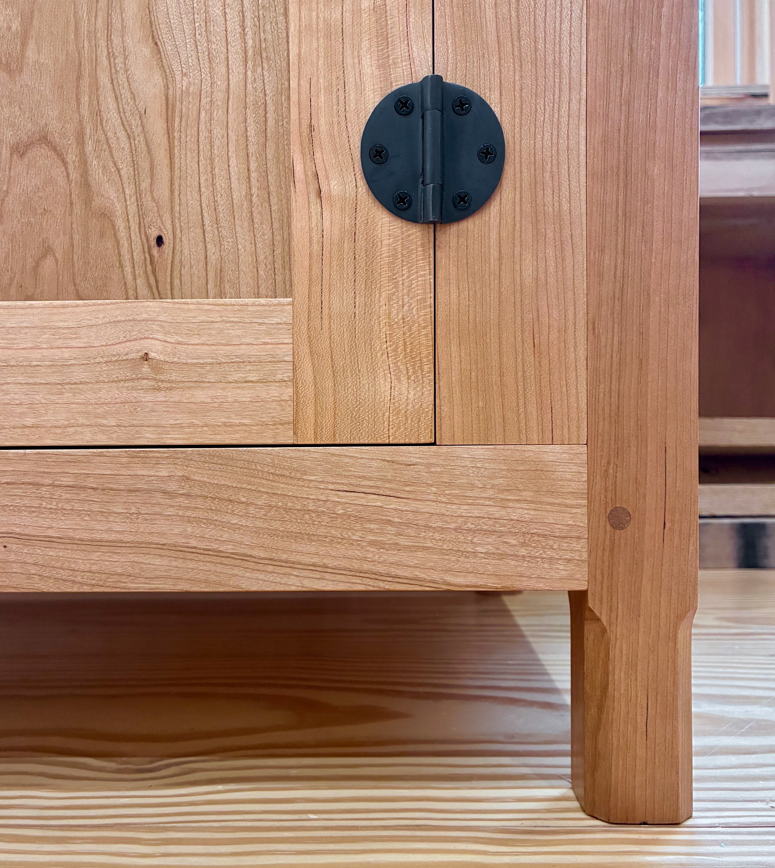
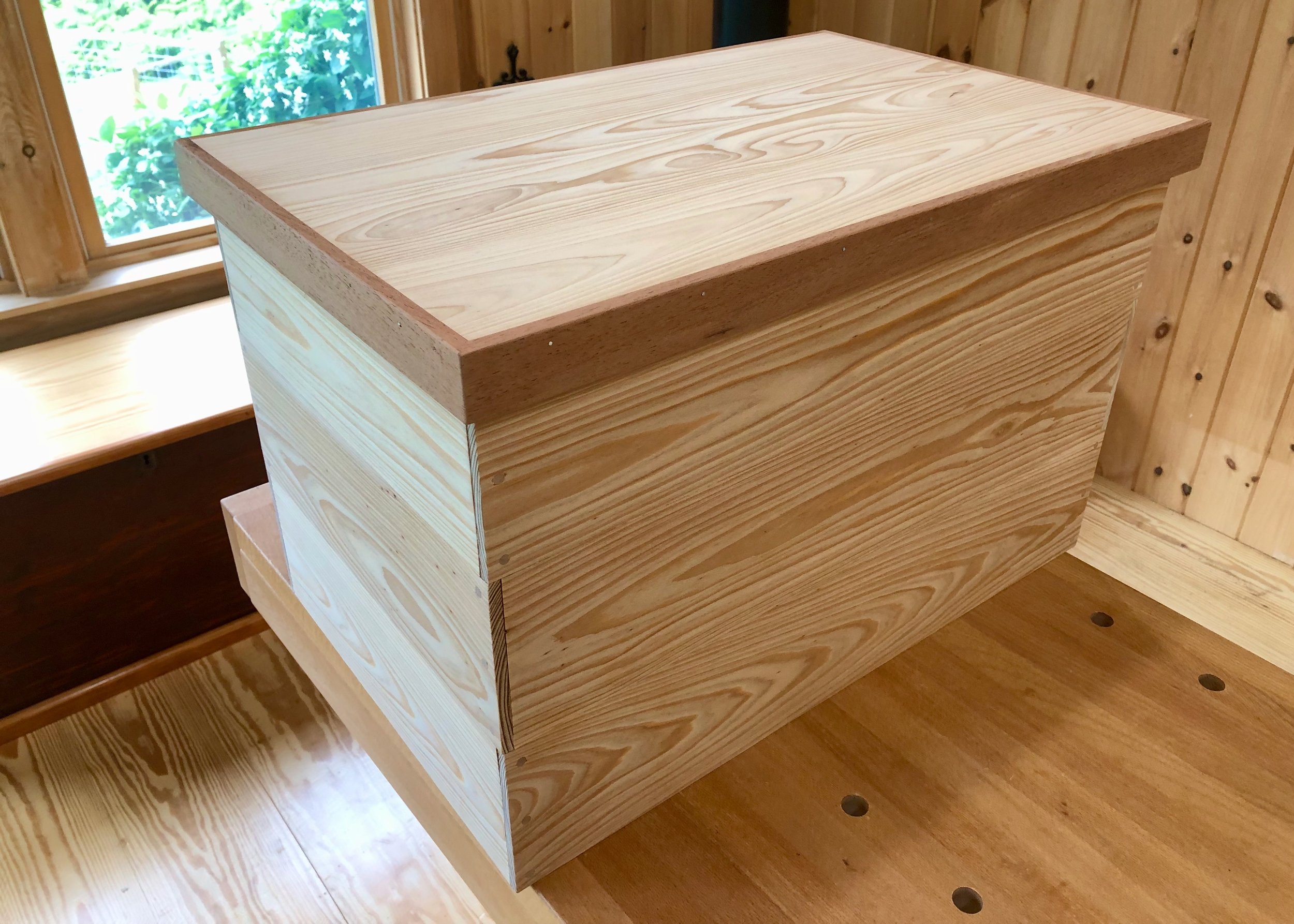
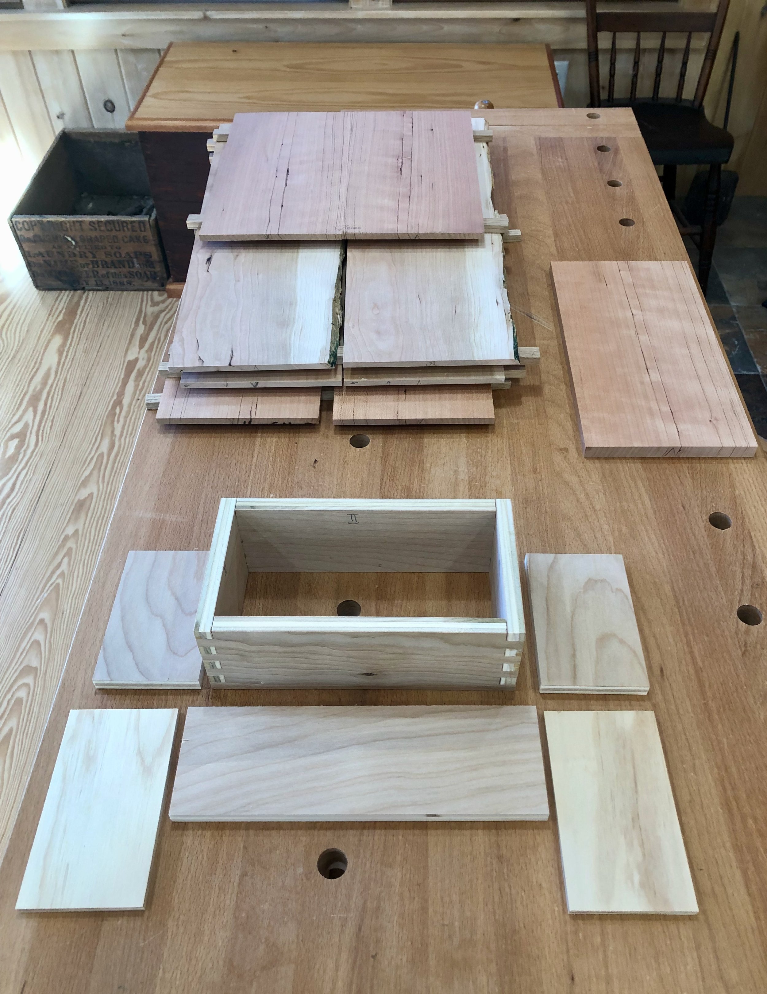
As it turns out, the intended recipients had earlier gifted me a couple of antique spruce boards leftover from their recent home expansion project. These centuries-old beauties were reclaimed from a Boston factory building during demolition and then repurposed for the construction of cabinetry during their renovation. Anyway, the wood was full of character, cracks and nail holes, and a small chunk off the end of one board would serve nicely here. Some leftover black walnut would be used for the sides and inlay, and I would put some cutting board feet on the underside.

Spruce and walnut stock
Dimensioning
The wood was first cut to rough lengths and then prepped at the jointer, yadda, yadda … No time for a blow-by-blow account, but you can follow the narrative with these pictures.

After the spruce was planed to the proper thickness, it was grooved at the router table and then the surface cracks (age defects) were filled using epoxy.
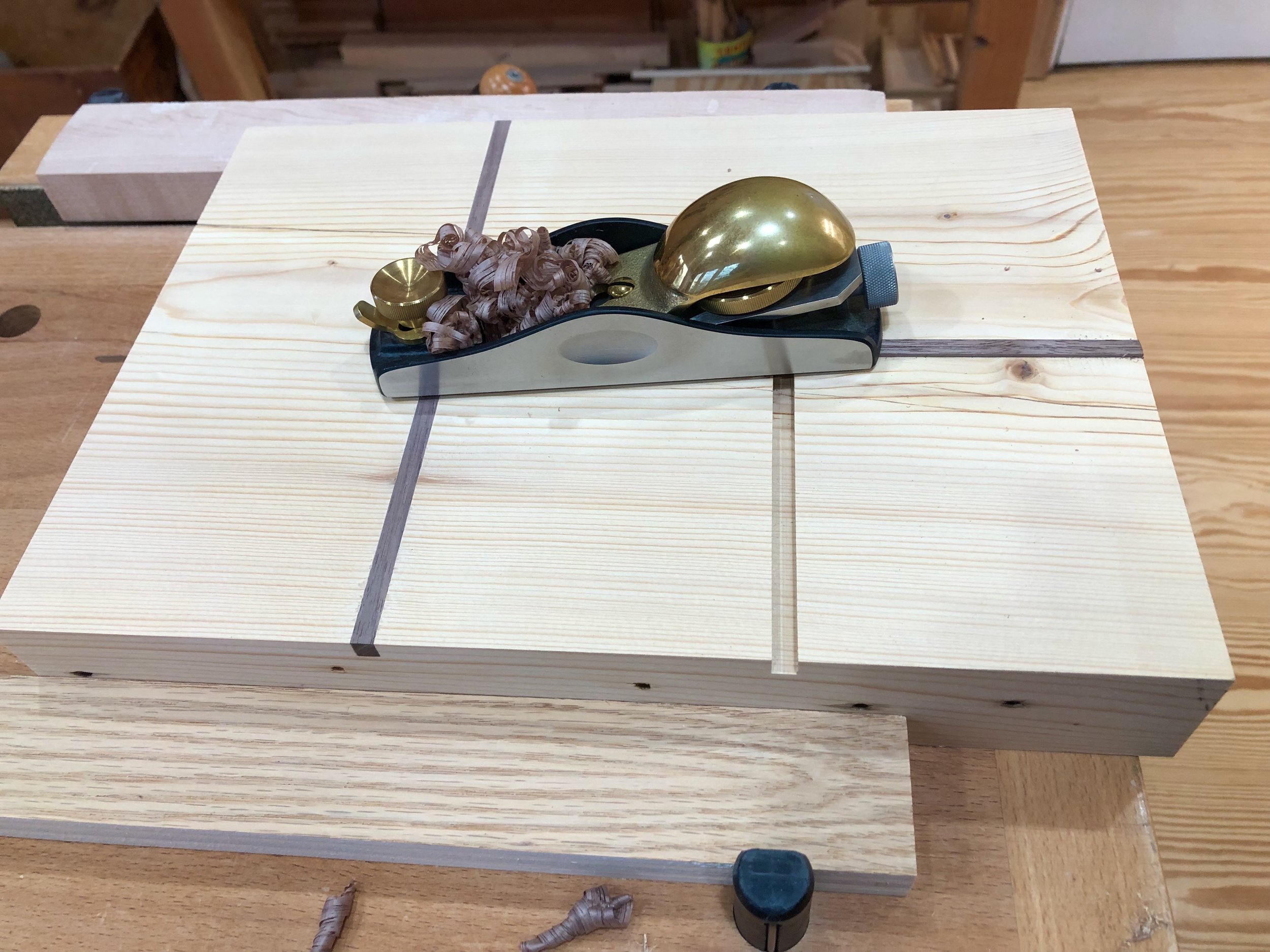
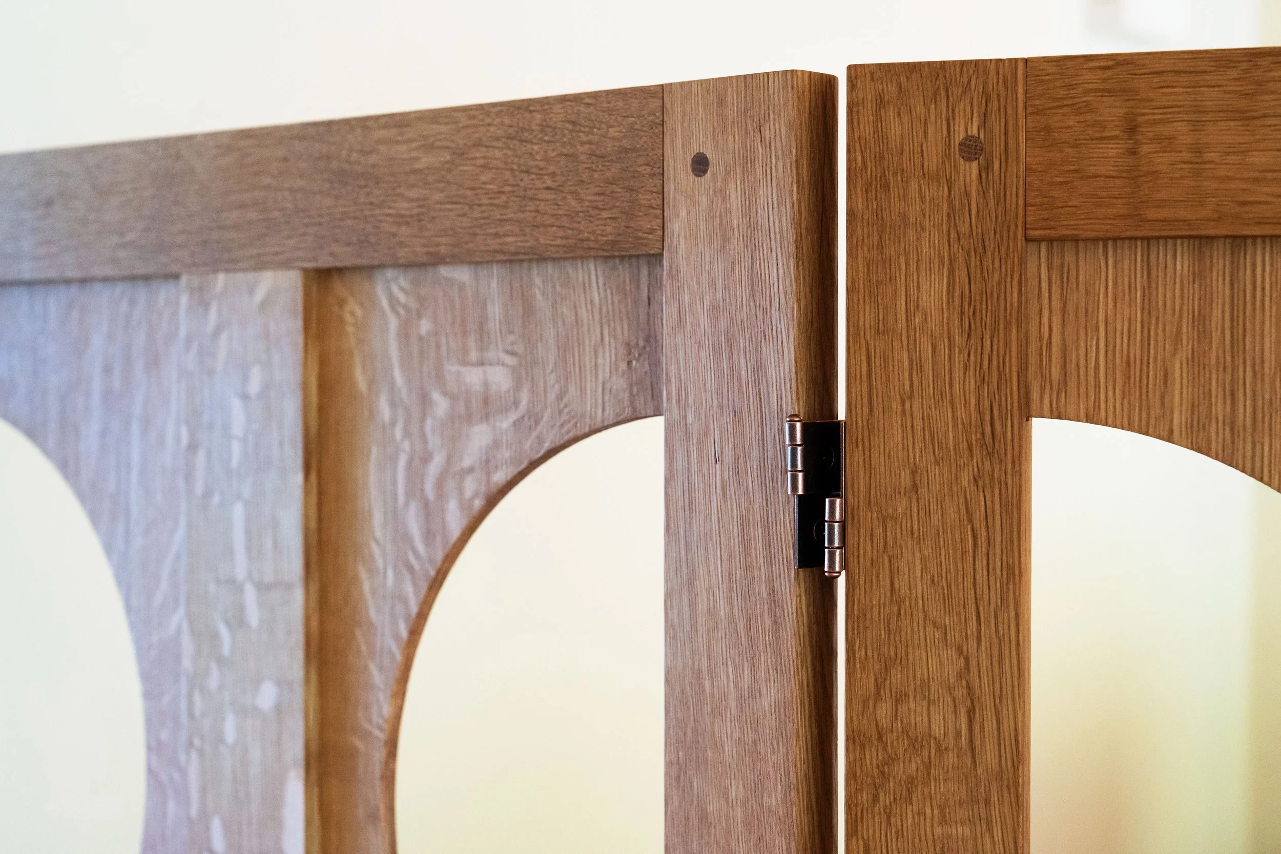
Due to their perpendicular orientation, the inlay strips were glued in one at a time and then hand planed flush to the surface. (Note square cut nails holes on the edge.)

With the “partitions” in place the walnut sides were cut to final lengths on a 45° bevel at the table saw

Glueing up the sides
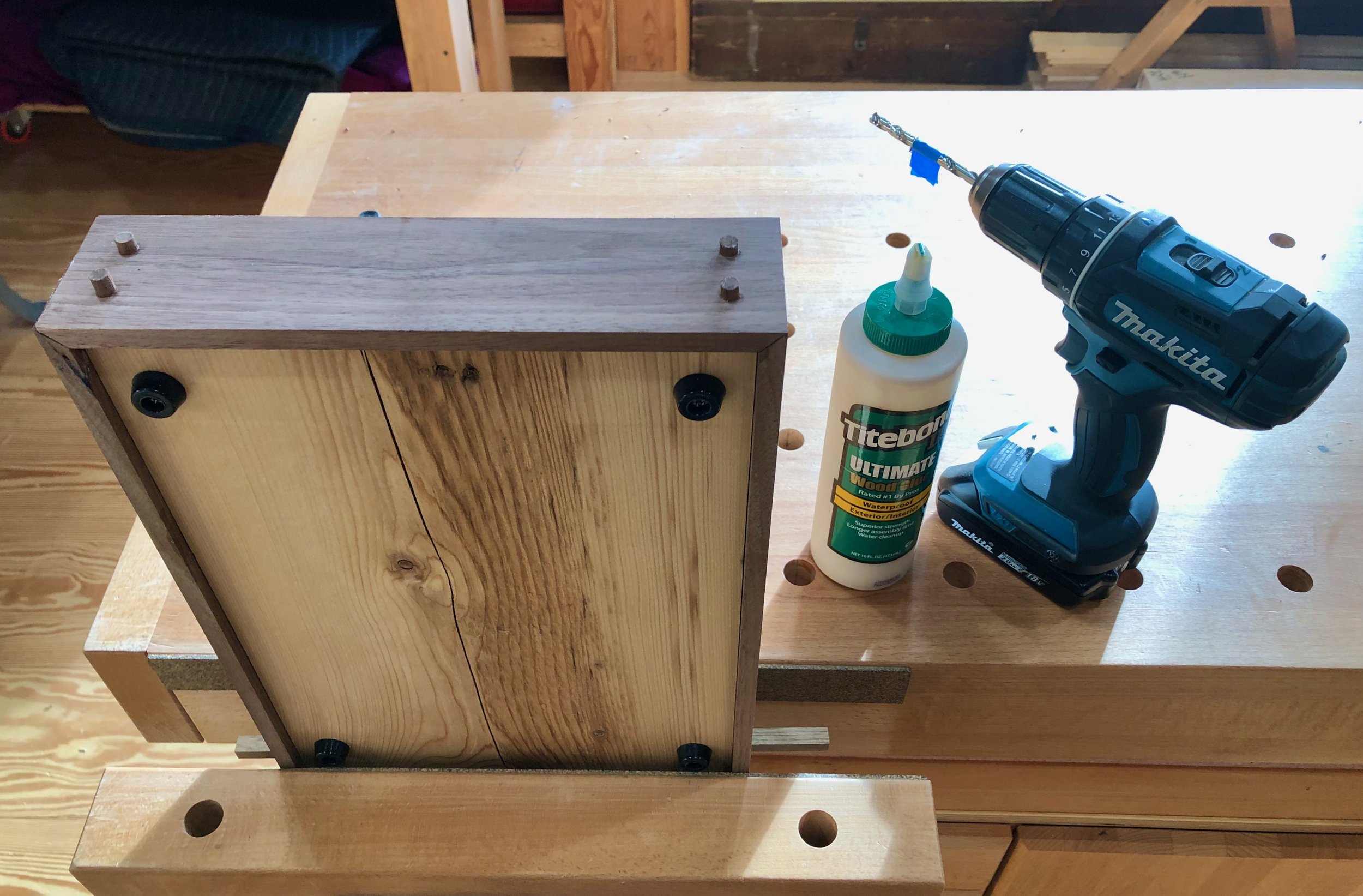
Because the two short sides were glued to the spruce’s end grain I wanted to add some additional fasteners. Walnut dowels did the trick. (Note cutting board feet attached to the underside.)
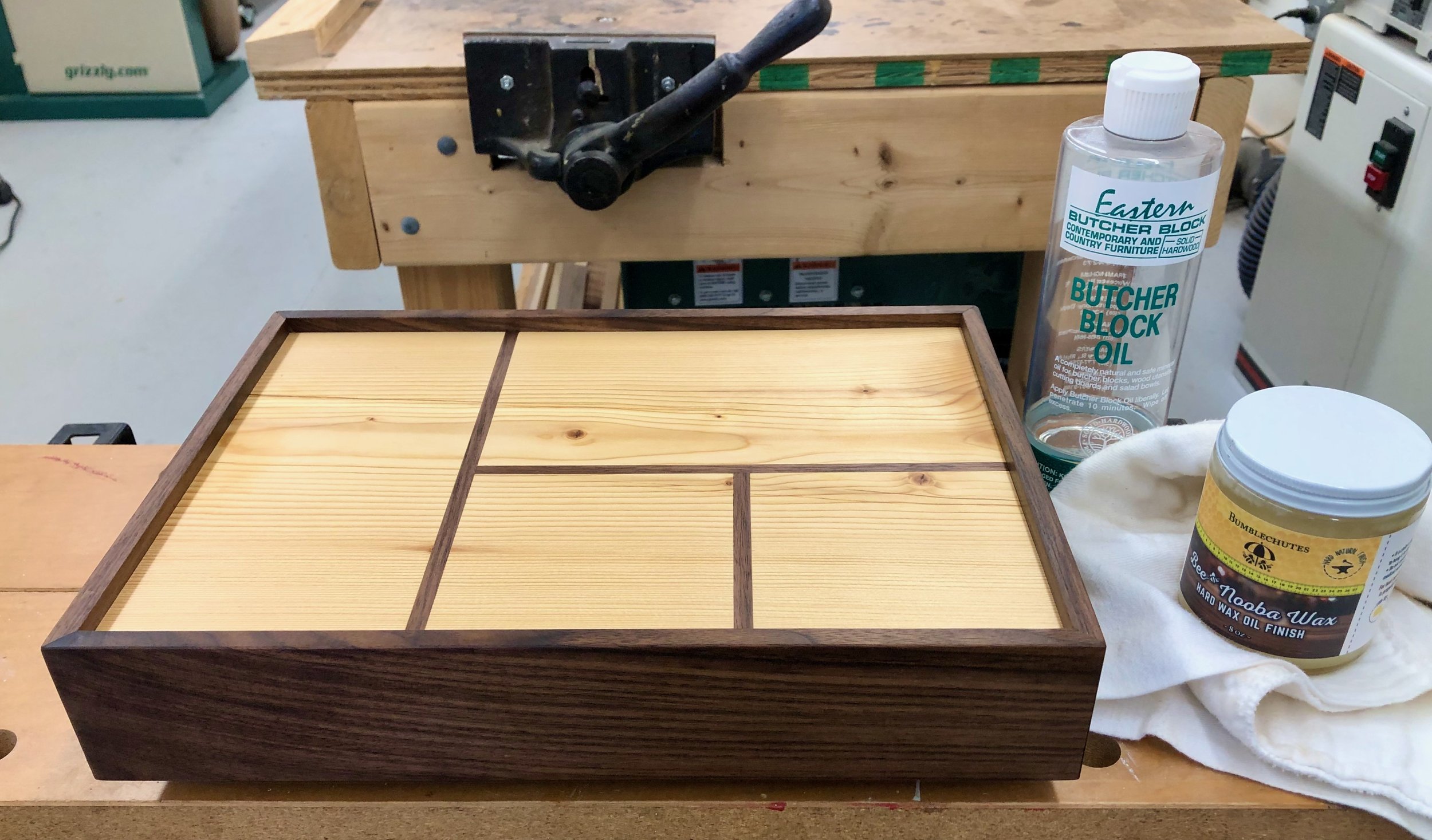
After a final sanding, mineral oil was applied to the surfaces followed by two coats of a hard natural wax.

A final buff and a ribbon finishes the Bento Board.
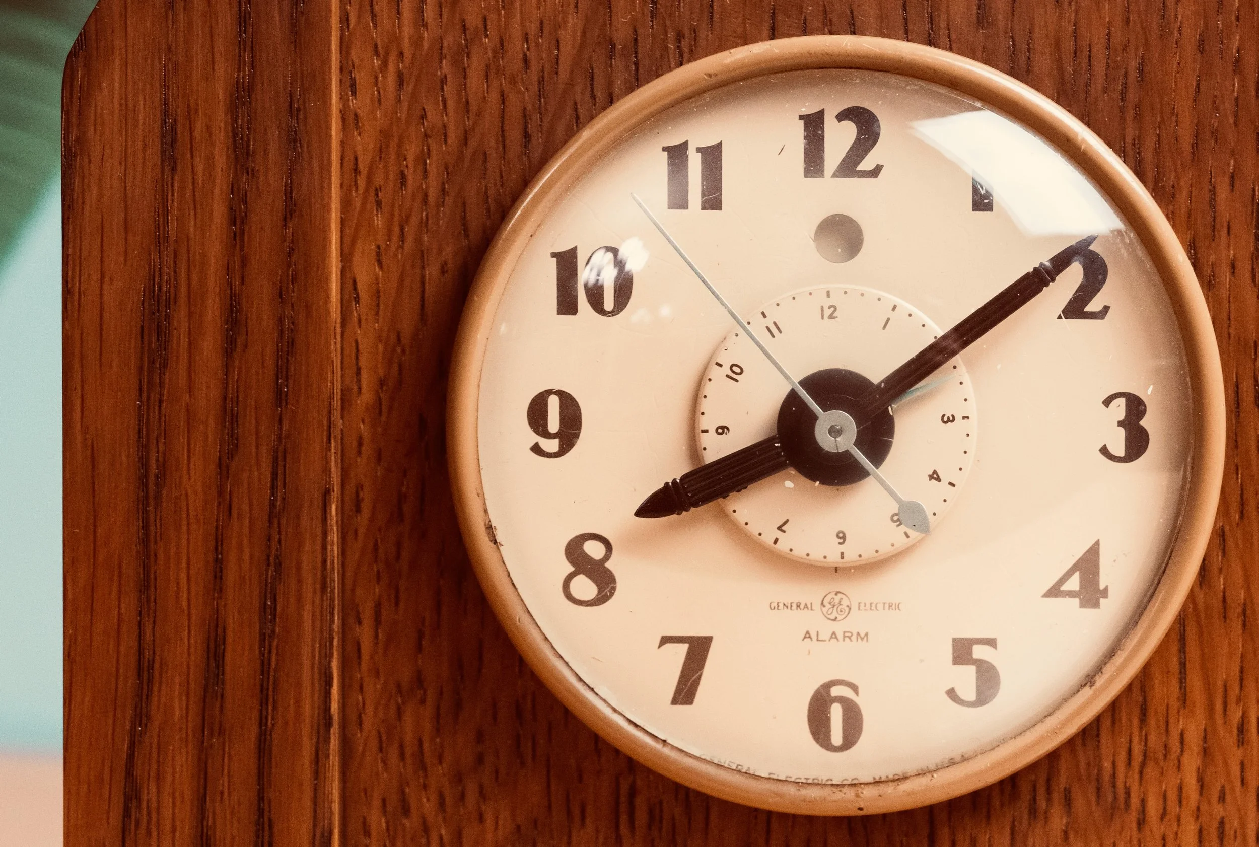
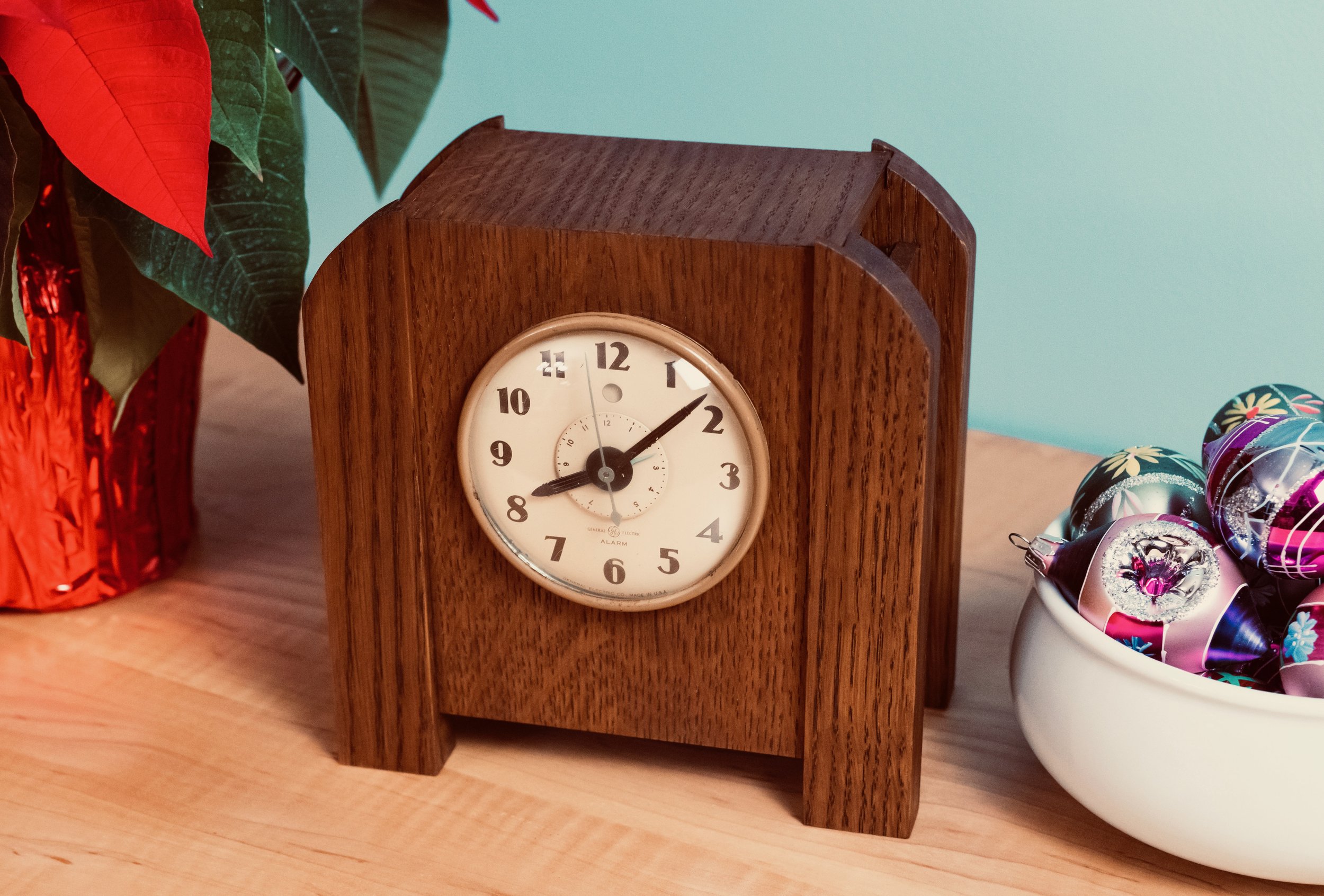
The Alarm Clock
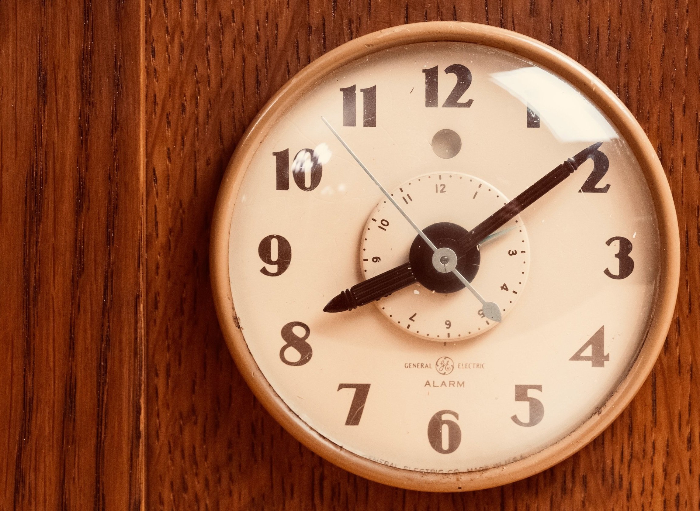
I have always appreciated alarm clocks. In addition to keeping time, these fellows let you, the user, enhance function by programming their works. This sets up a charming, human machine symbiosis which is the reason why we buy them instead of the less functional alternative. The current Project is an alarm clock restoration, of sorts.
It seems that among the family artifacts & heirlooms my brother, Mike, happened to acquire the guts of an old, 1940’s electric alarm clock that once belonged to our great uncle Louis. As with many family keepsakes he doesn’t remember how he assumed ownership, and I only became aware recently when he presented me with the naked works and a request to build a new case for them. The clock would have been originally clad in Bakelite, that early plastic which we presume was somehow damaged beyond repair, however, the clock face was unblemished, and it appeared to keep good time. This motorized timepiece would have been purchased shortly after electricity arrived to our area of rural Michigan and so I imagine that it was an extra special item in its day. Here’s a picture from the internet showing its original form.
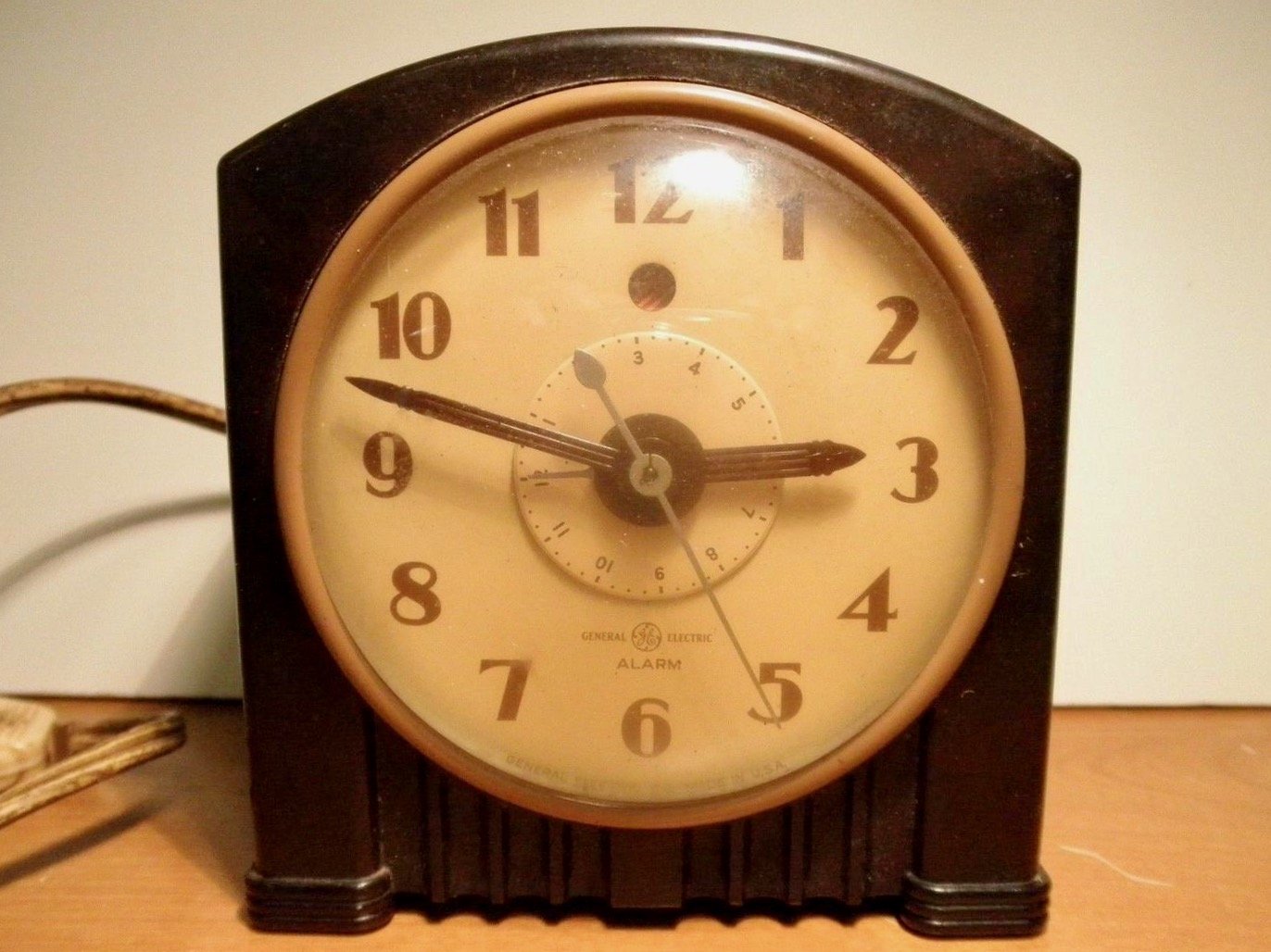
General Electric clock model 7H154
Design
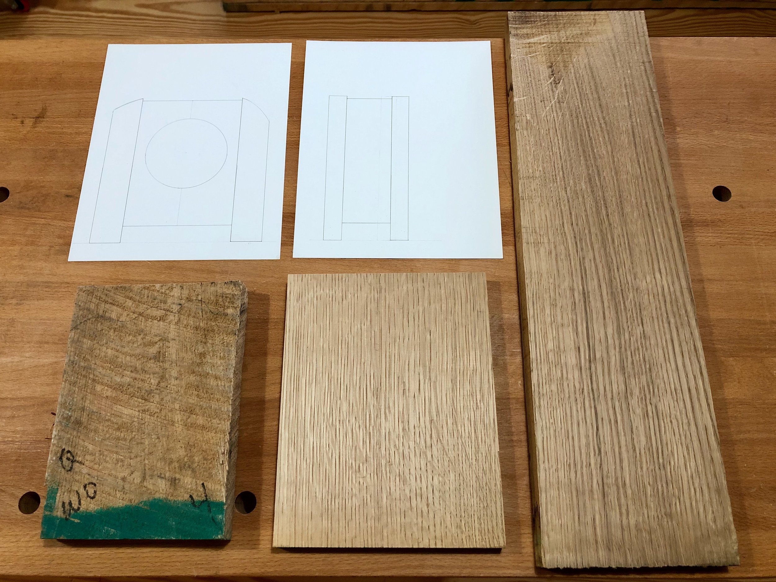
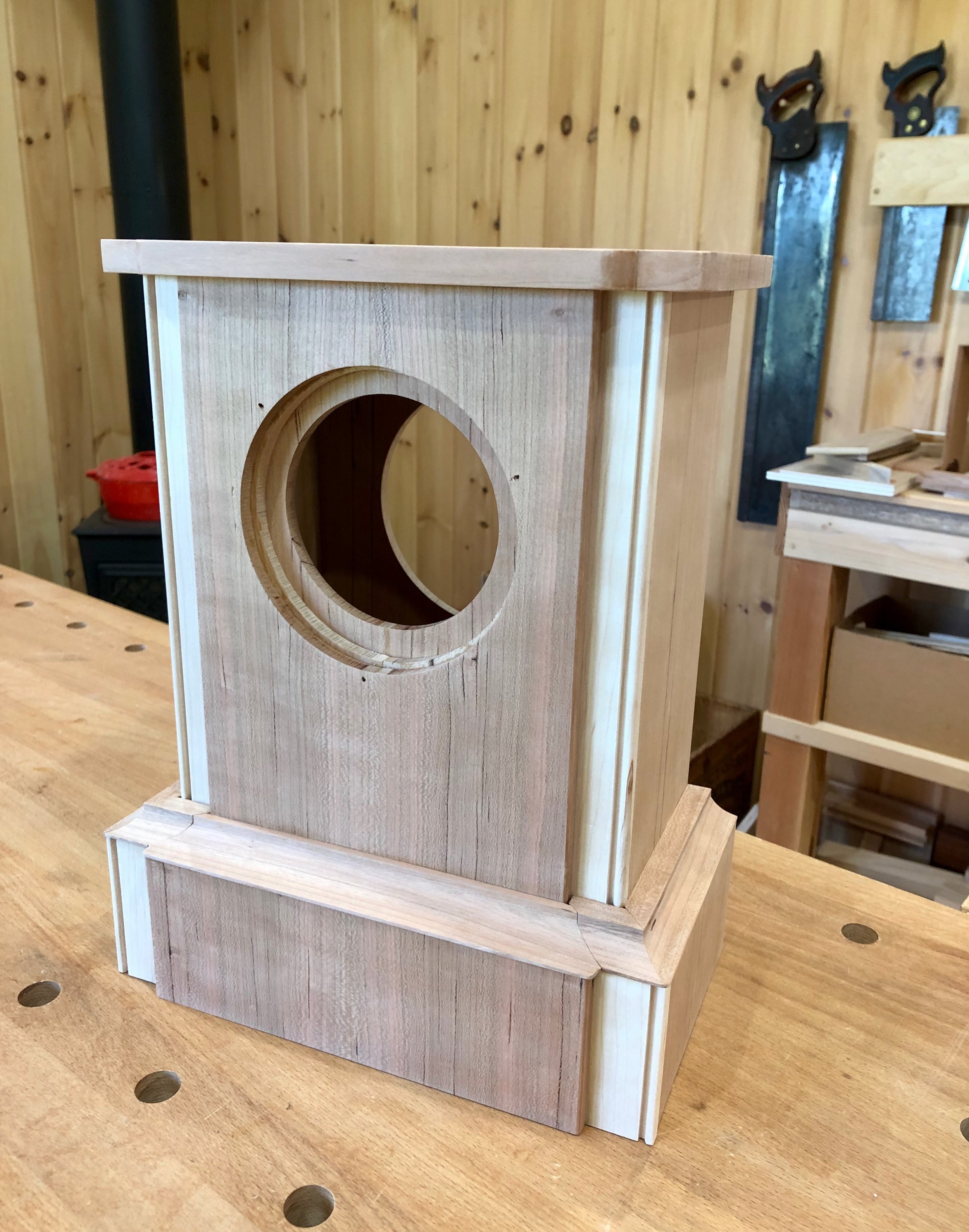
The art deco styling of the original evokes an era of home cooked meals and evenings by the radio. We wanted to preserve that feel, but an exact reproduction, replacing plastic for wood, was not the answer. First, the stocky 4 x 4 inch bedside form would look out of place on a shelf in my brother’s study and, more importantly, I was not sure I could execute the curved case top with success. The solution was to keep the curve element as part of longer, more pronounced “pillars” framing a rectangular chamber that would house the clock mechanism. While still a square 7 x 7 in. on the face dimension, it was anticipated that the illusion of verticality provided by the dominating pillars and the offset dial mount would give a more appropriate look. The motor on this clock generates heat and so the plan was to forego the box bottom and also leave a gap between the sides and top to promote cooling by convection.

Rough plan with front view showing two possible variants of the curved pillar
Materials
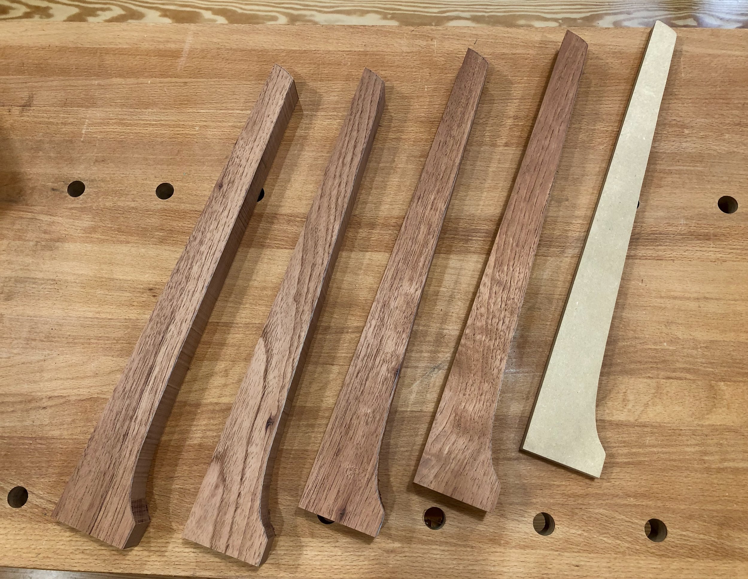
The mechanical part of this build was in hand except for two missing bolts used to mount the works to the case. Replacements for these were obtained at the local hardware store. For wood we chose quarter sawn white oak, that mainstay of solidly built furniture from this period. And in the spirit of Reclaim•Reuse•Recycle, a few leftover scrap boards from past Projects would be used.
White oak boards
Dimensioning
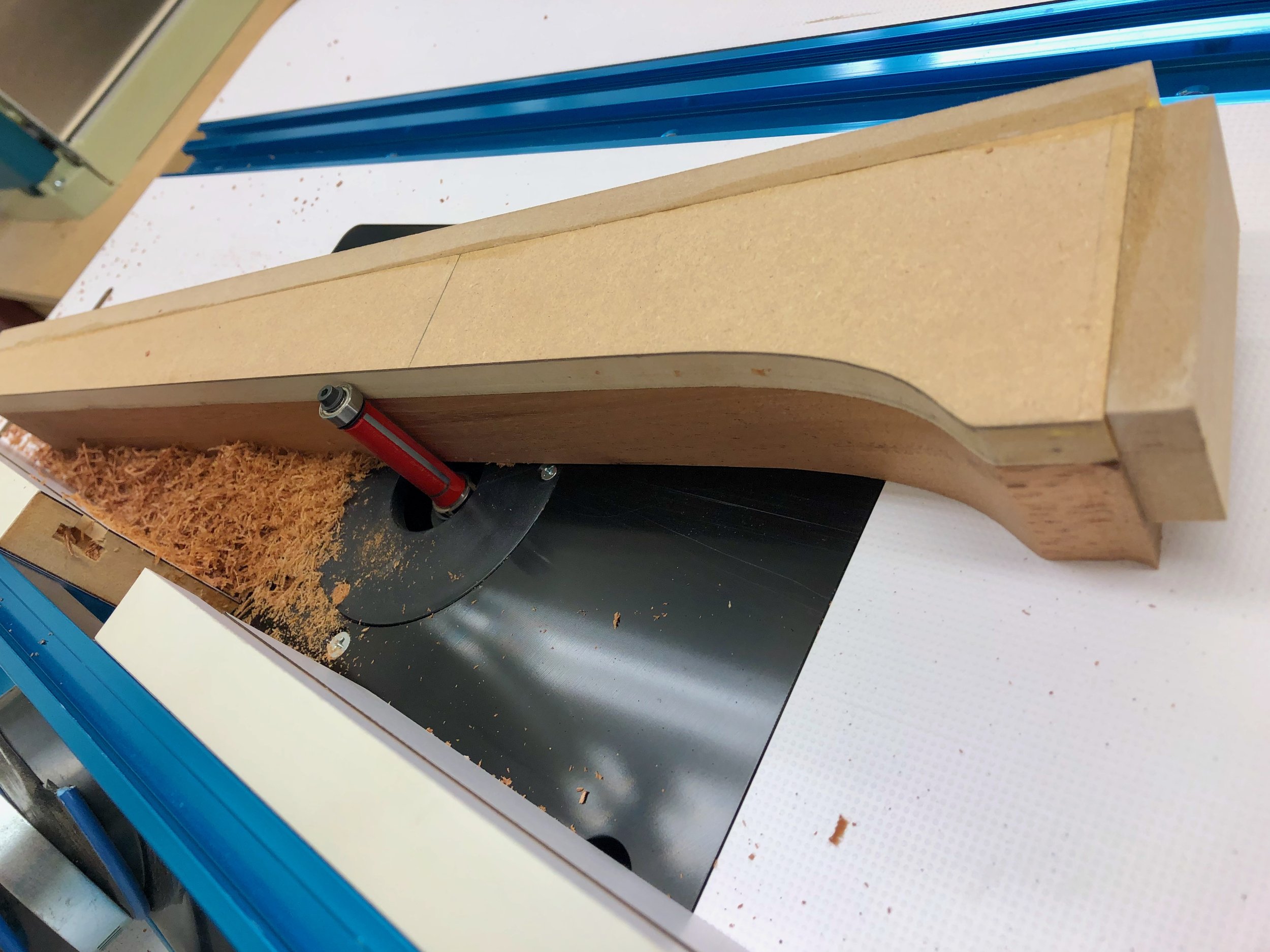
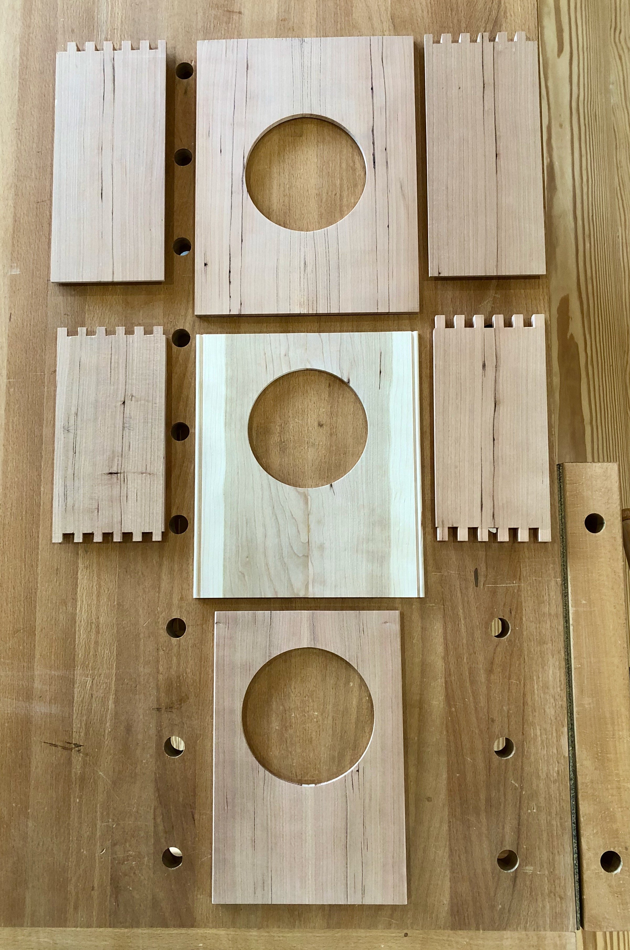
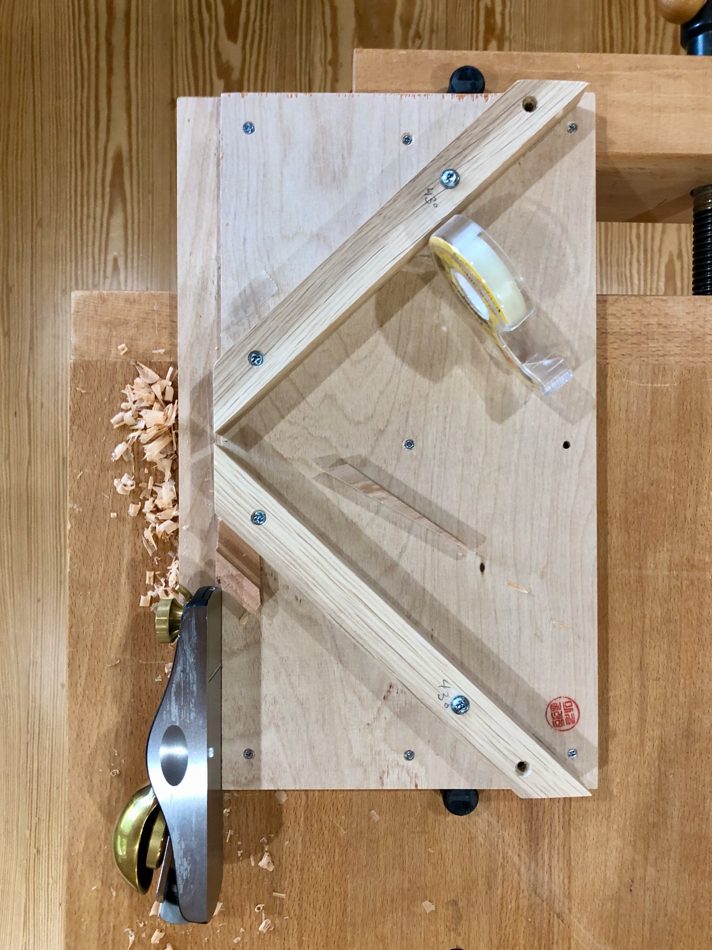
The parts for the case were easy to make. I needed four pillars (1 1/4 x 3/4 x 7 in., W,D,H) and some flat panels, thickness planed to 1/4 in. in depth. Some grooving in the pillars would hold the panels, and the seams along the top would be mitered. Just as with the plastic case, this construct would expose no joinery. Although “easy to make”, it required the use of all nine of the heavy power tools in my shop to do so. This included the smaller bandsaw, which was used to cut both the circular opening in the face as well as the curved pillar ends. Can’t have more fun than that!
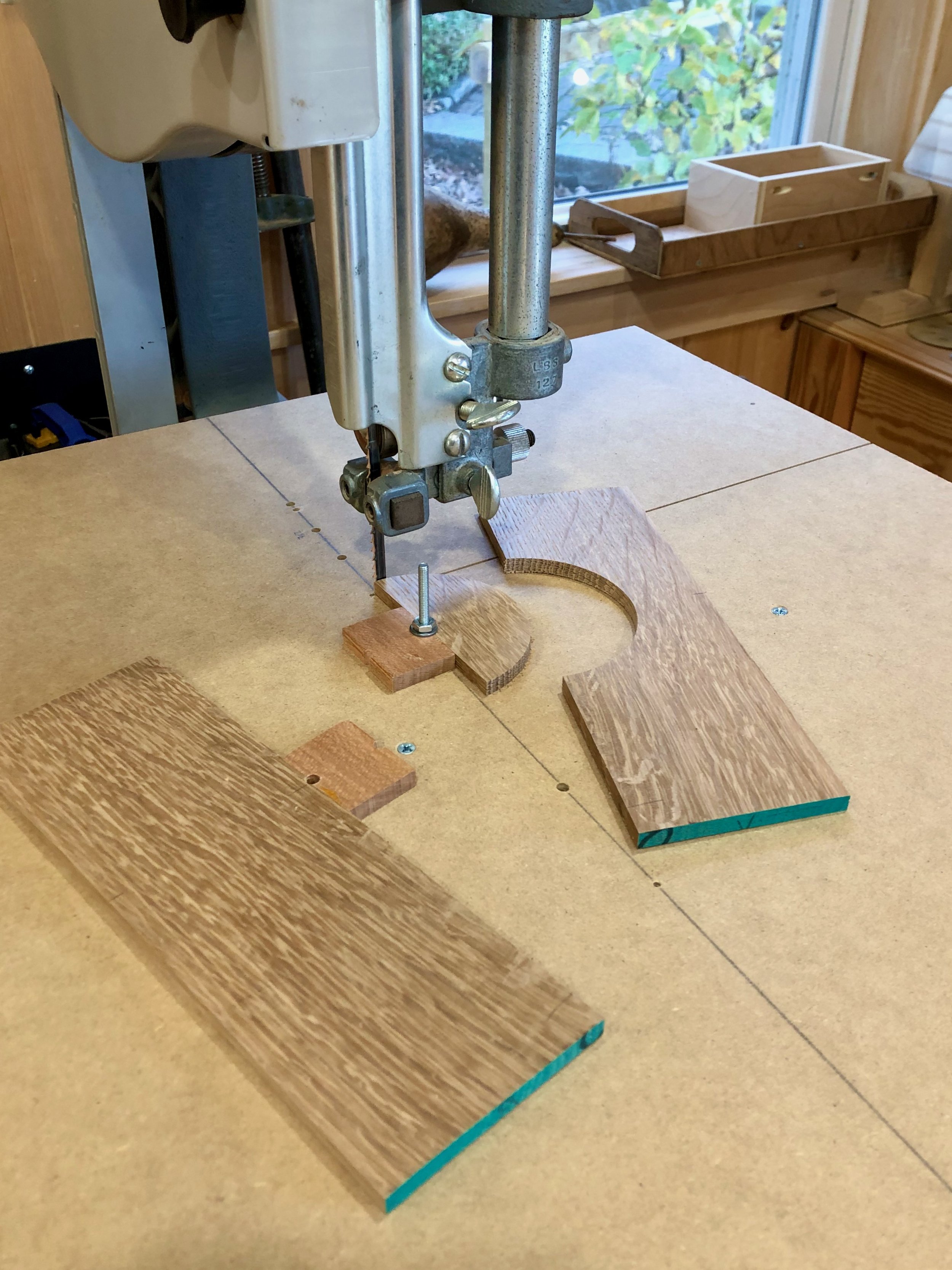
Cutting semi-circles out of the half faces using a homemade bandsaw jig
Hand planes, rasps and sandpaper were used in the bench room to further refine the pillars and to establish a tight fit of the panels in their dadoed slots.

Test-fitting the front and back panels
It all came together rapidly up to this point. The next step was to create a top to be joined with the front and back panels. The plan was to use mitered joints for this, which meant cross-cutting these pieces to their exact lengths on a 45° angle at the table saw. I cut the top first from a longer board in order to practice getting it right. Next, the front and back were cut to identical lengths. To get the whole thing fit together I also needed to chisel out a small section of the pillars. After marking the cuts with a knife I used a pull saw to make incisions where possible. I then placed a supporting plywood scrap into the groove and chiseled-out the remaining waste. It all went well.
Removing the top corners with a chisel
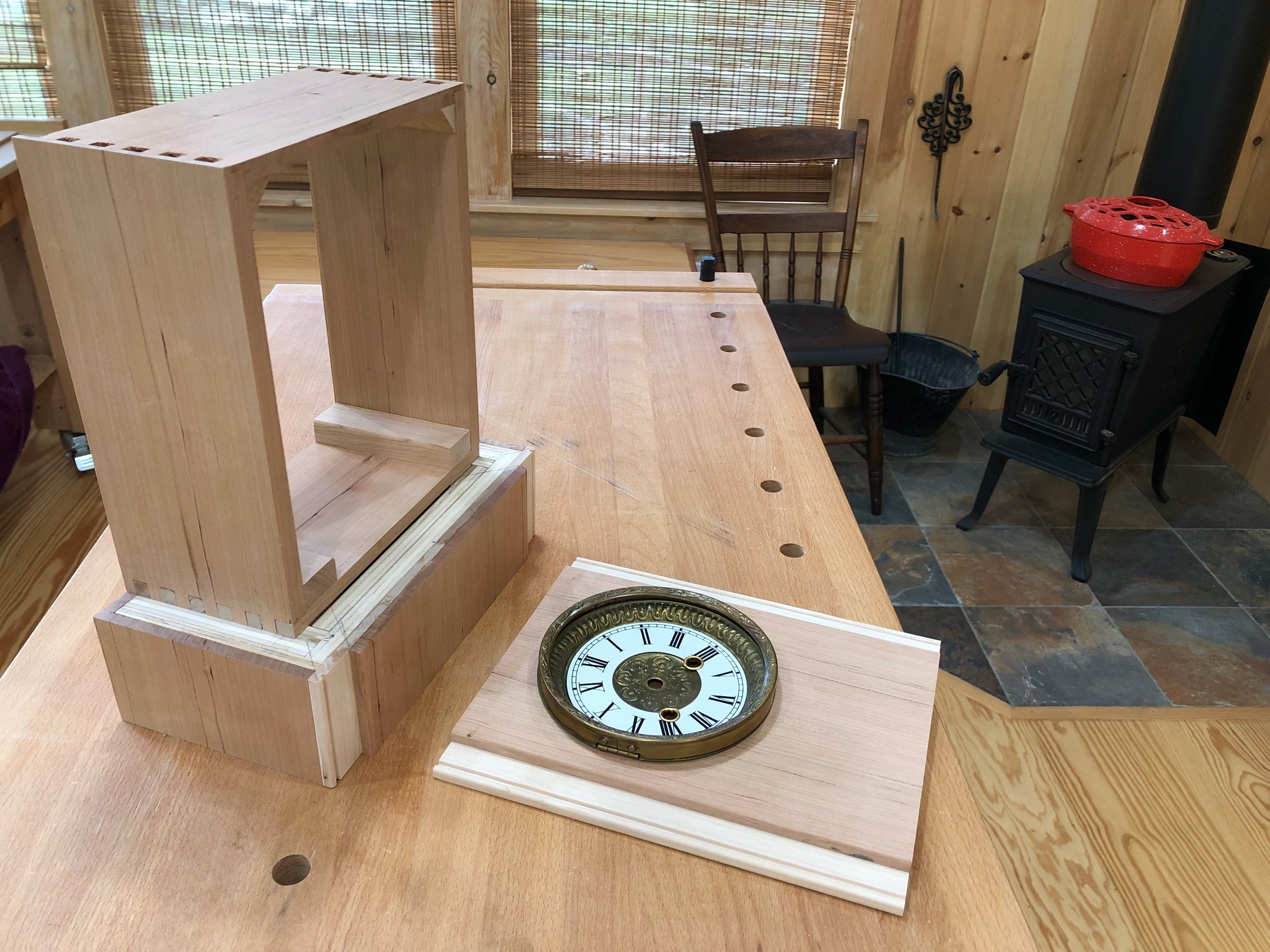
With the top settled into place I could make a final measurement for the width of the sides. Two side boards were then cut to size and the entire case snapped together nicely in a dry fit.
Dry-fit case
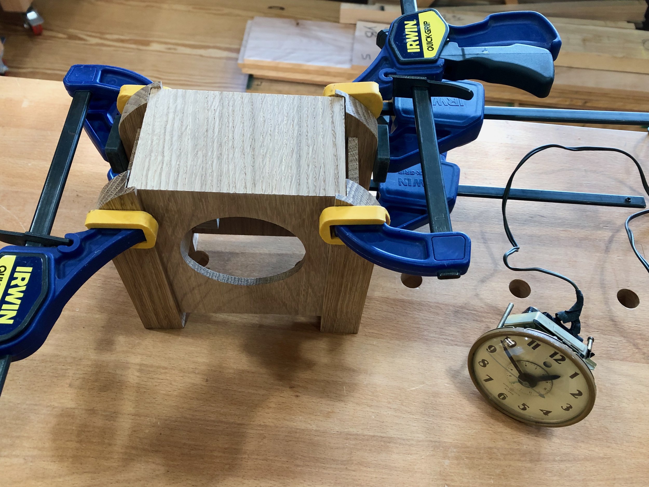
Only two operations remained prior to final assembly, both of which I had yet to engineer: mounting the clock works to the case; and creating a back door. The original clock used two bolts to mount the works to the backside of the case, and that backside contained three openings from which protruded the knobs and buttons used to set the clock and alarm. During design I had ruled against this solution as it would necessitate making the 7 inch tall clock a narrow 2 1/4 in. in depth and I was going for a different look. This look would necessitate a doored opening to access the control knobs. I could still use two long bolts to reach the back of the clock, as designed, but they would need to mount so close to the door opening that it was not considered a robust solution. The chosen method was to mount the mechanism to the front of the case by way of a couple wooden blocks glued to the interior, through which the bolts could be tightened.
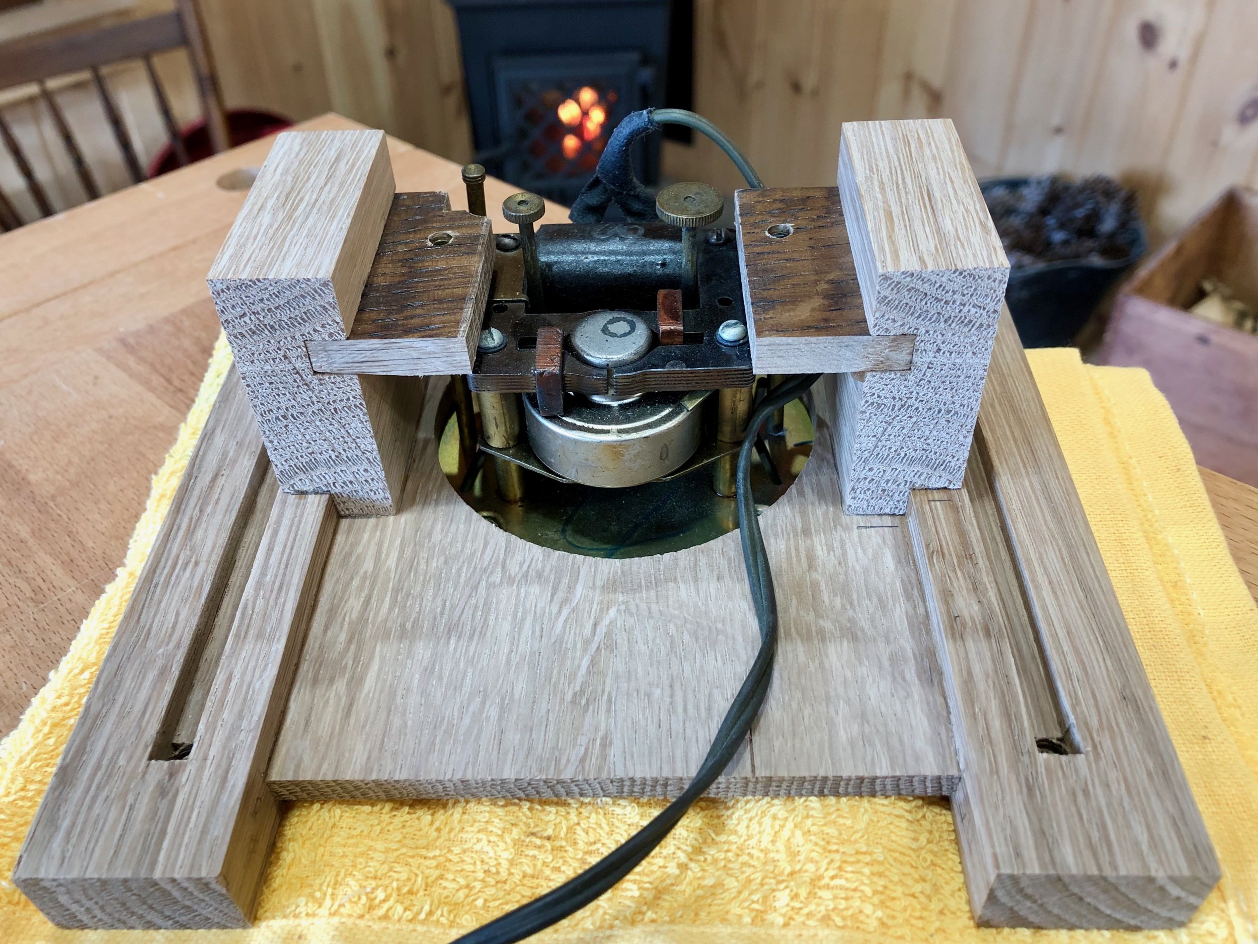
Clock works mounted to the front board
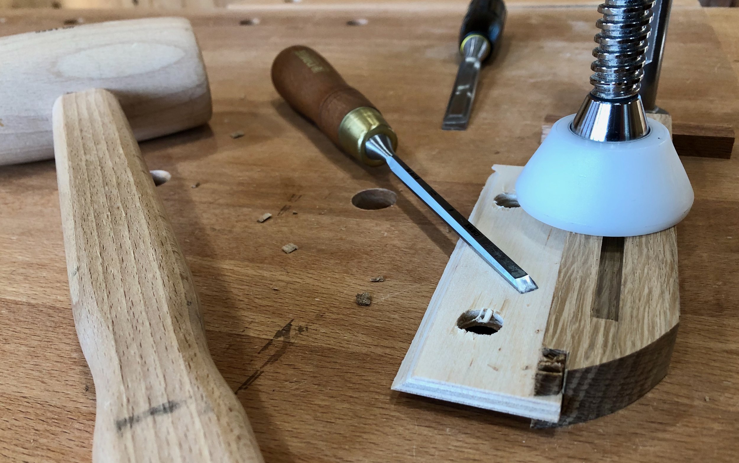
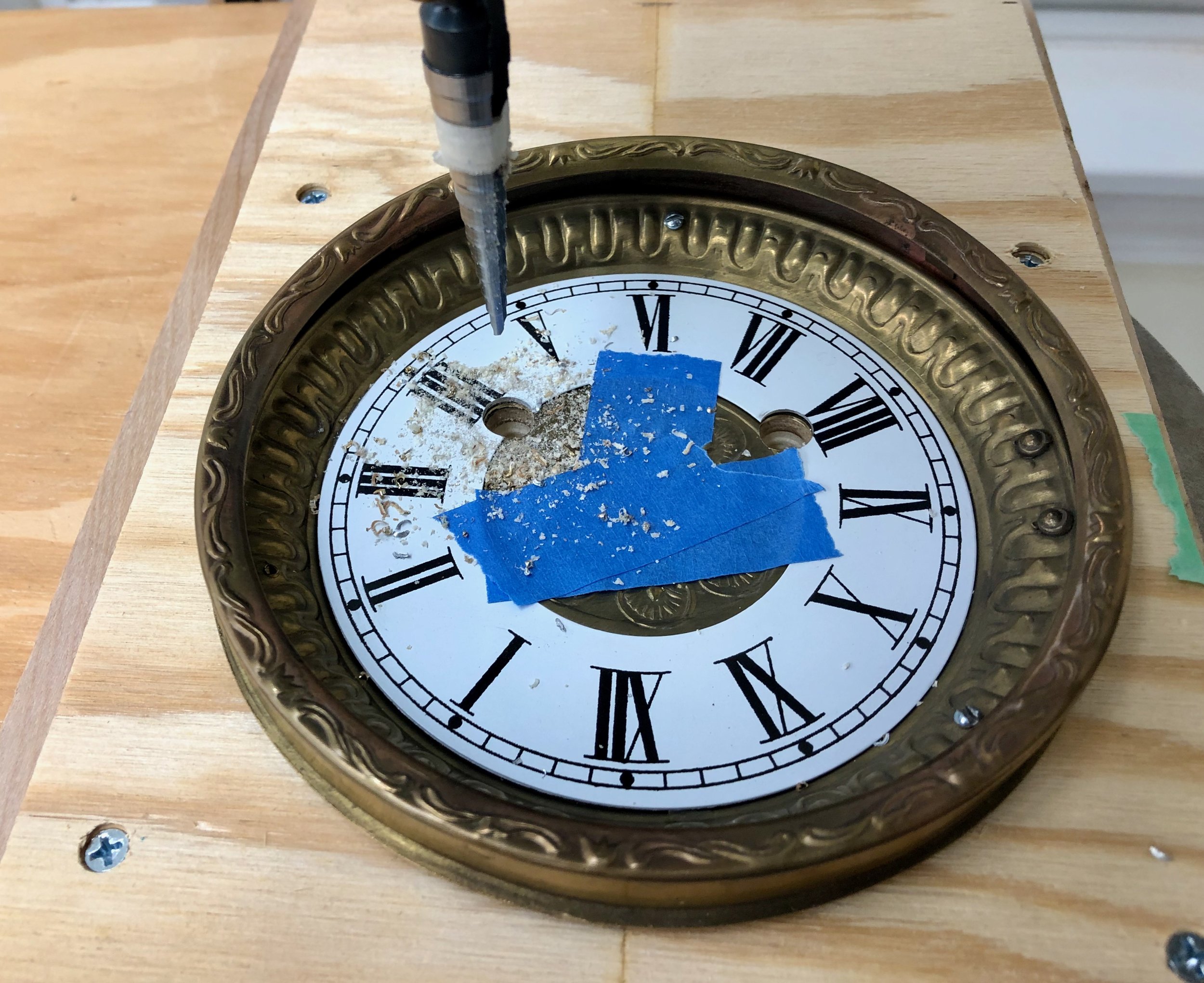
Finally, on to the access door. The back panel, having already been cut to size and fitted, was now a high-value component so getting the door right on the first attempt was important. It was decided to cut out an opening in this part and then source the door from another piece of oak, rather than use the waste material for this. However, with no other framing, that door would need to fit as if it were a cut-out and so the plan was to establish the opening and then trace this pattern onto another board to define the exact door shape. A Forstner bit at the drill press was used to bore holes in the back board along the perimeter, followed by a chisel to define the straight edges of the opening.

Chiseling out the door edge
Next, a door was cut out of a prepped white oak board and then the edges were hand planed and sanded to achieve a uniform interior fit.
Assembly and Finish
Glue-up of the remaining parts was straightforward. Once dried, the miter seam was treated with a burnisher to close-up the hairline gap, and all clamp marks were removed with sandpaper.
Assembling the case
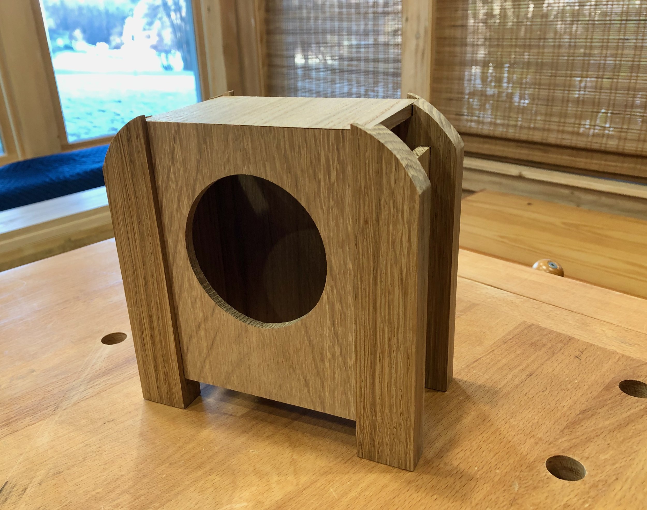
To preserve the wood I used Jeff Jewitt’s rendition of L. & J.G. Stickley’s so-called “Aurora” finish: medium brown dye, antique walnut glaze, satin varnish. I think it gives the oak a nice warm feel and still lets the medullary rays shine. After buffing the finish, the clock’s works were installed and tested. Finally, a couple of brass butt hinges and a round brass knob were applied to complete the access door.

Back door
Mike’s alarm clock now has a new presence; bold but friendly, and with a hint of nostalgia for simpler times.
Metamorphosis clock
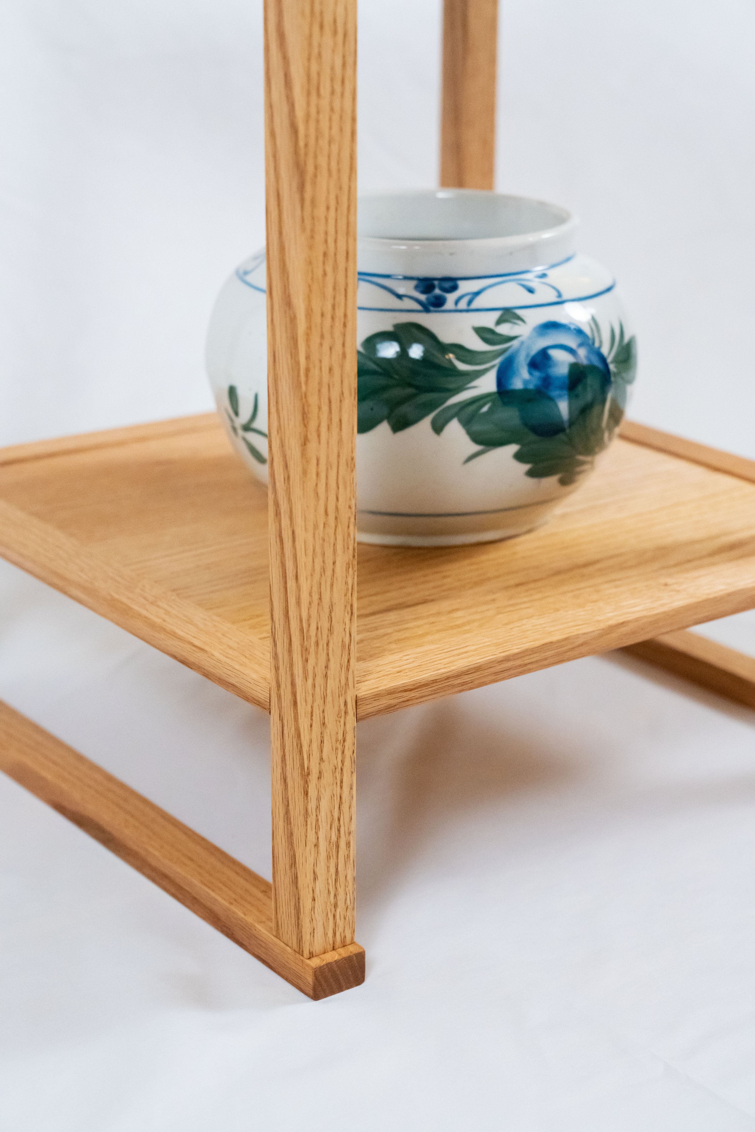
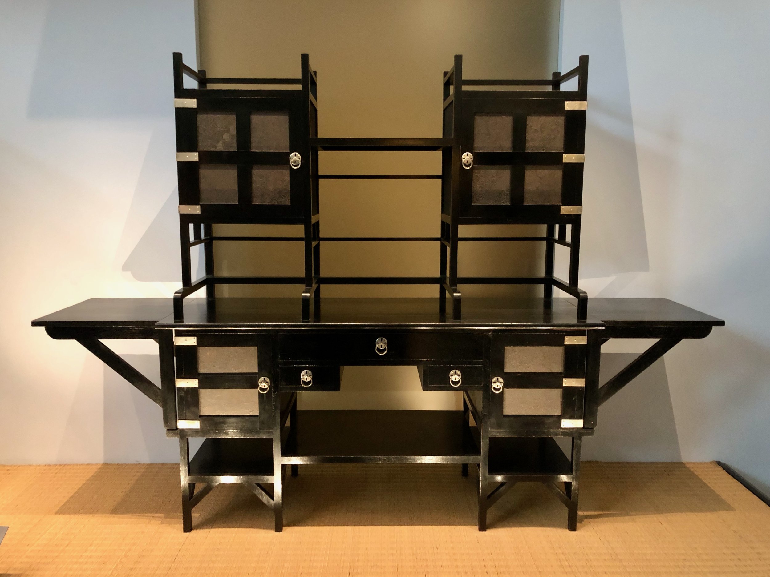
Korean Stand
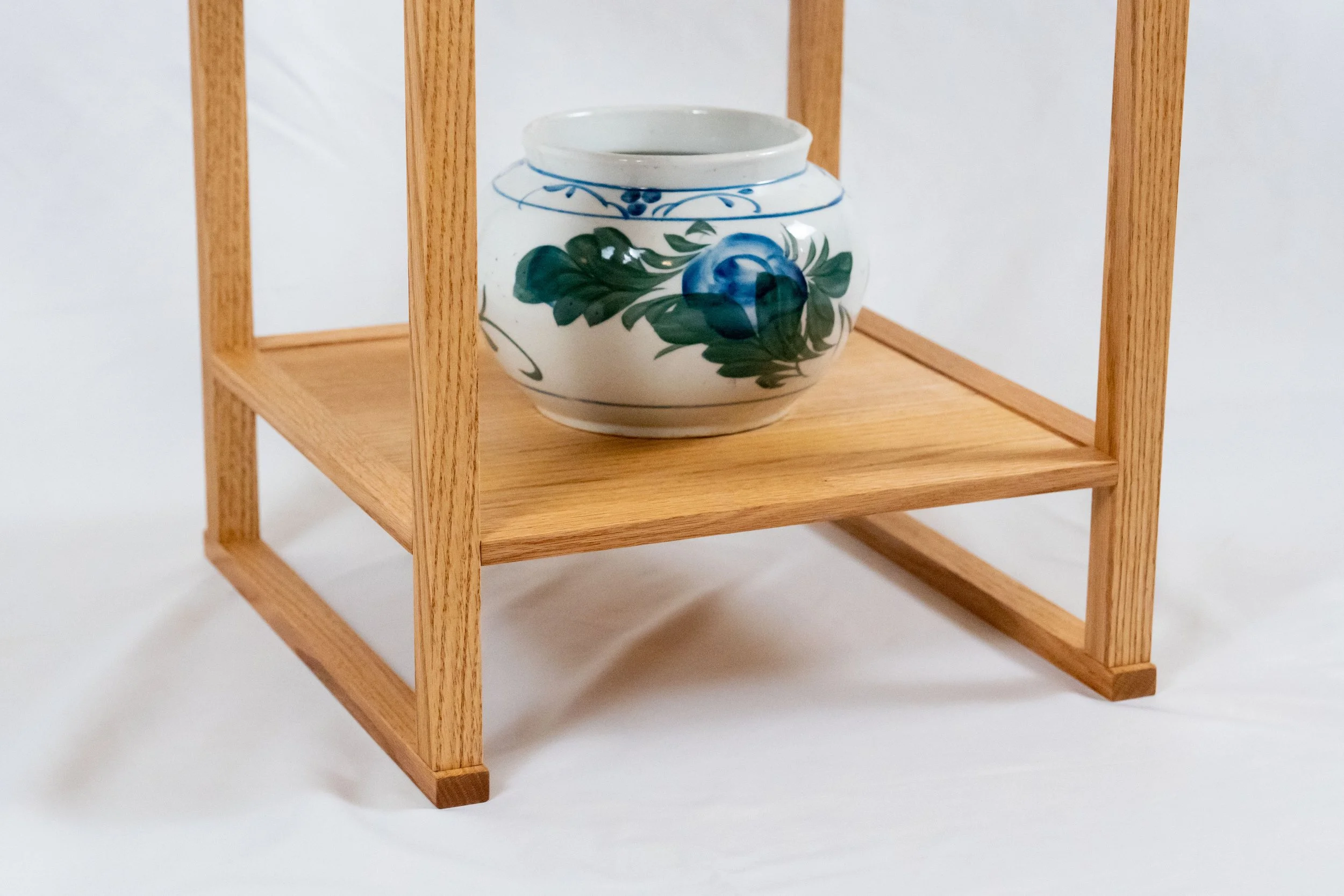
Korean furniture has but a few characteristic forms and these have served their storage, writing and dining needs for millennia. Distinct from other East Asian designs, Korean pieces tend to be stouter, less decorative, and more “earthy” than the island or mainland counterparts from Japan and China. And in my view, no form is more unique to that peninsular nation than the book storage and display stand, the so-called sabang t’akja. These stands, about 16 inches wide and no more than 6 feet tall, have several layers of shelves and can exist free of cabinetry, but often they will be anchored by a doored compartment for stacking books. The more utilitarian versions include small drawers, as well.

Korean book storage and display stand archetype (sabang t’akja)
reproduced from: Wright, E.R., Pai, M.S. Traditional Korean Furniture, Kodansha: Tokyo, 2000.
For lovers of East Asian design, sabang t’akja are downright charming. I think it is the combination of a sturdy base supporting the thin, beautifully proportioned shelf framework that gives this iconic furniture its appeal. Of course, the wooden material, joints and hardware all do their part, too. One of my earliest Projects in the workshop was to excise the shelving and just build that bottom compartment; this time I’m making the shelves.
My motive for this Project was to make a display stand so that we could unpack and put out some of our “precious” pottery, and for a moment I seriously considered using all authentic joinery in the process. Sabang t’akja are generally constructed using the so-called “swallow beak” joint. Traditional Korean furniture relied heavily on this method, adapted from the construction trade, for fastening parts. Structurally, it is a modified mortise and tenon joint that creates a solid corner. The “beak” portion serves as a second registry element that, along with the internal tenon, securely mates a pole and a rail, in olden days, without the need for glue or fasteners. It also serves to convert a simple seam into an interesting design element. If you’ve never noticed these on Asian furniture before, you will now.

Example swallow beak joint (not mine)
Alas, that consideration did not last long. I taught myself the rudiments of this joint from a book on Korean furniture making, and my practice joints were “okay” but not good enough for living room furniture. More practice would undoubtedly improve things but I found no joy for me there and I began to dread the thought of sawing/chiseling dozens of these joints to finish the Project. I also happened upon a few pictures of sabang t’akja made with traditional mortise and tenon joinery and that sold me on the path to take here. I’ll master the swallow beak joint one day on a smaller piece.
Design
The display stand, itself, will be a replica of another example found in the book, Traditional Korean Furniture, referenced above. Dating from the mid-nineteenth century and now part of the National Museum of Korea collection, this example stands 59 inches tall and has no cabinet. It is symmetrical, delicate and beautiful to my eye. The dimensions of the poles and shelves were calculated from the photo, below. Replacing the original swallow beak joints (n = 40) with mortise and tenons is simply an elimination of the beak work.

Korean display stand exemplar
Materials
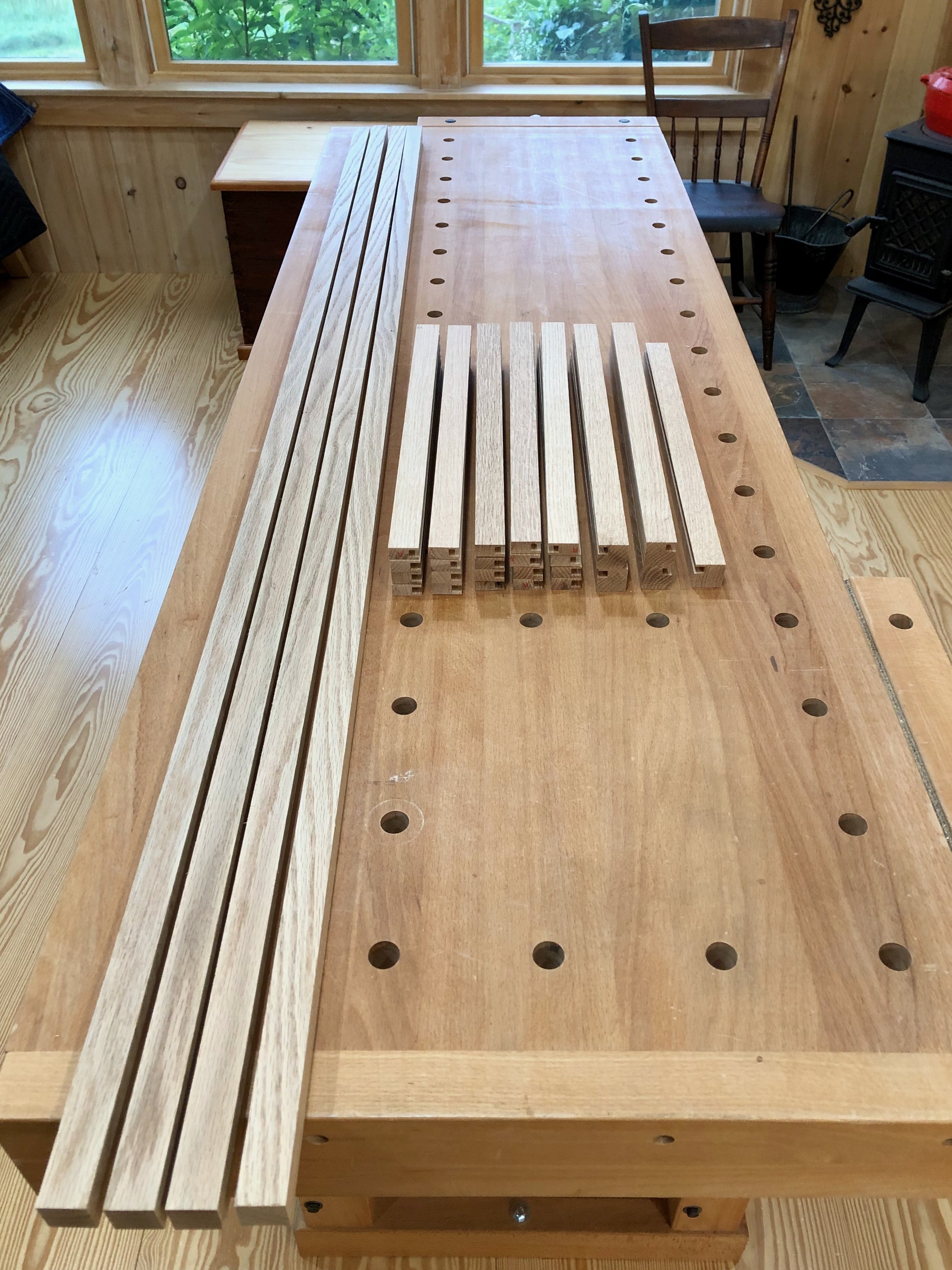
The original display stand was crafted using pine wood for the frame and paulownia for the shelving. These softwoods were employed extensively in traditional Korean furniture making, but I wanted to use hardwood for my version and so I decided to use red oak (Quercus rubra), quarter sawn at the lumber yard.

Red oak stock
Dimensioning
There are only five part “types” in this piece, and that simplicity of structure accounts for its beauty. They are by my nomenclature:
poles (4)
top rails (4)
rails (16)
shelves (5)
tatami-zuri boards (2)
The poles and rails come first and, with these, there is a specific sequence required for joint creation: mortises before tenons; grooves before shelves. To begin, the oak was prepped at the jointer and thickness planer, and then the poles, top rails and rails cut at the table saw to their final width dimensions (1 in.) but left long. The depth of these parts were set last: the poles and top rails at the thickness planer (1 in.); whereas, the rails were first resawn at the bandsaw and then thickness planed to 1/2 in. To eventually accommodate the shelf boards, a 1/4 in. wide x 5/16 in. deep groove was made in the rail parts using a dado blade at the table saw. All edges were then smoothed a bit with a card scraper to remove mill marks. Things will get finish sanded near the end of Project.
Poles and rails cut to their working dimensions
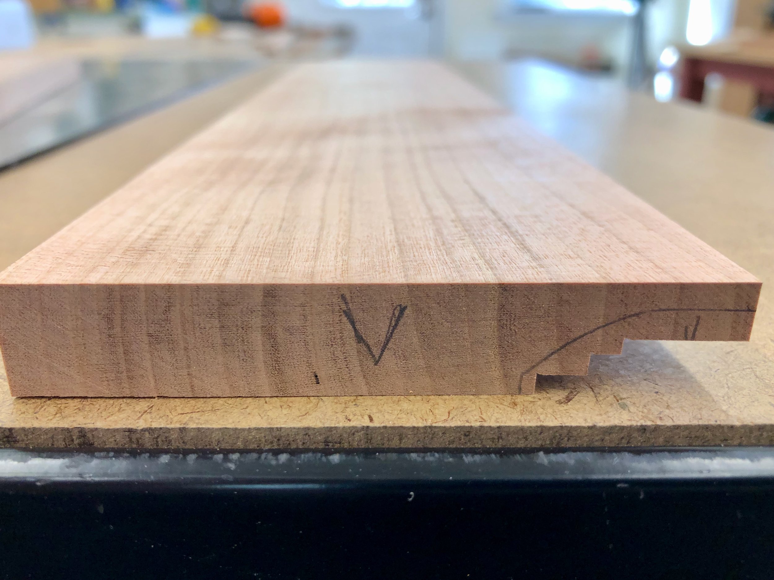
The joinery starts with the poles and before any of that work is done they first need to be cut to final length and marked. To define the height dimension, I measured down 60 inches from the top of each pole and sliced a 1/4 in. deep groove here on all four sides using the sliding miter saw. The grooves define a 1/2 in. square “core” which will be converted into a tenon to hold the tatami-zuri boards later in the build, but for now I will leave a stub the same dimension as the pole to make the next few operations easier. The poles were then chopped 3/4 inches beyond the groove to give parts of uniform length.
The poles were labelled for their position (e.g., left/front, etc) and then the position of the top mortises were pencil-marked using a ruler and square. These were cut at the mortiser and, since the top rails are thicker than the “inner” rails, they merited a thicker, 3/8 x 1/4 x 1/2 in. mortise, too.
Next, I needed to somehow cut the 32 remaining mortises, all 1/4 x 1/4 x 5/16 in., at regular positions along each rail. Instead of properly marking all of these positions and then accurately hitting the marks with the plunging mortiser bit I decided to try using a spacer jig. This little invention consists of a 1 in. wide oak board with a 1/4 x 1/4 in. mortise cut through it. A 1/4 x 1/4 in. square cherry dowel was then tapped through this glued opening and cut to a 3/16 in. protrusion on either side. Finally, cutting this board to length, 13 1/2 inches below the dowel, gave me my working jig.
Shop-made spacer jig alongside poles
In use, the jig was inserted into the topmost mortise on the pole, which was subsequently seated on the mortiser bed such that the end of the jig abuts the mortising bit. Plunging at this position, then reproducibly delivers a mortise at the appropriate position below the prior one. This 3-step operation (insert jig, chop, slide to next position) is repeated until you run out of pole. It worked well.

Spacer jig “in use” at the mortiser
Next, it was time to fashion the top rails. I cut the previously prepped & grooved stock to a length of 14 1/8 in., giving me the desired span plus room for a 7/16 in. tenon on both ends. The tenons were cut in a two-step procedure. First, a finishing blade at the table saw was used to cleanly define the shoulders on all four sides.

Top rail lengths defined
From here, a dado blade and cross-cut sled were used to form the tenon cheeks at the table saw. Coming off the saw they were still a bit too thick, but could be easily chiseled down to size during a fitting operation with the poles.

Top rails tenoned
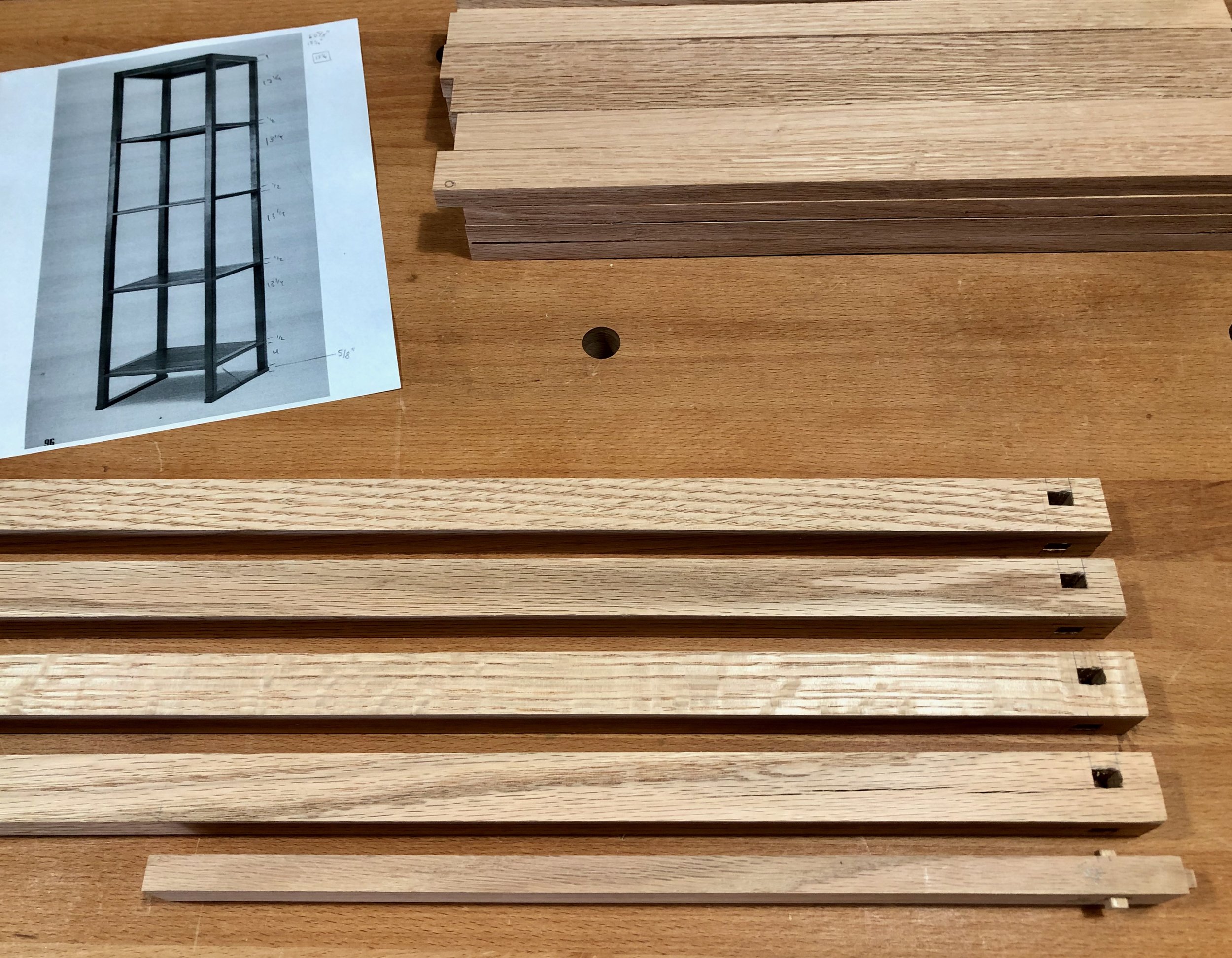
It was now time to make the tenons on the rest of the rails. The pole mortises were cut to a depth of 5/16 in. and so the tenons on both ends should be just shy of this length. With the same span as the top rails, this meant that the rails would need to measure ~ 13 7/8 inches in total. All 16 rails (plus a couple extras) were chopped to this length at the sliding miter saw. The tenons were formed in a manner similar to that described above and then chiseled for exact fit with their assigned pole. Dry-fitting the structure confirmed that everything was square and correct.

Dry-fit poles and rails
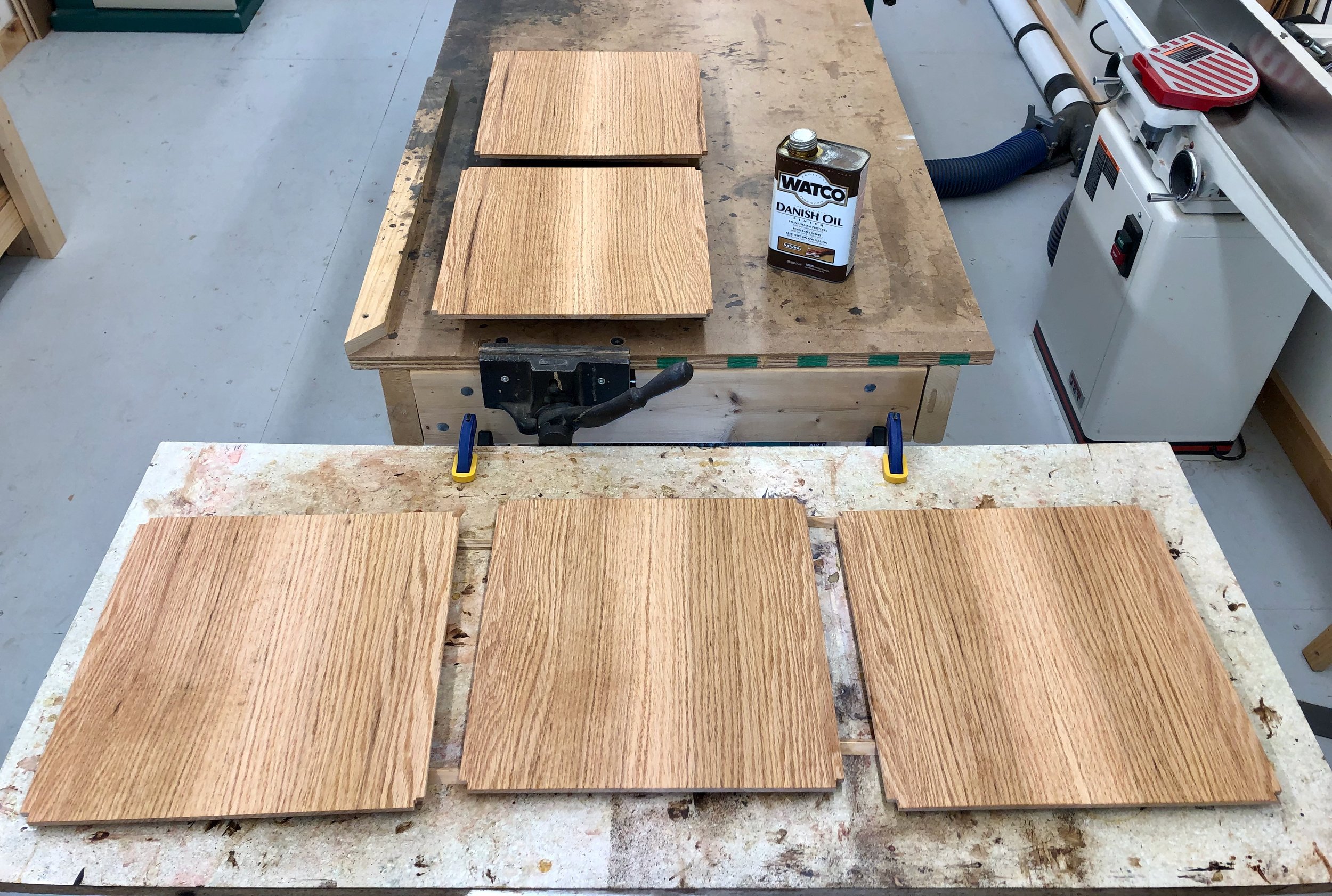
The shelves were next, all five prepared in an identical manner. First, a 7+ inch wide, 5/4 oak board was cut into four, 18 in. long sections and one edge of these made flat at the jointer. Each board was then re-sawn at the band saw into three, ~3/8 in. wide panels, giving twelve in total. The panels were then made uniform to a 1/4 in. depth at the thickness planer, and the ten best were taken on to the next steps.
To complete the shelves, the half-panels were first paired-up and the interior edges of each were made uniformly square at the jointer. The boards were then individually chopped at the sliding miter saw to uniform lengths and ripped at the table saw to uniform widths before the pairs were reunited again, this time with glue (and clamps). Next the surfaces were smoothed with a card scraper and sandpaper, each panel was then cross-cut and ripped to a 13 7/8 in. square using the combination of track saw and table saw, and the corners notched-out at the band saw to accommodate the poles. I applied one coat of the Danish oil finish to the selves at this stage. Now, should any shrinkage of the shelves occur after the final finish, it would not expose bare wood.
Shelves complete
That leaves the tatami-zuri boards. These 1 x 5/8 in. boards run between the front and back legs and serve two purposes: they contribute to structural fitness; and also act to spread the load, saving wear and tear on the tatami, that rush floor coverings found in East Asian homes. For these it made sense to reverse the proper order and complete the pole tenons before cutting their mortises. Excess material below the previously sawn grooves was eliminated with a dado blade at the table saw to yield a 1/2 in. square tenon at the bottom of each pole. After marking their positions, through-mortises of this dimension were then cut from prepped boards. In this operation it is best to leave the tatami-zuri boards longer than the final dimension, as cutting a mortise too close to the ends can result in catastrophic tear-out of the wood. (This is a fact!) Following a dry-fit, these boards were marked and cut to their final length.
After one last rehearsal of the assembly process the rails were hand planed to be smooth with their adjoining poles and then disassembled so that all surfaces could get their final sanding. Glue-up proceeded in a swift and methodical manner. I wanted to get all 31 parts put together with glue in the joints while the piece laid prone on the bench, and then flip the construct upright for a final square-up before applying clamps. This required that the glue remained fluid “enough” during the 20 minute procedure, and then harden after clamping. Employing spousal assistance it went pretty well.
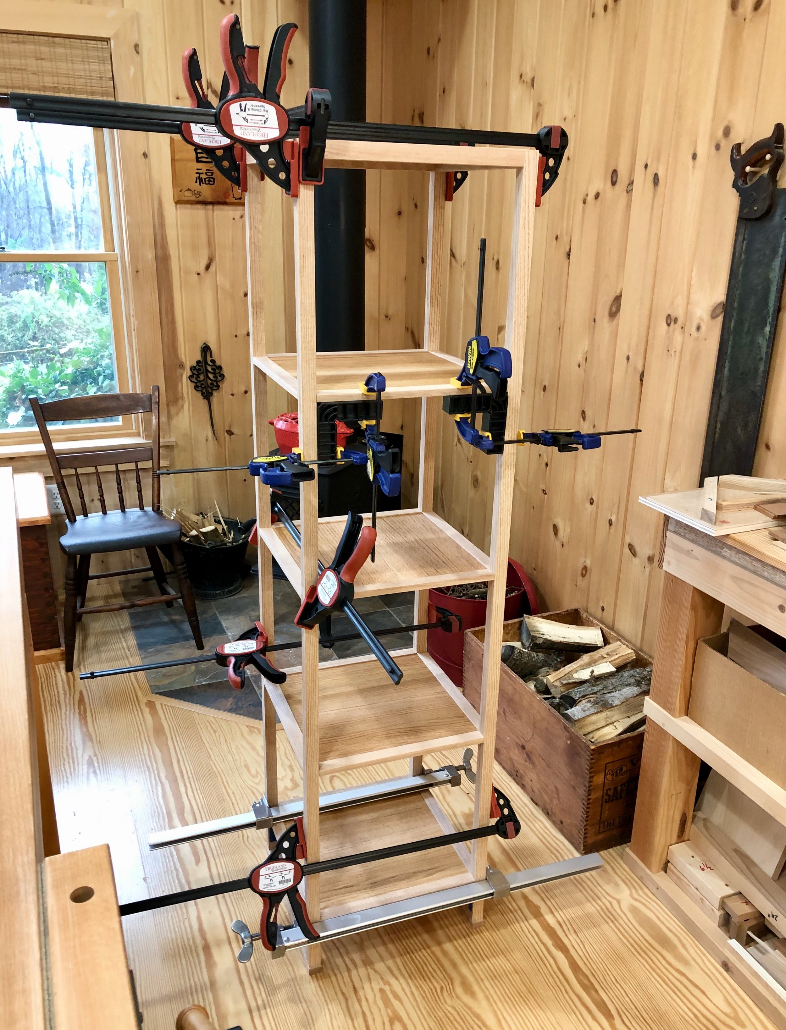
Clamped-up stand
Once dried I lightly sanded the structure to erase all clamp marks. To finish the piece I gave it a thorough rub-down with “natural” color Watco Danish Oil. I like how this product livens the grain of red oak while leaving a soft touch and no sheen. Two coats, applied over two days was all it took to complete this satisfying build.

Korean Display Stand reproduced in oak
And our pottery collection now has room to breathe, again.
On display
Thank you Dad and all Korean War era veterans for your selfless sacrifice on our behalf.

Cotswolds Pilgrimage

“Rural England is too absolutely beautiful to be left out of doors - ought to be under a glass case.”
Mark Twain (1872)
I have to agree with Twain’s sentiments of 151 years ago and, in fact, there’s a lot about England that remains “too absolutely beautiful”. Let me show you.
Lately I have gone deep into Arts & Crafts - the movement and, in particular, the furniture. It started with an appreciation for the American, Gustav Stickley, and his Craftsman ideals. There’s certainly plenty for me to learn (and make) in this area but, interested to know the background for his work, I also sought out examples of earlier, English Arts & Crafts pieces. Hmm, I have to say that first impressions here did not enthuse. In general, I found these pieces to be unappealing and, if taste needs a reason, it seemed they possessed “too many notes”. In fairness, I was consulting art pieces and my naïve eye was hooked on square and functional forms, where wood, itself, was the decoration. Vive la difference! But then I read Nancy R. Hiller’s English Arts & Crafts Furniture and became devoted to the form. Nancy Hiller (1959-2022) was a remarkable artisan and insightful writer who used step-by-step reproductions of three iconic furniture pieces in her book to reveal both the Art and the Craft of turn-of-the-century English furniture. It’s an informative and compelling read.

A wonderfully enlightening book
Attracted by the furniture I subsequently became interested in the movement. That is, how was it that these novel forms became important, if not popular? Who designed/fashioned these objects during that brief, 30 year burst of creativity? And what were they trying to achieve? To be sure, there are larger questions in this world, but those were mine. Of course, the answers are all out there in biographies (my favored genre), and to start me off I found some good ones on John Ruskin and William Morris. I also became aware of other works that were either inaccessible or unaffordable, given their location in British bookshops. That predicament, on top of a simmering curiosity, sealed our next vacation destination. We were headed to England to feel the environment, to see the furniture, and to secure reference works of the Arts & Crafts period.
While there are several geographical areas (so-called “schools”) in Britain associated with Arts & Crafts furniture making from the period of ~1880-1910, a region known as the Cotswolds is, arguably, the most important. This magnificent region of rolling hills and villages has been home to humans for over 6,000 years. In fact, it is the largest designated Area of Outstanding Natural Beauty (AONB) in Britain, covering 787 sq. miles and a popular tourist spot for non-furniture lovers, as well.

The Cotswolds, located in England between London and Wales
While planning our trip, my wife and I had two primary destinations in mind: The Wilson Art Gallery and Museum in Cheltenham, which houses an important collection of Arts & Crafts furniture; and the villages in and around Chipping Campden, where several major designers of the Cotswold School worked. We were certain to happen upon other meaningful sites, but those were the anchors. Our trip began in London where destinations such as the Victoria and Albert Museum also beckoned. What follows is not a day-by-day journal, but just some captioned pictures, intended to give an appreciation for the area, the furniture (and the clocks). I hope you find them interesting.
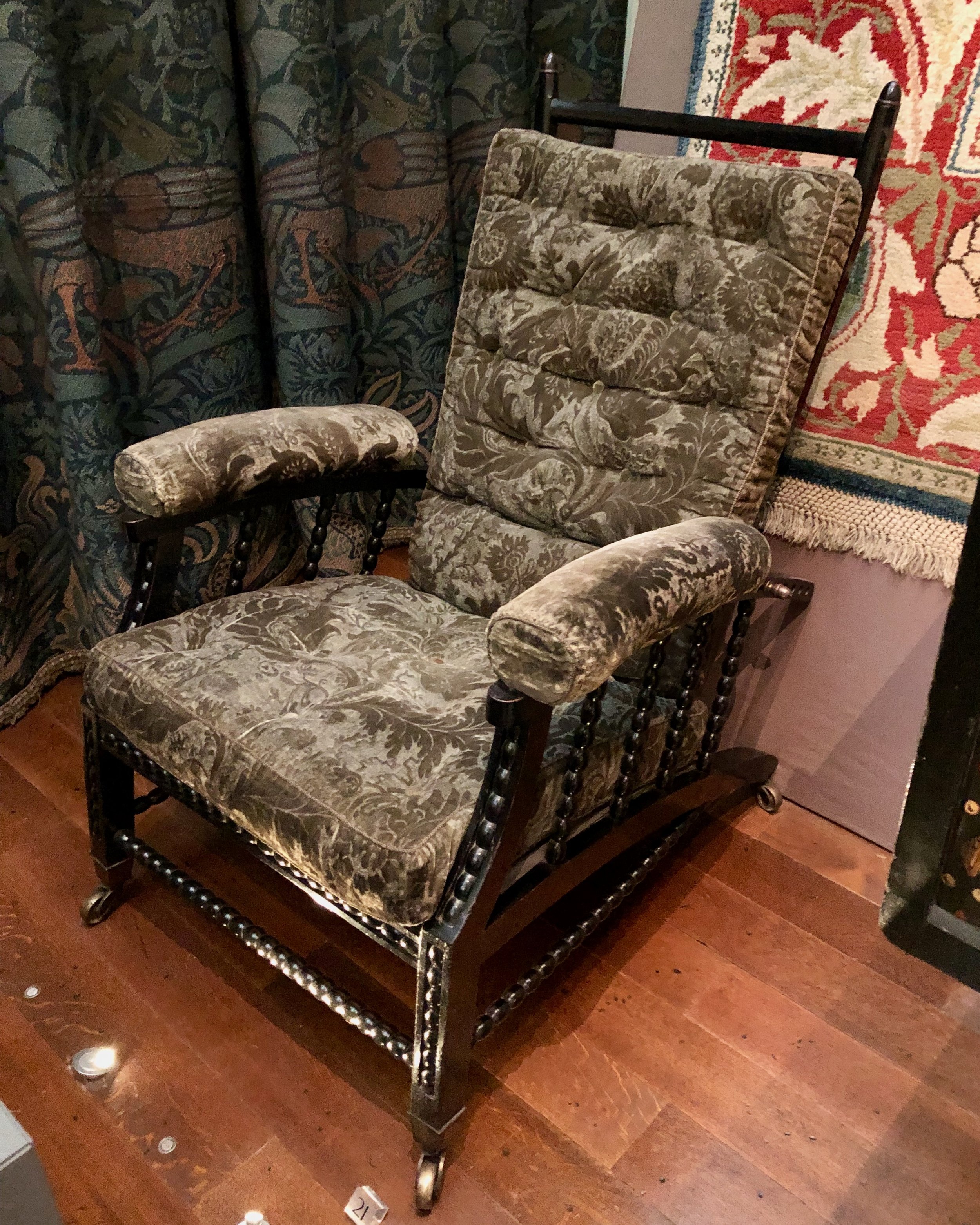
The original adjustable “Morris Chair” designed by Phillip Webb. Copied by many, and catapulted to stardom by Gustav Stickley; this is an important early piece. (Victoria & Albert Museum)
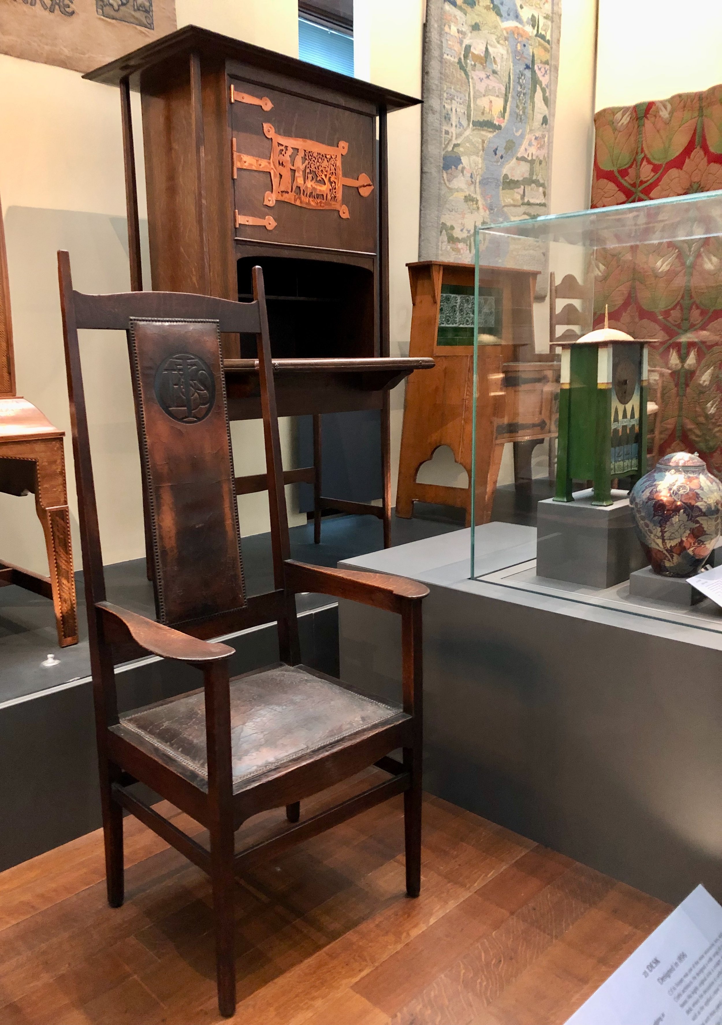
Magnificent chair, desk, clock and river rug by C.F.A. Voysey (V&A)
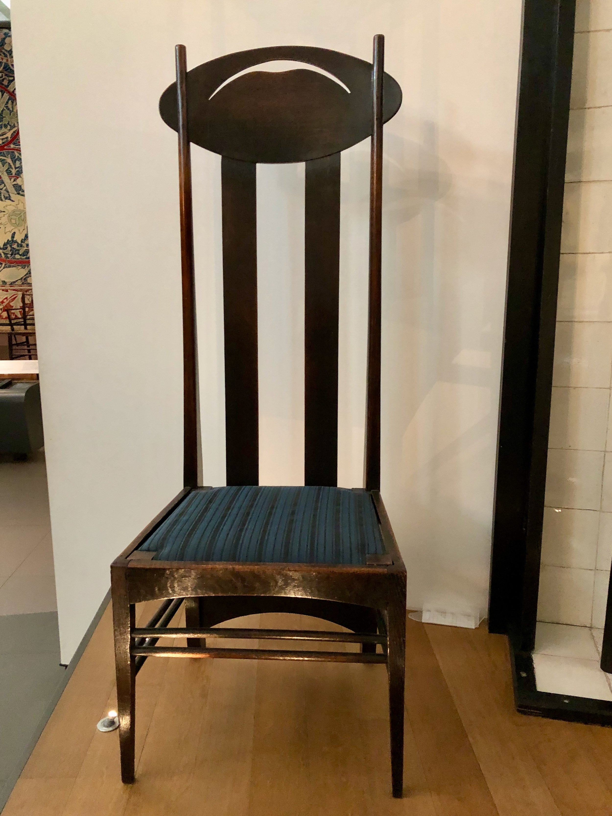
High-backed chair by Charles Rennie Mackintosh of the Glasgow School (V&A)

Frank Lloyd Wright chairs, likely influenced by Mackintosh and other Arts & Crafts designers(V&A)
Sideboard by E.W. Godwin. While striking, it represents a gaudy crescendo to the Aesthetic movement, where ornamentation served no other purpose, that pre-dated Arts & Crafts (V&A)
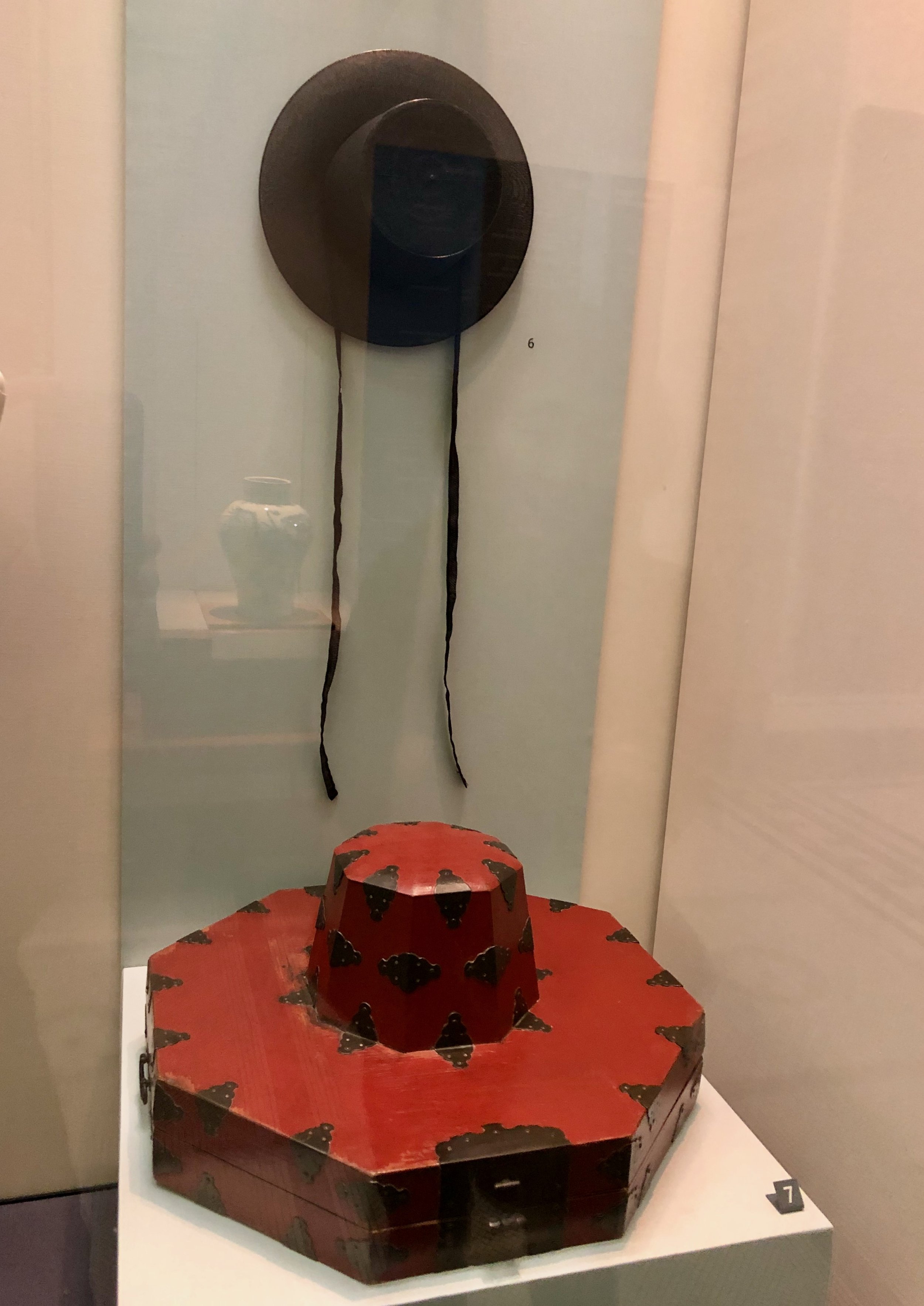
Korean horse hair gat (hat) and box from the late Joseon dynasty. The lacquered bamboo box is as beautifully crafted as the furniture from this period. (V&A)
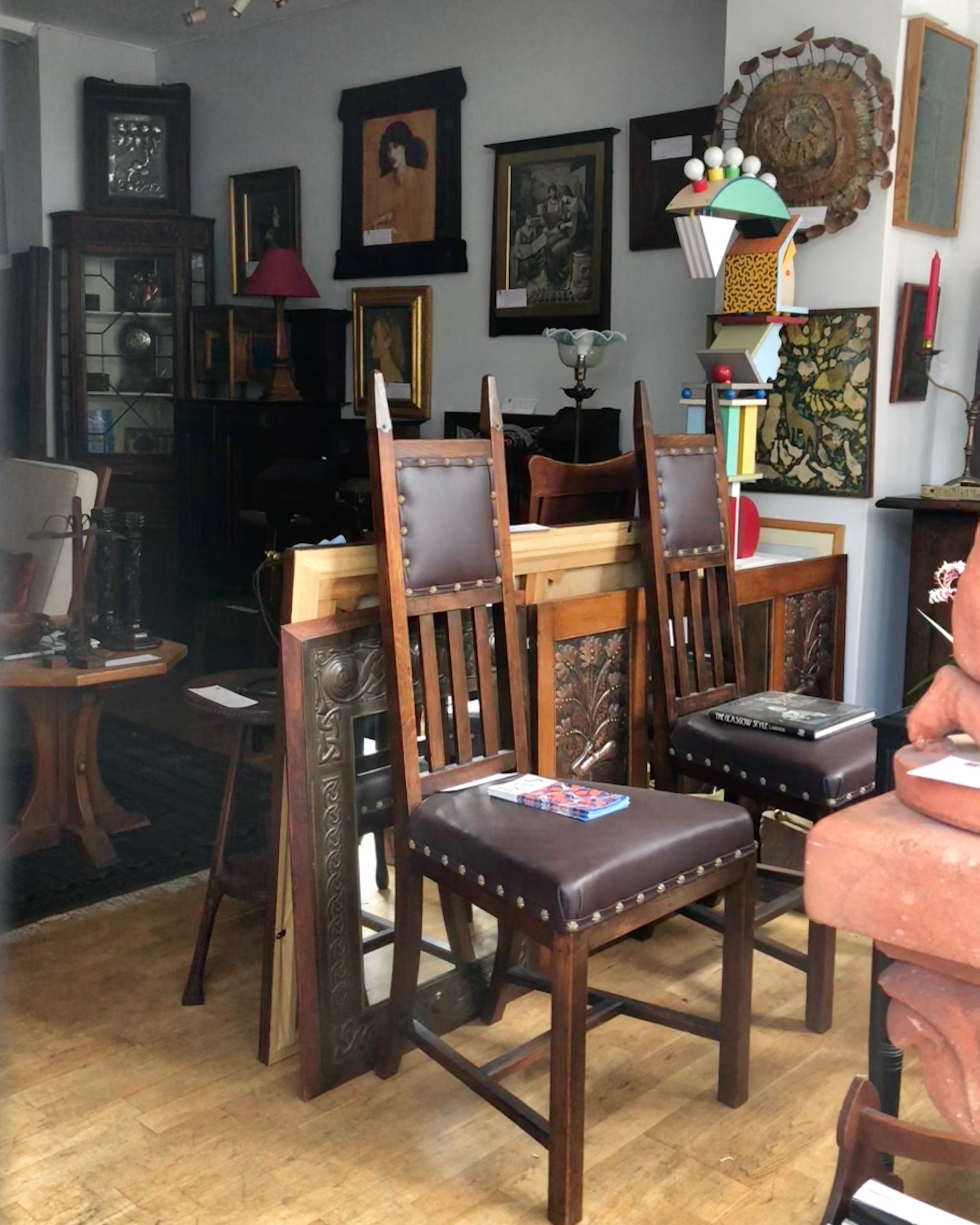
Scene through the window at Hill House Antiques, in Kensington which was unexpectedly closed when we visited.
Japanese inspired Tavern Clock from among the many amazing pieces for sale at Howard Walwyn Fine Antique Clocks in Kensington.
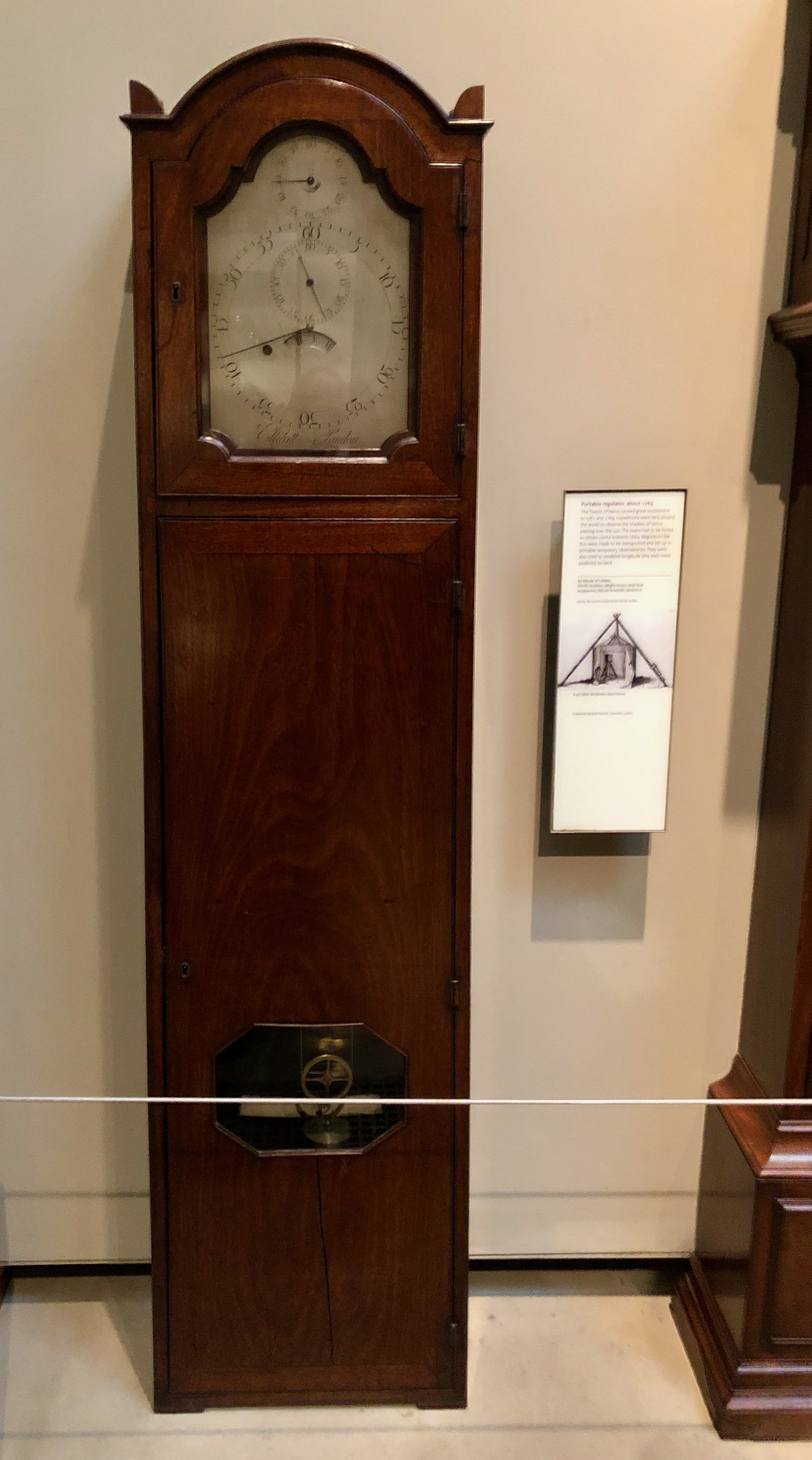
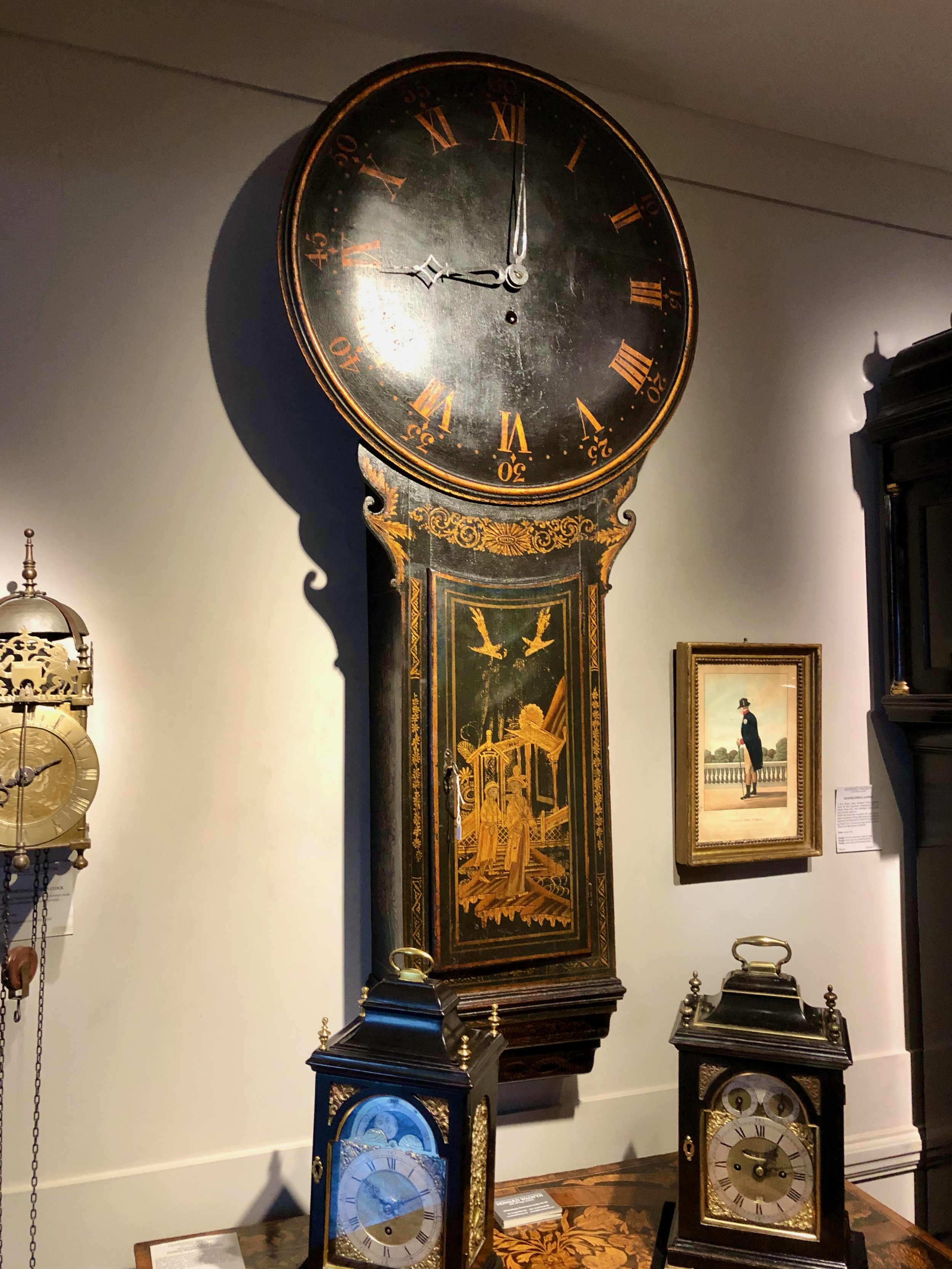
The British Museum has an extraordinary collection of important clocks, including this “portable” regulator case clock, taken across the world in the late 1700’s and set up in a field to time an eclipse event.

— intermezzo 1 —
Sharing The Cotswold Way, a scenic 102 mile footpath that skirted our B&B, stretching from Chipping Campden to Bath
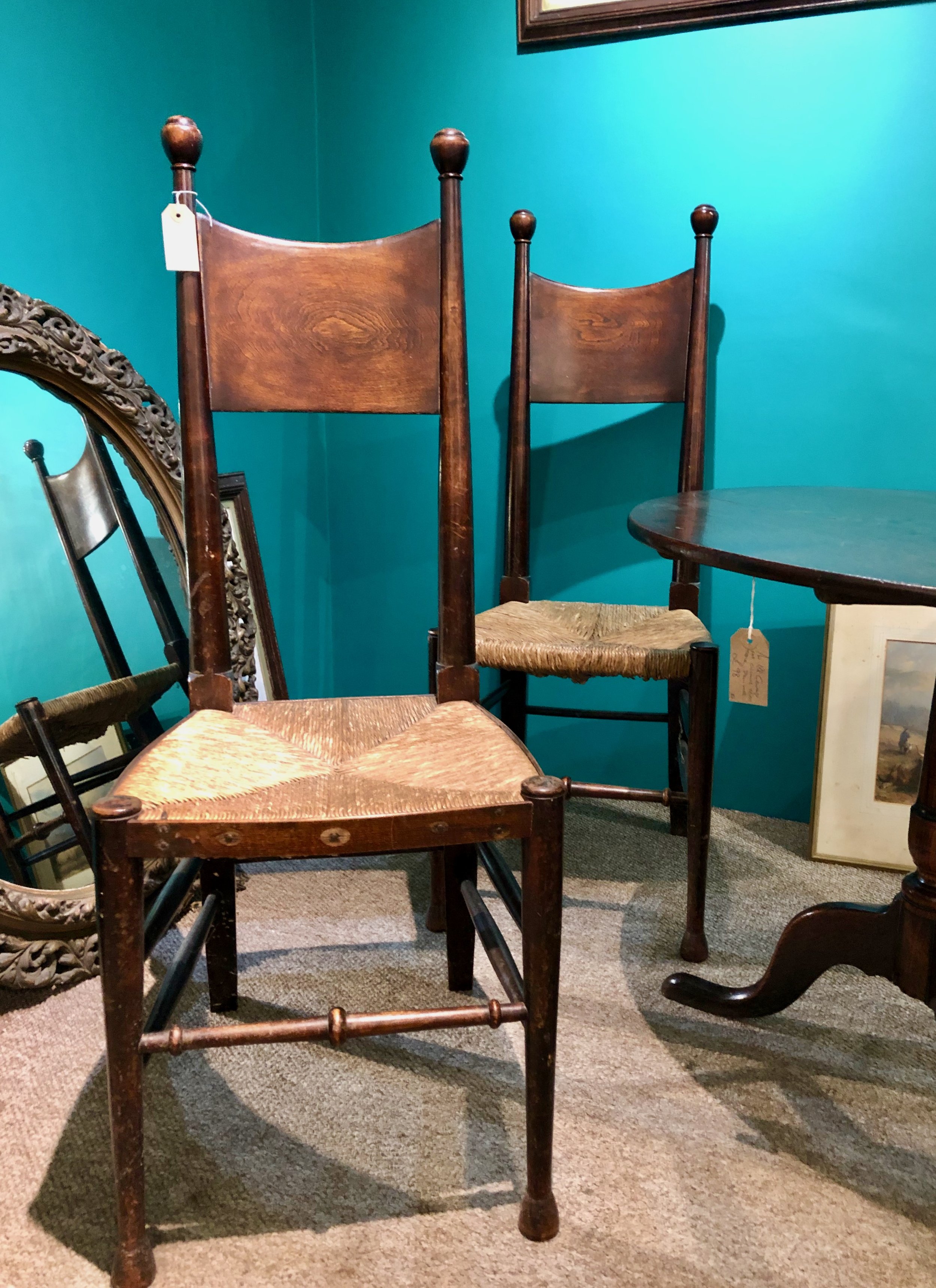
A couple interesting chairs found “in the wild” at the Winchcombe Antiques Centre

Left to Right:
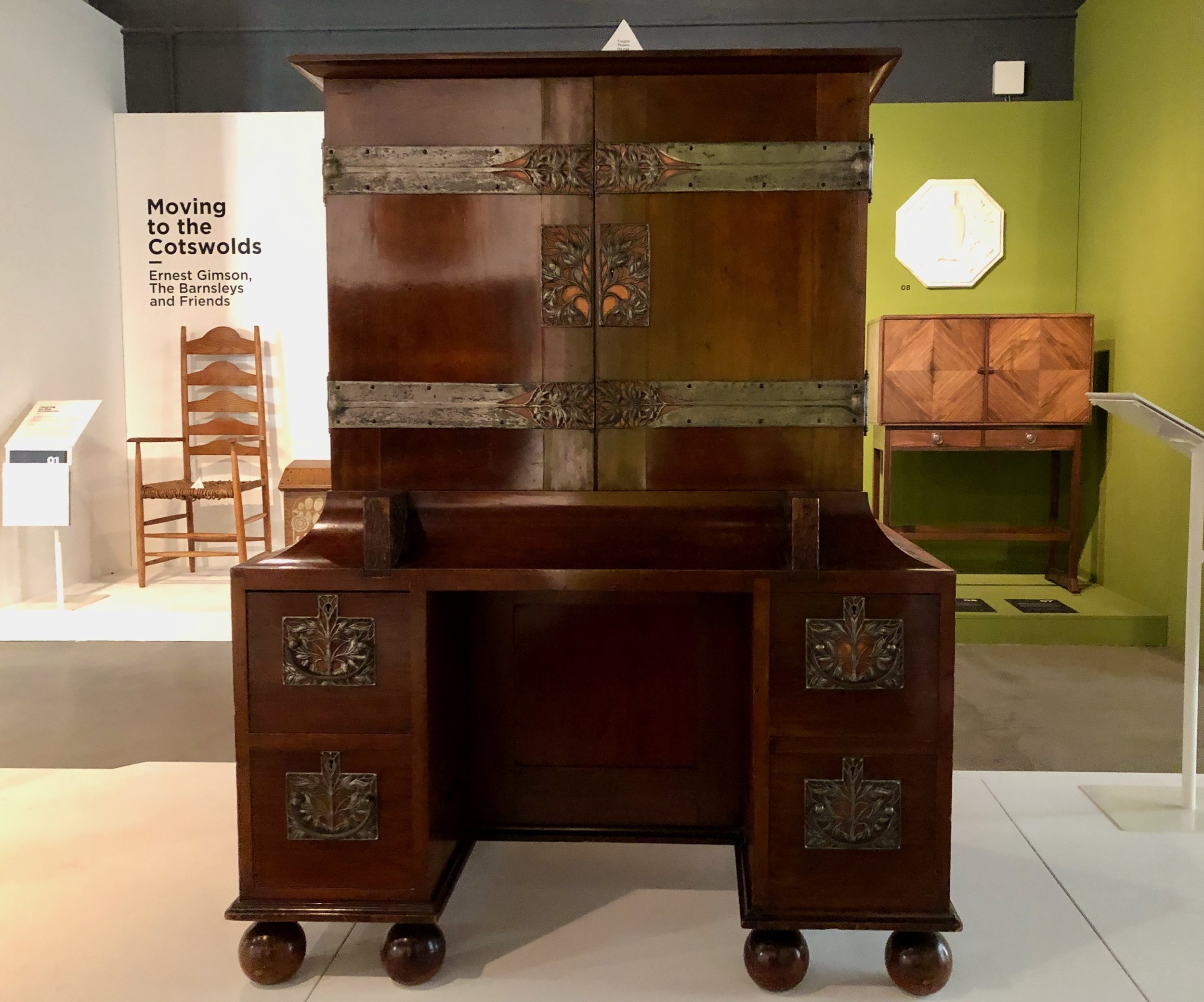
Bookcase and desk by C.F.A. Voysey; Chair by (I do not recall); Music cabinet by Benson and Sumner (Wilson Museum and Art Gallery, Cheltenham)

Portion of a coffer by Earnest Gimson. Reportedly, he was in the process of applying the white gesso prior to painting when he passed away. (Wilson)

Settee by Sidney Barnsley (Wilson)
Cabinet with exquisite metalwork by Charles Robert Ashbee. Along with Gimson and the Barnsleys, above, Ashbee was an important Cotswold designer who worked in Chipping Campton, Gloucestershire. (Wilson)

Piano by C.R. Ashbee (Wilson)
— intermezzo 2 —
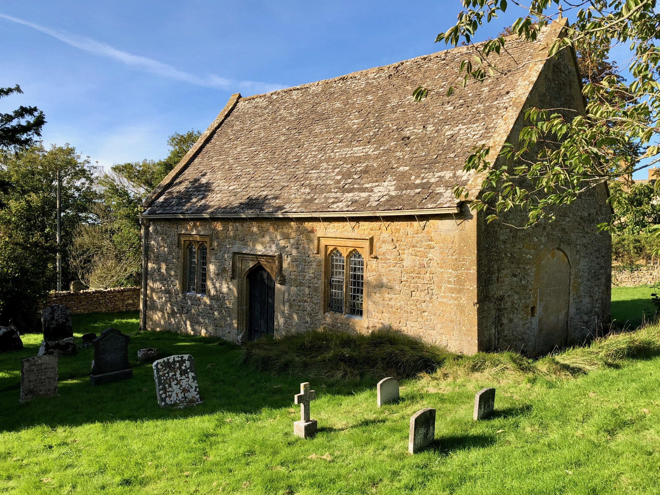
St. Faith’s Chapel, in the village of Farmcote, Gloucestershire, just down the lane from our B&B.

A volume from the Works of Chaucer designed and printed by William Morris at the Kelmscott Press (Wilson)
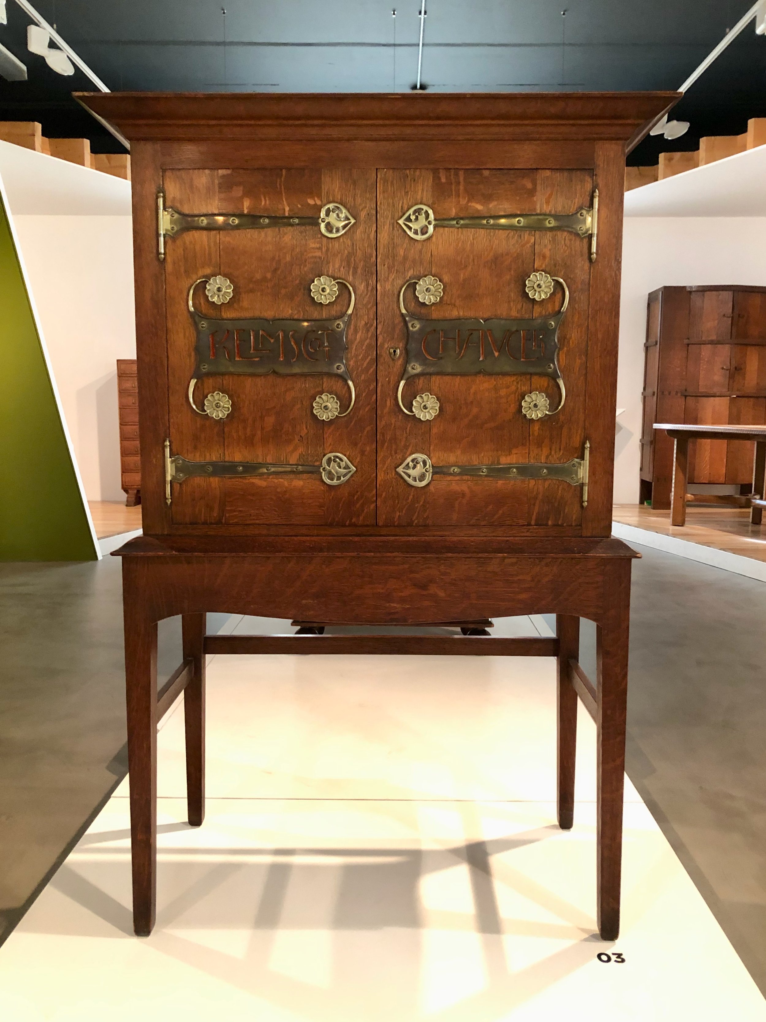
Cabinet designed to house the Kelmscott Chaucer works by C.F.A. Voysey (Wilson)

Dresser by Ambrose Heal (Wilson)

— intermezzo 3 —
The eponymous Ebrington Arms, that lovely village’s pub in a building that dates back to 1610 was our home for the final leg of the trip

At the Gordon Russell Design Museum, once part of his furniture manufacturing workshops in the picturesque village of Broadway, Worcestershire.
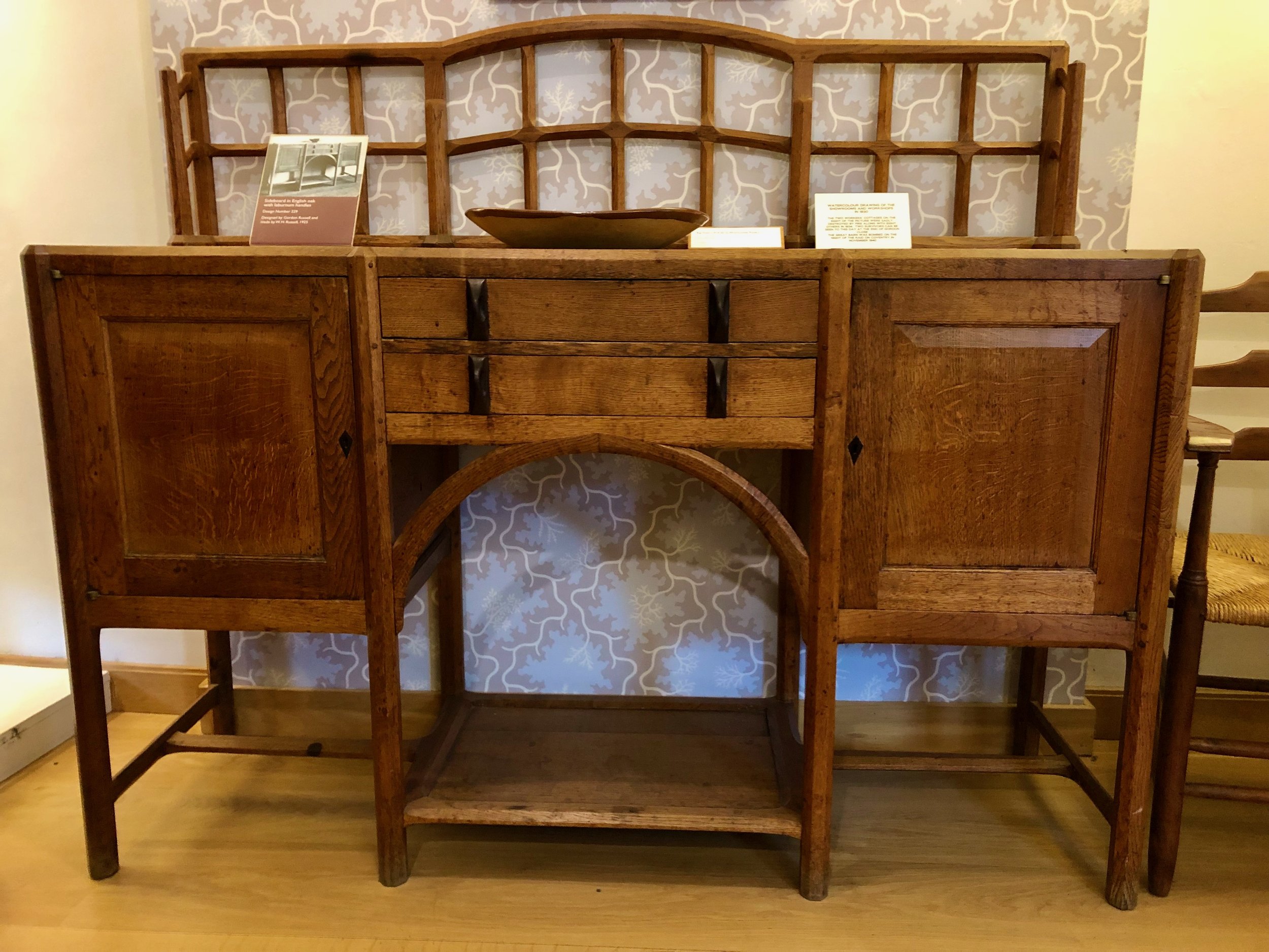
Dresser No. 229 by Gordon Russell (GRDM)

The Paris Cabinet No. 157 by G. Russell. It was awarded the Gold Medal at the Paris Exposition in 1925.
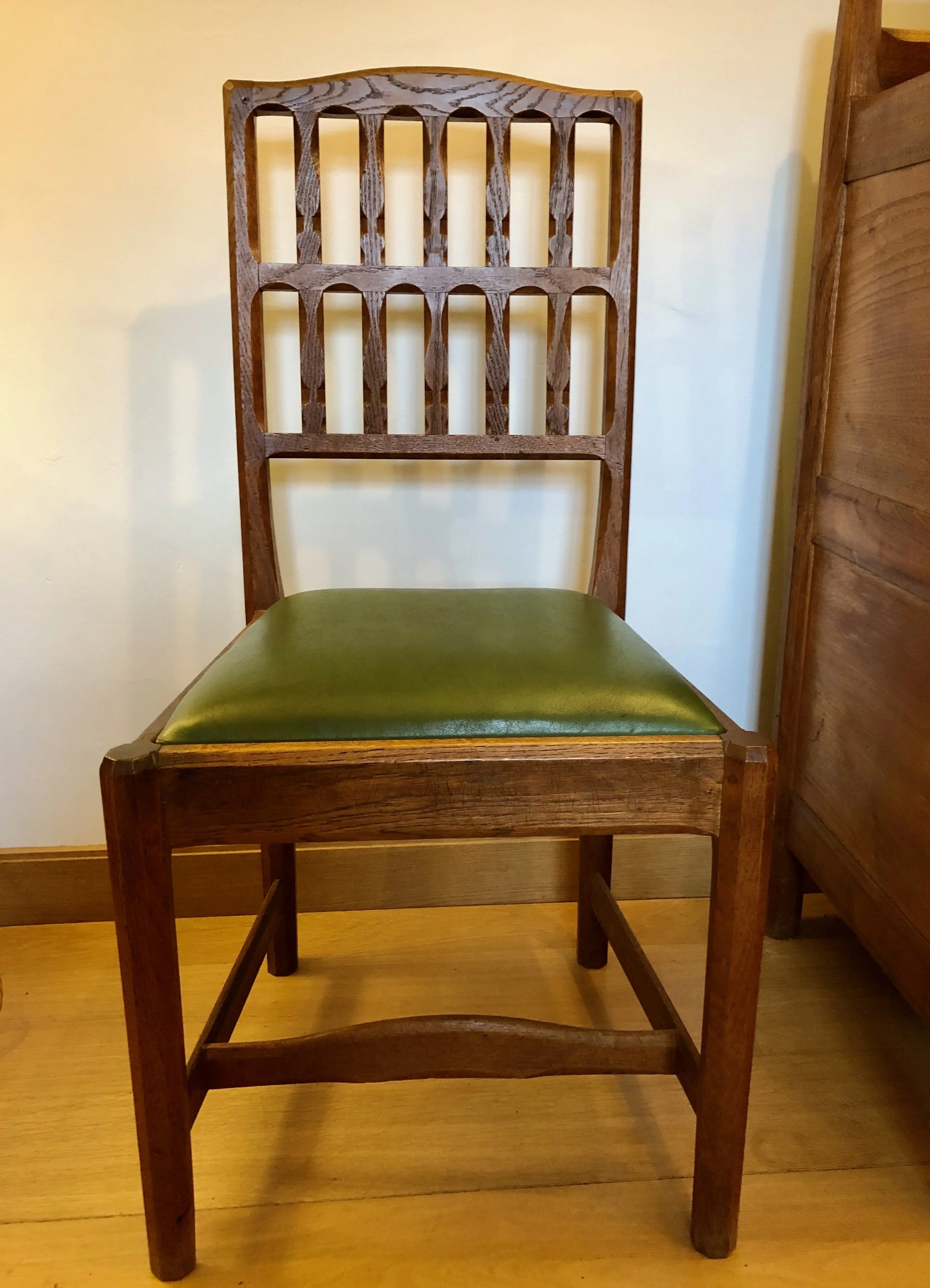
Chair No. 280 by G. Russell with beautifully executed chamfering, typical of the Cotswold School.
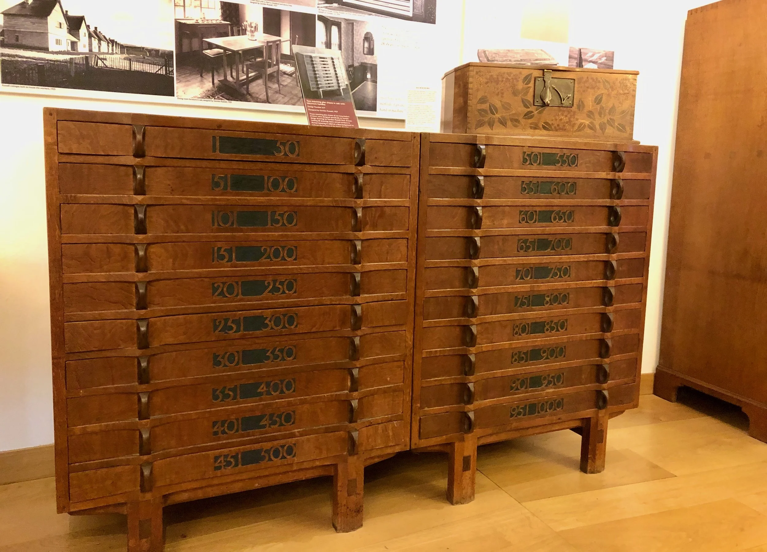
Two Document Chests No. 617 where Russell kept all of his numbered drawings, with Glove Box No. 495 on top (GRDM)
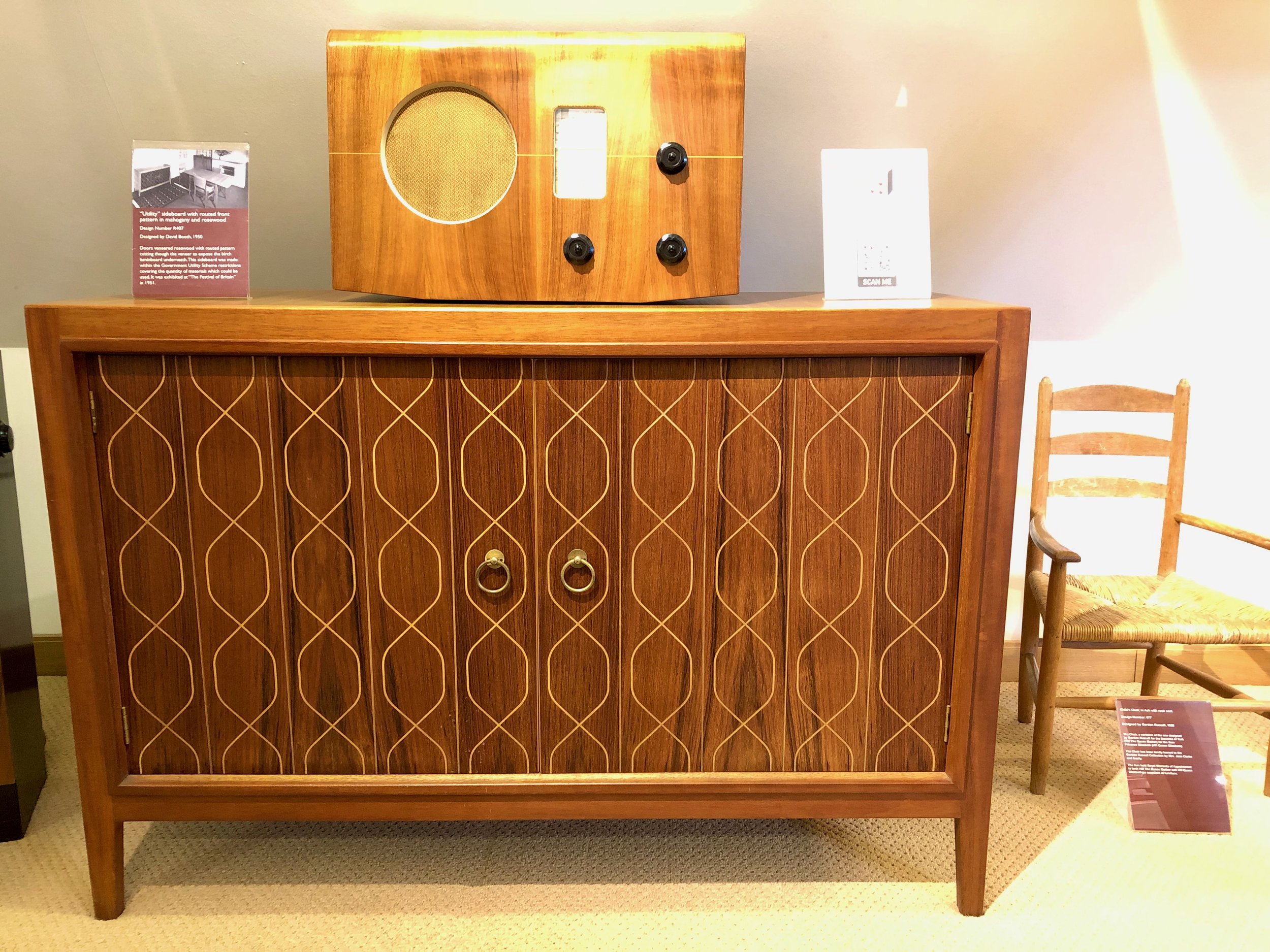
Sideboard and radio case by G. Russell. This sideboard, an icon of mid-century modern furniture, is sometimes called “the double helix” but since it was designed in 1951, two years before Watson & Crick’s DNA structure, I think that is an attribution in retrospect.

I know what you’re thinking, “Please make it stop.”
Scene from the churchyard at Saint Micheal’s and All Angels Church, Guiting Power, Gloucestershire
OK, I will.
I’ll just close by saying that, in addition to the “too absolutely beautiful” sights, this was an inspiring trip for me as a maker. To see the important Arts & Crafts furniture pieces in their own land is to capture them in a way that will last a lifetime. iPhone pictures taken within cramped museum spaces cannot do the job, but they at least serve as reminders. The gorgeous Cotswolds, their charming villages and friendly people surely influenced the furniture designed there, and they also made our trip a smashing success. I even got my reference books!

Lasting inspiration!
A Beloved Board

Here’s a new one; a good one, too. Last week I had a customer bring me her cutting board and asked, essentially, “Can this board be saved?”. It seems she uses, daily, the same hardwood cutting board that had belonged to her mother, and all the years of chopping were beginning to show. One is easily drawn to this board. While not an expensive item, the value bestowed by memory made it priceless. You know the feeling. This project is about restoring that beloved board.


The goal was to make the board “better”, that is, flatter, smoother and less wobbly while keeping the character intact. I started by sizing up the physical attributes and reason for its unsteadiness. Putting a straightedge to the top revealed the primary defect, a 1/4 inch sag over the 12 inch width caused by wear, warp and also failure at the joints. It turns out that this “board” was made up of three smaller boards, which were coming apart at the seams.
Daylight above the sagging board
At this point, all thoughts of cosmetic restoration were abandoned, it now appeared that reconstructive surgery was in order. Sanding/planing, the outer edges deep enough to achieve a level work surface would produce a cutting board with a pronounced belly that still wobbled. The new plan was to remove the legs, slice the board into three at the seams and then plane the top surfaces flat while also removing a layer of worn-out wood. Re-gluing the parts back together and then finish sanding would give a flat, and hopefully attractive work surface for a few more decades of service. I would restore the legs, too, but decided to leave the underside relatively untouched to keep some patina and that sweet Dansk® trademark.
The first job was to cut the legless board into three parts at the band saw.

Dissected board
The three boards then were run, individually, through the thickness planer several times. This revealed their composition to be maple, and also produced hard, useable wood on the surface, again.


With a clean, flat surface in hand, the rough, band sawn edges were then made square at the jointer. Next, the undersides of the boards were skimmed lightly using an orbital sander to clean the surface, and then, to give the new joints a better life, I decided to add some biscuits before glue-up.

Biscuits in their slots
Reassembly using waterproof glue
Once the glue dried, the surface was card scraped to level the joints and then sanded smooth to #220 grit; the edges were treated similarly. Next, I scrubbed the board using a mild detergent and let it dry. This served to raise the grain, which was hand-sanded smooth again. Finally, all of the corners, made sharp by the resurfacing process, were rounded-off.
The legs turned out to be a lost cause. Like fossils within a rocky matrix, the recessed rubber feet had petrified over time and became one with the wood. I found it was too difficult to chisel-out their remains without also damaging the frail wooden legs. And since those feet would need to be replaced anyway, it seemed best to just create four new legs from some scrap maple lying about the shop. This also permitted me to make one of the legs slightly taller than the others to compensate for warp at one of the corners. Stainless steel screws were used to mount the legs and feet which now sat square and firm on the bench.

Standing proud again
A couple treatments with food grade mineral oil, smoothing with a red Scotch-Brite pad in between, completed restoration of the beloved board.

While not the typical Project, this was a very satisfying effort. After witnessing the metamorphosis my wife put in a request for her boards be sanded and reshod, too, so the story has two happy endings. What shape are your boards in?
The T-Shirt

Picking up on a prior post, let me share a new endeavor with you.
After reading my recent analysis of a William Morris quote, you might be thinking: “Wait! If ‘win back art’ is such an important mission, how come I am only learning about it now, some 150 years after it was proposed?” I was thinking the same thing, too; and then it began to gnaw at me. Not that it matters, but I’ve never seen the phrase on a poster or a T-shirt where it might raise awareness, or at least expose itself in places we expect bold ideas to reside. To me that felt like a miss. And so I decided to design that T-shirt - why not?
Design
Now, I have never created a T-shirt before but I have watched my sons make several. In high school they had taught themselves the craft of screen printing and occasionally turned our basement into a “sweat shop of friends” cranking-out fund raising shirts for their school’s bands. I had always admired their stick-to-it-iveness on these projects, as well as their skills, and it continues to inspire me. My plan for the current shirt was to stop after the design phase and project manage the rest of the endeavor using trained professionals.

“Winning back art” in the basement (2010)
Following a discussion with my friend, Bob, and a brief internet search, I learned that there are plenty of companies out there ready to create custom printed shirts for those with an idea and extra cash. Heck, they’ll even supply the idea; they really just want to make T-shirts. With an idea in hand, all that’s required is: 1. a properly formatted file of your graphic; 2. a method (direct print, screen print, embroidery); 3. a position for printing (front/back); 4. an ink color scheme; 5. a shirt choice (style/color); and 6. the quantity (by size). They also need a credit card number, which I imagine one is happy to supply after having successfully burrowed all the way to level 7. Seriously, the whole thing is made as simple as possible. Now understanding the process, and with a couple production companies in mind, I set about creating my design.
The graphics for this one will just be text. Easy, right? … you try it. The challenge here is that, if all you have is text and you want your message to stimulate something, you had better get that font right. Fonts are the product of typography; a complex & nuanced art form, or a cunning & manipulative science depending on your perspective. And perspective - the way we look at things - is key. After all, you are trying to send a message that will stick!

Fonts help the message stick
And here’s where fortune smiled upon this Project. William Morris was, himself, a self-taught typographer. During his printing days at the Kelmscott Press, a high end book publishing business and the last of his creative endeavors, he developed three new fonts (Golden, Troy and Chaucer), as well as a series of elaborate initial letters for use at the beginning of chapters. Morris thought carefully about typefaces and was among the first to use photography in their development. His most treasured of the Kelmscott types was Troy. Described as “semi-Gothic” this design was modeled after a few of his favorite medieval typefaces. In his own words, Morris intended Troy to “redeem the Gothic character from the charge of unreadableness which is commonly brought against it”.

Morris’s Troy font
I decided to make Troy the font for this shirt and found a free download for my Mac. I also downloaded the William Morris Initials font too, just for fun. As to the actual design, my idea was that the text could be displayed on the back of the shirt in three lines. I started with no capitals as the quote, itself, was merely a sentence fragment. However, Morris did choose to capitalize the word “Art” at all instances in that 1884 pamphlet. Anyway, a bunch of iterations were sampled, six of which are shown below.

Trial designs
They all looked fine but, in order to pick one that I would be willing to live with, I needed to think more deeply about the function of the font.
1. The font should make the words memorable, and spark interest - all designs check that box.
2. The font should make the message unambiguous - uh-oh. There is potential for confusion with the unpunctuated fragment “win back art”, due to the polysemantic nature of the words back and art. For instance, given the dorsal location of printing, might one wonder about some sort of “back” art contest underway? What does it take to win it? Or, a reader might ask: who is this Art guy? Is he being held hostage? It’s tricky. I think a no caps version could serve here as that assigns “art” to be an improper noun, but that also happens to be the most boring choice. Using color for the capital “A” in Art would properly focus attention on that word, instead of “back”, and perhaps indicate it to be other than a person’s name. I liked that. A red colored initial letter was used frequently during the heyday of medieval monastic calligraphy. However, according to Fiona MacCarthy in her captivating 1994 book, William Morris: A Life For Our Time, Morris did not favor this practice and only used it on one occasion when publishing a collection of poems by Wilfred Scawen Blunt, a middling poet who at the time was also moonlighting as Morris’s wife, Janey’s, lover. Hmm … Despite the dubious endorsement, I think that is the right choice for this shirt. As a final touch, I tried giving the text a background block so that it might look good on dark colored T-shirts, as well.
And that is where I left things for the summer as I worked to finish some deadline projects and jetted off on vacation. Back in June, I had told my sons of the idea, thinking they would get a kick out of it, and even shared my test creations for their comment. They must have feared that I would let this idea languish for they secretly took it into their own hands and finished the Project for me. Much to my surprise I was gifted with the T-shirt on my recent birthday. What a nice surprise! They used a T-shirt vendor this time, and also added a new “Red Top Workshop” logo, in Troy, on the front. I love it, and plan to print more (let me know if you are interested).
Thanks Ben & Andrew!
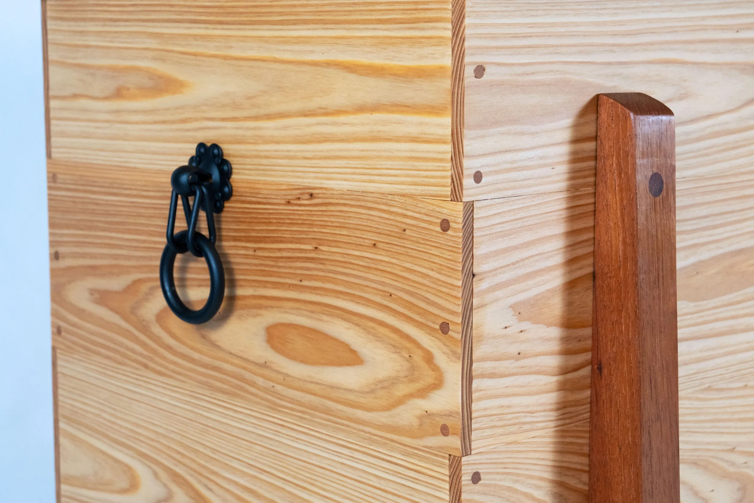
The Karabitsu
Here’s an interesting item that’s been on my build list for a few years. It’s a modest sized chest from Japan that I will use for storing firewood next to the hearth. Like most Projects, a little background research is rewarded with new appreciation for the enduring influence of former times. The story follows.
Karabitsu (or kara-bitsu) is a Japanese term that reportedly translates to '“foreign coffer”. I’ve also seen it expressed as “Chinese coffer” or “Chinese chest”, and some believe that kara may even come from kan which, for a time, was a word used to refer to the Korean peninsula. I don’t think we need to propagate confusion here, though. According to the book, Tansu: Traditional Japanese Cabinetry, the karabitsu has existed as a recognized form in Japan since the Nara Period (645-794) and I would imagine that “foreign” in eighth century Japan pretty much meant “Asia”, anyway. Still, it is curious that no non-Japanese examples of the “foreign” coffer pre-dating the Nara era have been found. The term wa-bitsu (Japanese coffer) dates back to the year 1050 and describes a legless form of the karabitsu. Even alongside the “native” wa-bitsu, and the wealth of tansu forms that followed, the karabitsu remained popular in Japan for centuries, serving as storage chests for special objects, often highly decorated with inlays or painted lacquer. I discovered this form while perusing the wonderful reference book: Traditional Japanese Furniture, A Definitive Guide, and there are many fine karabitsu examples to be found on the internet. Some versions sat on tall legs, often six in number, which grew stouter as the form became more ornate. It is a striking chest.

Karabitsu example reproduced from: Koizumi K. Traditional Japanese Furniture, A Definitive Guide, K. Koizumi, Kodansha International: Tokyo, 1986.
Design
My karabitsu would sit on four legs and be unpainted. That makes it closer to the eighth century original in form, and, as fortune would have it, an example from that time still exists. It seems an imperial warehouse on the grounds of the Todai-ji temple in Nara, dating from that eponymous period, was discovered to contain four intact furniture pieces, and included in these was a karabitsu from which the construction techniques could be gleaned. Quite a find! I show a photo of that piece along with an exploded-view diagram below (reproduced from Tansu: Traditional Japanese Cabinetry).

Earliest known karabitsu?
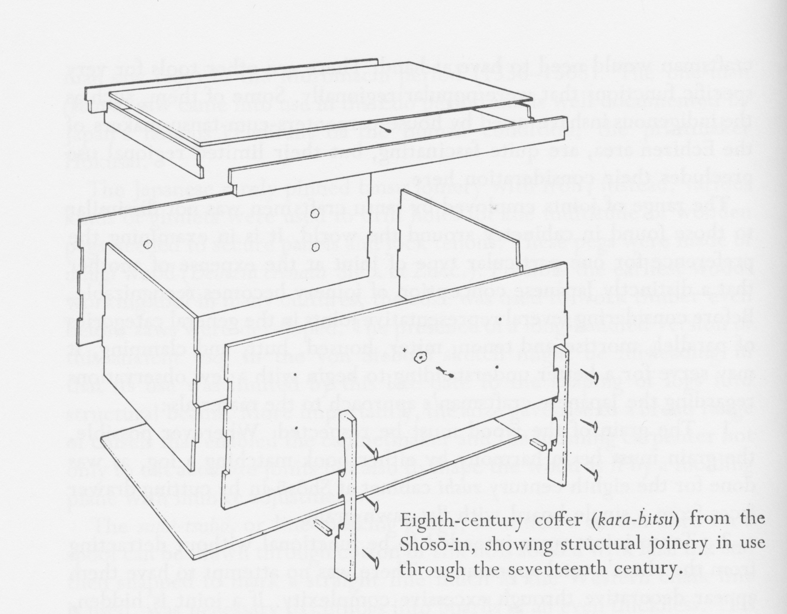
Anatomy of an early karabitsu
I’ll use this plan as a starting point. The corner joinery was my biggest question and it appears they used simple “box joints” here. I’ll do the same. Iron nails were used to attach the leg pieces to the sides and a brace ran between these legs to support the floor board. The legs of the original also contained cut-outs through which rope could be threaded, allowing the chest to be carried by two people using a cross pole. Instead, I’ll opt for the decorative metal handles used on later examples and lengthen those legs a bit for height. Likewise, I will hinge the top for ease of access, as was the practice in subsequent centuries, and mine will also have a floor board housed within a dadoed groove for strength. In the end, the design will have a few changes brought about by what has become possible with new tools and materials over the millennia, but not wholly different from ancient times.

Karabitsu firewood box, rough plan
Materials
The thirteen hundred year-old karabitsu used zelkova (a member of the elm family) for the legs and cryptomeria (Japanese cedar) for the box parts. These are common woods in Asia, used extensively for tansu and other furniture pieces. However, they are not common in North America and so I would need to find substitutes. I wanted to use special wood for this chest; something that would look nice with a simple oil finish and that would be resistant to insect damage. I decided to try Spanish cedar for the legs and Southern cypress for the box. Not common boards, but ones carried by my favorite yard for unusual lumber, Goose Bay Sawmill and Lumber, Inc. For the handles I would use some authentic hardware picked-up on my last trip to Korea, and I would source the hinges from an Etsy-based craftsman.
Spanish cedar and Southern cypress boards (in lock-down)
Dimensioning
Construction on this Project divides itself neatly into three jobs: the box; the lid; and the cradle (for lack of a better descriptor). They should be made in this order, too, for the dimensions of the box dictate those of the subsequent elements.
the Box
To make the box I first prepped cypress boards to be 5 in. wide, 5/8 in. thick and “square” all around. Before cutting to final length, though, I needed to make a decision on where each board would be placed. I wanted to show off the wonderful grain, of course, but do so in a way that would alternate the orientation of the growth rings to reduce the effects of warp. Once the position puzzle was solved each board was labelled with tape.

Cypress boards positioned and labelled
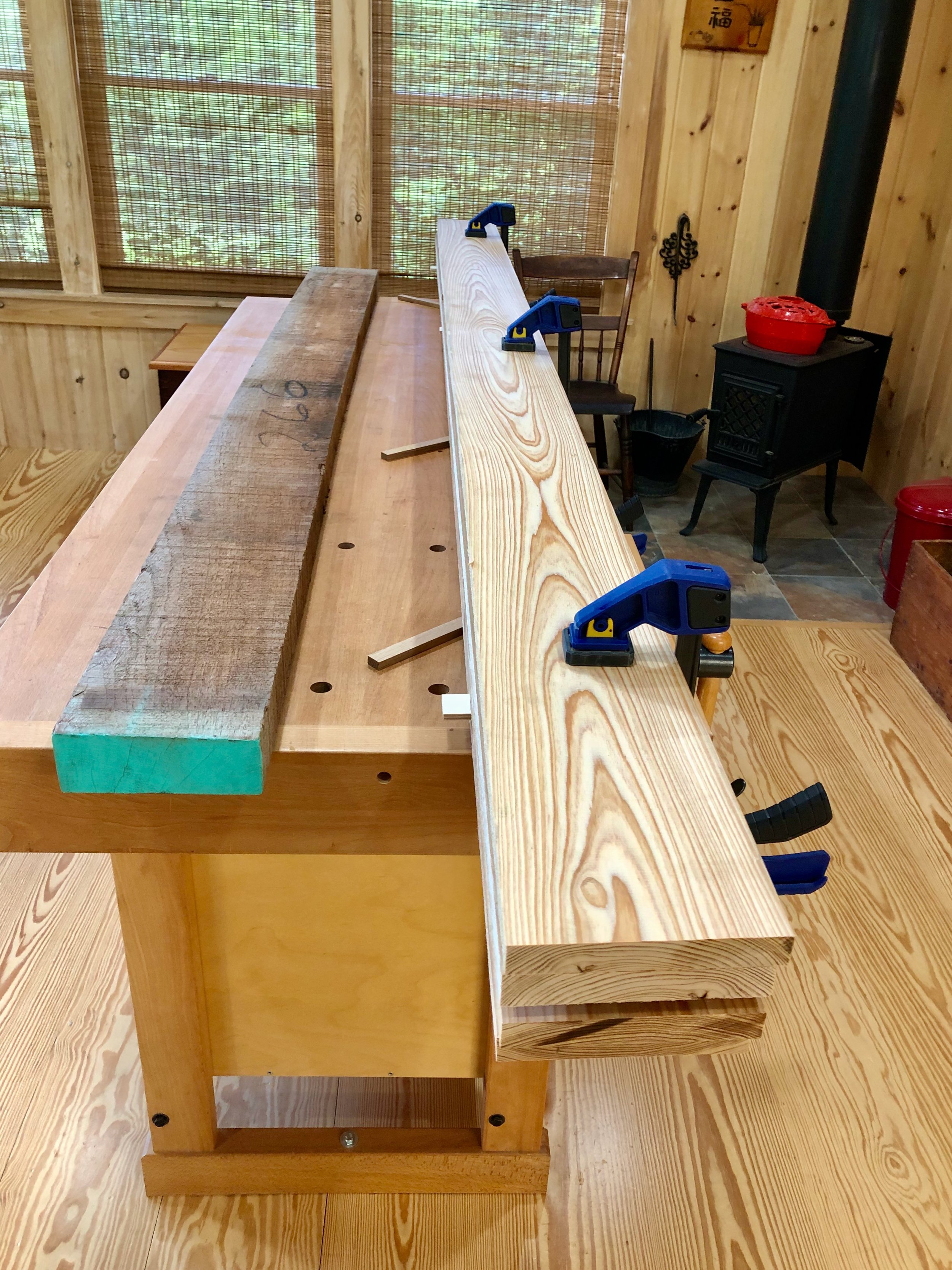
In order to form the box joints, the top and bottom boards from the front and back faces and middle board from each side face were cut to their exact lengths, 24 and 15 in., respectively. These define the length and depth dimensions of the box. Using a dado blade at the table saw I then created a 5/16 x 5/16 in. rabbet on the backside of both ends of the boards. When mated at the corners, these would form a double rabbet joint, a bit stronger and better looking than the butt joint connection found in a typical box-jointed case. With the “long” boards rabbeted I could make an exact measure of their interior spans, which would define the lengths of the “shorter” boards. Weaving together side boards of alternating length serves the function of a box joint, mating edge grain with edge grain, to form a stronger glue bond. The shorter boards were cross-cut to size and then dadoed to form the same rabbets on their ends. One final cut to house the plywood floor board was needed prior to assembly. For this, I used a dado blade at the table saw to create a 1/2 in. wide x 5/16 in. deep groove near the bottom of the four lowest boards. A piece of 1/2 in. furniture grade birch plywood was then cut to fit the final dimensions. Lastly, I added biscuit slots along the board edges to assist in the assembly.
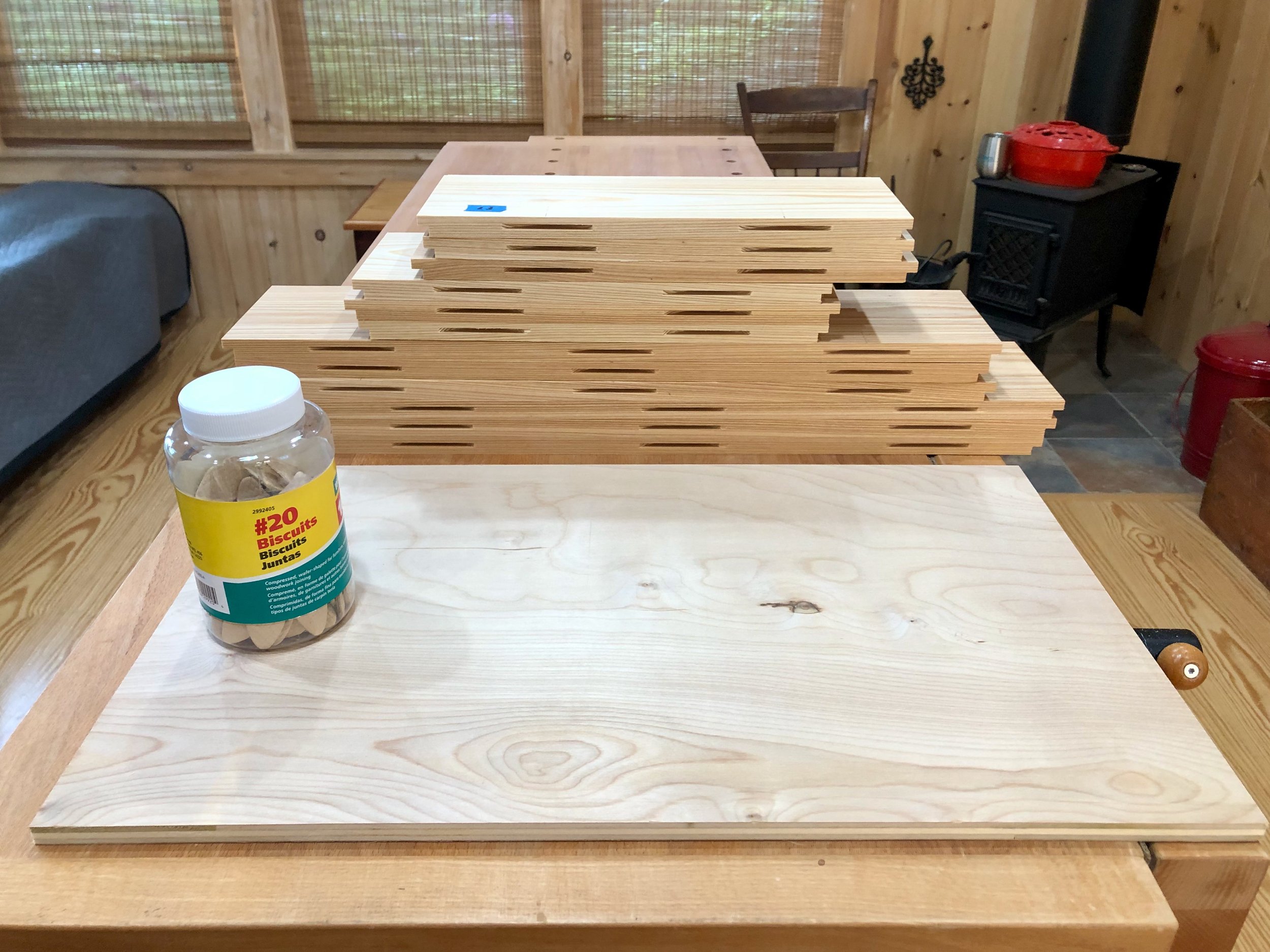
Box parts cut to final dimension
Assembly of the box proceeded in layers, beginning at the bottom. There are no box joints nor biscuits in this layer and so the floor board is the primary reference for squareness. It was sequentially snugged into the glue-filled groove on each side board and this construct was then squared-up by adjusting the diagonal dimensions across the top. Once all was good, clamps were employed to hold everything tight during the cure. Getting the first layer “right” is key.

Glueing and clamping layer One
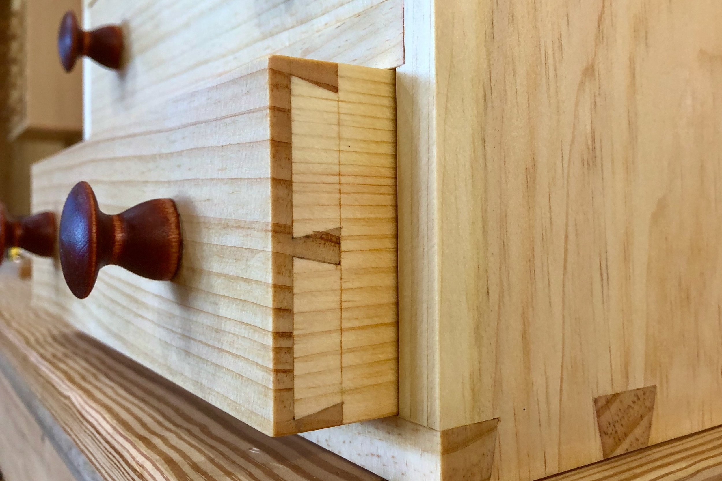
The second and third layers stacked on easily with the biscuits to keep everything aligned. After all of the glueing was finished, the sides were hand planed a bit to level everything off and then 3 cherry pegs were inserted on the ends of every long board, in keeping with the Japanese method. The whole body was then sanded to 220 grit.

Completed box
the Lid
The lid for this box will consist of a platform top surrounded by trim around the edges. The original karabitsu appears to have had the top resting atop the “trim”, which acted as a surround for the box. But, since I would be using hinges to keep the top in position I did not require the surround feature and so I decided to use the trim to hide the end grain of the top boards and overlap just a bit with the box when closed. I also decided to make the trim from Spanish cedar to provide a bit of color contrast there.
Construction of this element was simple. I first prepped four cypress boards to be 4 in. wide, by 5/8 in. thick, by 25 in. long. The boards were then positioned to get the desired grain orientations and biscuit slots were cut to assist during assembly. Following glue-up, the ends were trimmed to 24 1/4 in. using a track saw. I prefer this tool to the table saw for cross cuts on large boards such as these, given that I do not have an extension on my saw’s table, however, the rip cut to fix the top’s width at 15 1/4 in. was performed there. Once cut to the final size the platform was sanded to 220 grit.
Platform complete
There are many ways to hinge a lid of this type. My desire was to not show hardware on the exterior of the chest, and so I opted for full inside mount strap style hinges, procured from the Lock and Box Shoppe, a small business found on Etsy.
To attach the hinges I first knife-marked their ideal location along the top edge of the back side and then scribed a 1/8 inch depth mark at this location. The knife marks were sawn down to the scribe line and the interior portion removed with a chisel to create mortises. The result of this operation is to allow the top to sit level when closed. The hinges were then inserted and the screw holes drilled into the back of the box. Next, double-stick tape was applied to the strap portion of each hinge and the lid was laid down carefully into position. With the hinge now taped to the interior of the lid it was lifted free of the box and screw holes were drilled into the lid. The hinges were then temporarily affixed to the lid with a couple of steel screws and this was placed back on top of the box. With my wife, Joung, supporting the open lid I was able to temporarily mount the interior hinge straps with a couple more screws. Everything worked as it should.

Hinged lid in place
Lastly, it was time to fashion the trim. For this I sliced a 1 3/4 in. slab from the side of a 5 ft. long, 2 in. thick Spanish cedar plank. This was re-sawn at the band saw into four ~1/2 in. thick boards which were subsequently thickness planed to a 3/8 in. depth and then ripped to a final 1 1/2 in. width at the table saw. For the joinery, I decided to hide the two front corner seams with miters. Assembly started by cutting the front strip to length on a 45° bias and then fastening it to the top board using finishing nails and a bit of glue. Next the two sides were cut to length and added. The back, ripped at a narrower, 5/8 in. depth to accommodate the hinges, was applied last. Once everything was put together, the top edge was rounded-off and the other edges broken to feel smooth while looking sharp. This completed the lid.
Box and lid
the Cradle
The cradle is my name for the four legs and “chassis” that supports the box. The legs are the stars here so I decided to fashion those first and then figure out the rest of the joinery afterwards. Karabitsu legs act as “stilts”, whose function, I presume, was to lift the box off of a damp, stone Chinese floor. I wanted them to add character to the piece, but nothing overwhelming. After some doodling, I came up with a tapered flare that looked appealing (see rough sketch). This shape was drawn on a piece of 1/2 in. mdf and then cut-out at the band saw and smoothed with a drum sanding bit at the drill press to provide a template. The leg material came from a Spanish cedar board, prepped to 1 1/2 in. thickness. Tracing the template four times onto the cedar and then cutting out these shapes at the bandsaw gave the rough members in a very simple and satisfying operation.
Rough cut legs and template
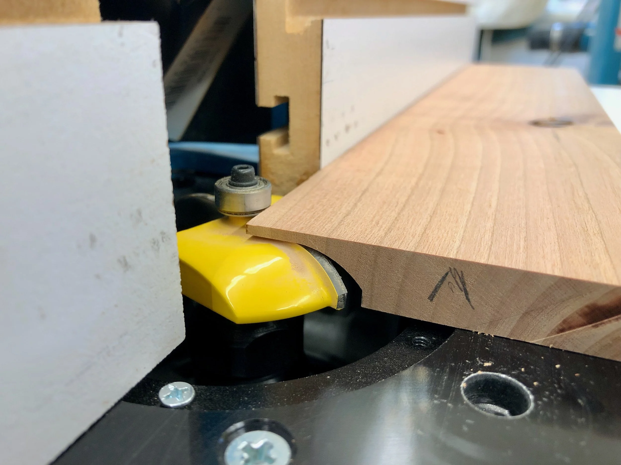
Next, I glued sides onto the flat edges of the mdf template to convert it into a pattern which could be employed at the router table to convert the rough cuts to a uniform and smooth shape using a flush-trim bit. The edges were then further refined with a card scraper and sandpaper.
Smoothing the bandsaw cut at the router table
The legs would be connected to one another by stretchers made of Spanish cedar. Here I opted for mortise and tenon joinery to keep everything solid and square. It would be tricky to cut the mortises on the curved leg pieces and so I brought out the pattern once again. After attaching an additional mdf leg this could now be used as a jig to hold the karabitsu legs level during the mortising operation. One by one, the cedar leg pieces were screw-mounted to the jig and then a 1/2 x 1/2 x 1/2 in. mortise was cut at the desired position. Easy!

Cutting the mortise with assistance from a jig
For the stretchers I prepped some Spanish cedar to 1 1/2 in. x 1 3/8 in. and then cut two parts to 16 in. length. The tenons were fashioned using a dado blade at the table saw, with the top face of the stretcher cut back further to also accommodate the box edge. For added strength I decided to connect the stretchers with two 1 1/2 in. x 1/2 in. cedar supports. These would keep the cradle structure “square” in the absence of the box and prevent sag of the bottom board. Half-lap joints were used to attach them to the stretchers.

Dry-fit cradle with box in background
Lastly, the design called for visible pegs along the legs. The legs of the original karabitsu were affixed to the box with iron nails, and as the piece was coming together I had decided to use screws here, instead. Screws applied from the outside of the box could have their heads covered with a short dowel cap to achieve the design intent, but I felt that a screw mounted from the inside was the better approach for securing a board to a post. Thus, the pegs would be purely decorative and maybe just one up near the top of each leg would provide the best look. To accomplish this I pounded out a few 1/2 in. diameter Spanish cedar dowels with a dowel plate and used a homemade jig to reproducibly drill a shallow hole into each leg part. The dowels were then glued into place, sawn flush and hand planed smooth.
Final Assembly & Finish
To begin assembly, the half-lap joints of the stretchers and supports were glued together while sitting on the overturned box. This ensured that they would eventually fit, again, during the final assembly. I then decided to finish all components at this stage to better seal the overlapping wooden parts. The plan was to use some sort of colorless product for this but that hardly narrows down the field of contenders. There are a host of appropriate oils, varnishes and oil/varnish blends available these days and so some research was in order. Never having worked with either wood I first queried online and discovered that both are “well-behaved” and easily preserved in a manner that enhances their look. Great! And while that narrows nothing, it also makes it hard to go wrong. On scrap Spanish cedar I tried some boiled linseed oil (BLO) and a product advertised to be a tung oil finish, which is actually an oil/varnish blend that, for all I know, may even contain tung oil. It’s not like they list the ingredients or anything, and I’ve read that snake oil sharps now thrive in the paint aisle. Anyway, this product sold by Minwax gave a nice, subtle luster, less orange coloration compared with BLO and it did well on cypress scraps, too. I liked the look and so I removed the hinges and got to work.
The underside of the box and the cradle chassis were finished first. Once dried, the chassis was aligned and mounted to the box using 4 stainless steel screws through the bottom board. After masking the tenons with tape, I then gave all the remaining parts three coats of the “tung oil” finish over the course of three days.

Finishing the parts
Final assembly proceeded in this order. With the box flipped upside-down, the four legs were glued to the chassis at the mortise and tenon joint. They were then each aligned to be perfectly upright and held in that position by means of a band clamp. I also used this opportunity to drill two 1/2 in. “air holes” in the back, near the bottom, to guard against any hide-and-seek mishaps.
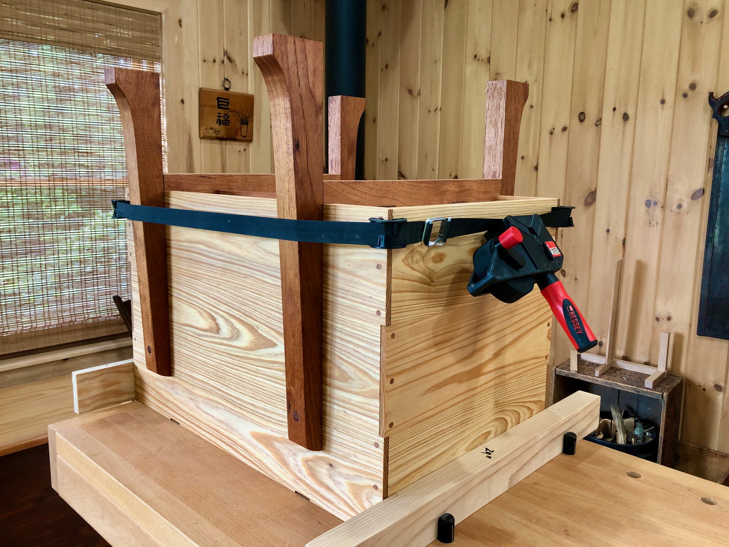
Scene during glue-up
Before the glue cured, I tipped the piece upright and fixed the legs to the cypress box with one screw, each, applied from within. Next, the hinges and lid were attached as before, using the proper screws this time. Finally, reproductions of a classic Korean handle pattern were added to the sides to complete the karabitsu.

This American version of the “foreign” coffer exudes a new pride of heritage, posted by the fireplace to serve today’s special storage needs.

Fireside friend

L'horloge Cerise

Take this lesson to thy heart; That is best which lieth nearest; Shape from that thy work of art.
- Henry Wadsworth Longfellow
“The cherry clock” would also be a fitting title for this special Project, a wedding present for my nephew Sam and his wonderful bride Jill, but I prefer the French version, don’t you? It fits, too, for this Project is all about the Americanization of a revered French clock.
Recently, I described the features of an archetypical French marble clock, the favorite of our house. While admiring this object one day it bothered me that in the age of Dick Tracy devices and rechargeable (ahem) “pocket watches” nothing remotely as captivating as this timepiece is being made for sale anywhere on earth. I’m sure there are some specialty clockmakers out there who would differ, but let’s not quibble. The fact is that today it would be impossible to reproduce this nineteenth century gem. Even if a clockmaker could locate the proper marble and some means to carve the decorative patterns, he/she would find the brass and porcelain face very hard to come by, and I would bet the “pendule de Paris” movement, with its conspicuous Brocot escapement, has not been manufactured for over a century. Sadly, with no means of production, the French marble clock will one day become extinct. The only way to re-produce this species would be to conjure up a version using today’s materials. That is the undertaking here.
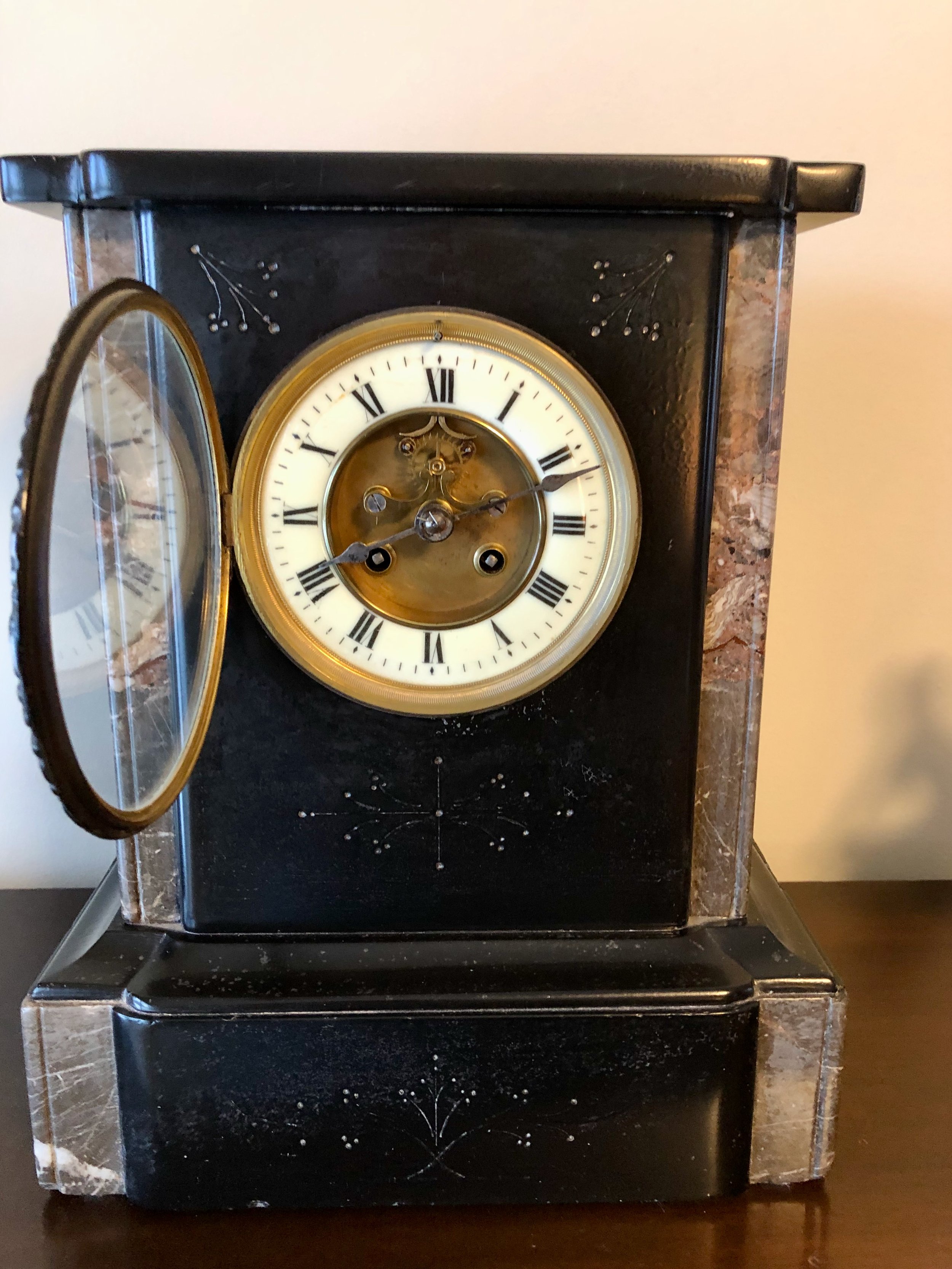
French marble clock (1850-1899)
Design
Often when trying to copy an antique the craftsperson is left with the task of divining dimensions from an old picture using calipers, a calculator and plenty of conjecture. What made this build so special was that I had the real object before me. In rendering the design I became a portrait artist, obsessing about the details of his subject en pose, quantifying every aspect and coming to know each individual feature of the object I had so long admired as a whole. It was fun! I then took these numbers and drew a rough plan on paper.
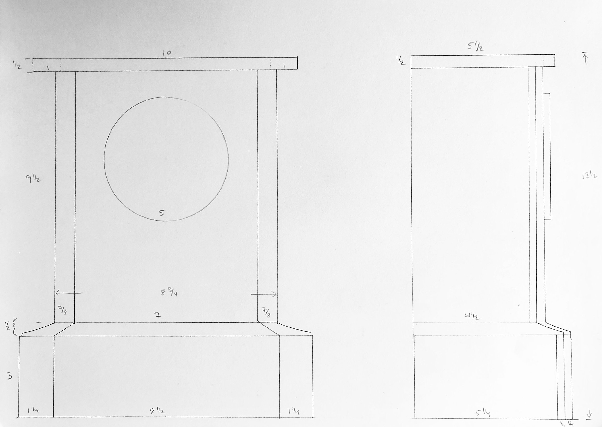
The Cherry Clock: rough plan
While the interior construction (i.e., the attachment of marble to marble) remained a mystery, I reckoned that all of the stone elements could be fashioned from wood and then joined in the typical woodworking manner. The clock case would have an interior base made of plywood that, in addition to providing mass to lower the center of gravity, could furnish a platform for the decorative molding to rest upon. This base would ultimately be clad in the same cherry material used for the remainder of the case. My vision is that the lighter-colored marble surround on the original clock could be mimicked using sapwood from the edge of a cherry board.
Materials
This clock would be made from black cherry lumber (Prunus serotina) but not just any version of this native American hardwood. The boards I selected were quarter sawn, for use in constructing a stable box and top, and also a plain sawn plank to furnish the sapwood reveals. Some birch plywood parts were incorporated to provide out-of-sight support.
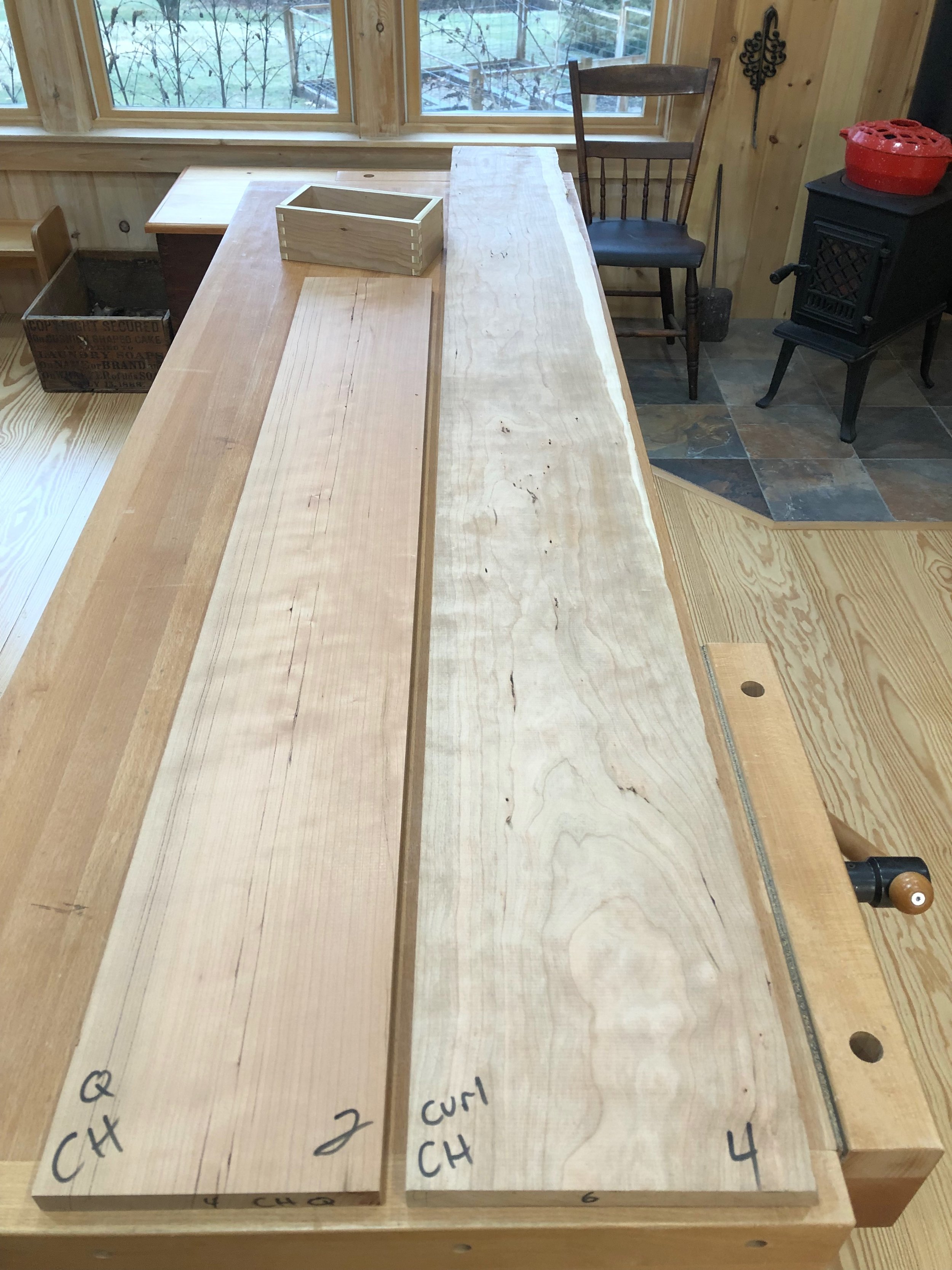
Cherry lumber (note sapwood along the far right edge) with base box constructed of plywood
The remaining clock components would, as best as possible, mimic the original. These French clocks used a cuplike bell strike, as opposed to a gong, and so I was on the lookout for movements with this comparatively rarer feature. I found a nice one at my favorite online shop, Clockworks, where I was also able to procure a French style key, pendulum, clock hands and grommets. The Roman numeral porcelain and brass dial was impossible to obtain, but a modern replica of a nineteenth century American knock-off was found complete with the characteristic flat glass bezel (thank you! Ronell Clock Co.). They also had the metal back plate I required.
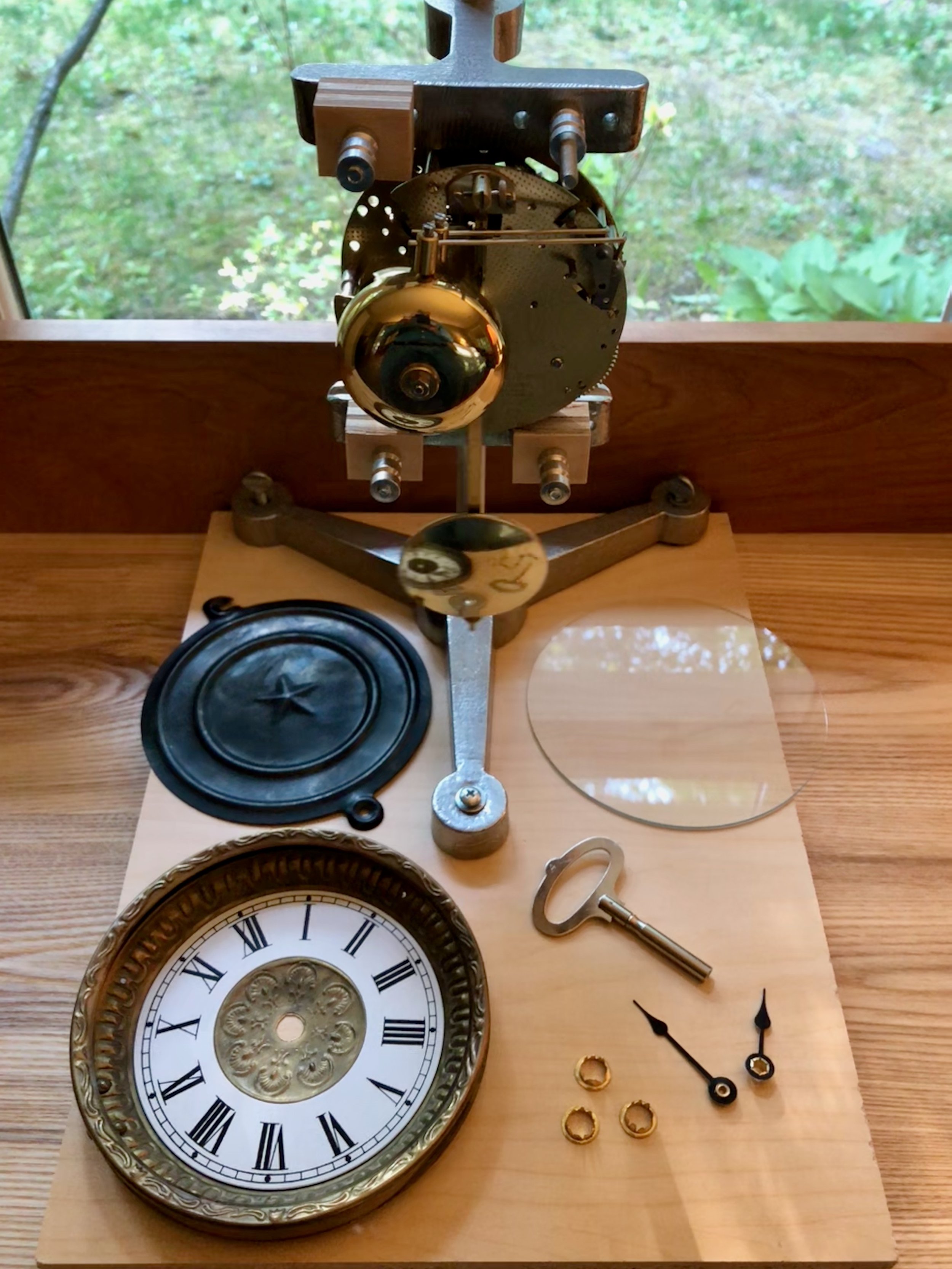
Clock components
At last, with the preliminaries behind us and filled with the exhilarating notion that anything is possible, we take the plunge. (gratuitous wedding analogy)
Dimensioning
This clock case would be built from the inside-out and so the first job was to construct a rectangular plywood box to serve as the base. After joining four pieces together with box joints a few extra layers of plywood material were cut to augment the front and sides. Next, the cherry boards were chopped to rough length and then resawn and thickness planed to 1/2 in. (top, bottom and sides) and 1/4 in. (front, back). This “stock” would be further trimmed and refined during the course of construction.
Clock case components
To build-up the base, a layer of 1/2 in. plywood was laminated using glue onto the sides and front. The sides then received an extra 1/4 in. layer of plywood and the top and bottom of the thickened box was then leveled smooth with a block plane. Next, the cherry sides of this base were cut from quarter sawn stock. Once these were dry-fit into place the first of the two front layers could be measured for exact width. In the end, this layer will largely be covered by another cherry panel; the exposed sapwood edges are the purpose of the underlying board. The light, unstained marble edges of the original case also had an accenting bead carved along the side which I did my best to replicate at the router table. The beaded boards were then trimmed to proper height. The second panel was prepared from quarter sawn stock by edge-glueing two small boards together in a book match fashion and then trimming to the proper height and width. I would still need to round-off the edges before final glue-up but this phase of the operation was all about creating parts. Finally, the back of the base was prepared from two quarter sawn boards and then the back and sides were trimmed to their final lengths.

Base with cladding in place (dry fit)
With the base components in hand, I next needed to create the case tower. Like the base, the tower’s sides and back would be made from quarter sawn boards and the front would have a quarter sawn piece over another cherry panel sporting a beaded sapwood edge. The front and back parts were constructed much like those in the base, except that the half-panels would need an opening cut out for the dial and pendulum access before they could be glued together. The sides and bottom were prepared from thicker quarter sawn stock and joined with a box joint. A shallow rabbet on the top edge of the sides was created into which a ‘false’ top could be inserted to help hold the tower together. In the end, this would be covered by the actual top board. The sides were also rabbeted along their back edge to receive the back board. The dry-fit box could be used to determine the exact dimensions for the front and back panels, which were then trimmed to final width, the semi-circular holes cut-out at the bandsaw, the panel halves glued together, and the parts trimmed to final length at the table saw.
Tower parts
The seam between the base and tower is covered by a cove molding which provides the only ornamentation in an otherwise restrained assembly. It pleasingly elevates the structure, which means that the four mitered joints along its length should be executed with care so as not to distract. But first the molding must be fabricated.
The concave face of the original molding was flatter than a true circle and I also wanted to achieve this elongated profile in my version. I found a router bit online that matched the desired shape and used it at the router table to create the profile from 1/2 inch thick quarter sawn cherry boards. There is a lot of wood to rout (i.e., subtract) here, much more than should be shaved in a single pass, and so to save time I removed the bulk of the cavity with three passes over the dado blade at the table saw before finishing at the router table. The pictures below illustrate the approach. To complete the molding strips the boards were ripped on both edges at the table saw.
Interior wood removed at the table saw
Molding profile finished at the router table
Finally, the top was fashioned as an exact replica of the marble original using a 1/2 in. cherry board. The curves along the front edge were roughly cut at the band saw and then finished with a rasp and card scraper.
Assembly
Time to put the clock together. The first step was modifying the dial pan to accommodate the winding arbors, and this involved accurately drilling two 3/8 in. holes into the metallic pan and number ring. Following some compass and ruler work to fix these coordinates on paper, I then used this paper template and a thumb tack to dimple the hole positions onto the metal dial. The “dots” were then widened to 1/8 in. on the drill press, and these entry holes now allowed for perfect alignment of a Unibit (a step drill bit) which was used to create the wider openings. Grommets were placed within the holes to finish the look.
Drilling the arbor holes with a Unibit
It was now time to assemble the case body. After a final sanding and some edge rounding the base was completed by sequentially gluing the thick veneers about the plywood core. Next, the tower box was constructed by fitting the sides to the ‘false’ top and bottom. The two front layers were laminated together but I decided to leave this piece unattached from the case body, for now, to make it easier to mount the clock mechanism into place. The back of the case will attach with screws during the final assembly step. I glued a couple of cherry “braces” along the bottom seams of the box joint to ensure stability and then the tower was mated with the base by affixing these with screws onto similar wooden braces mounted out-of-sight within the base cavity. Next the dial was attached to the front board using 3 steel screws, eventually to be replaced by brass. I’ve learned to always pilot brass screws with their steel lookalikes to avoid the heartbreak of shear that can otherwise ensue.
Clock tower and base with front panel.
It was now time to test-mount the clock works to the case. The trick here is to center the winding arbors and center wheel shaft within their respective holes while also making sure that the shaft protrudes far enough beyond the dial to accommodate the hands, but not so far as to touch the glass. To get the spacing right for this one I ordered flat mounting brackets and attached these to an extra 1/4 in. spacer board inserted behind the front panel. (It’s reasonable to assume that factory produced clocks had every component sized to perfection prior to assembly, whereas, amateur clockmakers like myself must collect the parts we can find and then figure things out from there. Victor Frankenstein worked under similar conditions.) With the arbors all centered the 6 mounting screw positions were marked in pencil, the clock removed, the holes drilled and then the clock reinserted and fastened into place. Finally, the pendulum was attached, and with a gentle flick the wound clock sprung to life. That’s a nice feeling.

Clock works mounted to front board (clamped in place)
Once assured everything would fit properly during final assembly the clock works and dial pan were removed. The cherry top was then affixed to the tower with glue and some pan head screws, followed by the front panel. Since there is only a narrow glue surface along the edges to support this critical section a wooden support was also installed along the inside top for extra stability.
The final step to complete the cherry clock was to trim the base with cove molding. In this step, five unique molding segments would need to be cut and joined with mitered seams. The tool chosen to cut these parts was my 12 inch sliding miter saw. This is a nice saw but over-powered for the job, and a bit rowdy for cutting the two smaller pieces. Still, using double stick tape to hold the molding in place on the platen I was able to make it work. I spent a day playing around with scrap wood, and another day on an abortive attempt using the real stuff, all in an attempt to get the lengths and angles right. To mate properly with the front edge protrusions a 47° angle was needed for the central two miter joints, a 43° angle for the adjoining piece and 47° again at the corners - or thereabouts. Now, I had earlier prepared an angular shooting board specifically to assist in this operation. These handy jigs allow you to use a hand plane to shave the ends of miter joint components to make the mating surfaces square and accurate. However, forgetting about the front protrusions, I naively fashioned my jig at a 45° angle. To make things work for this Project, I rebuilt the shooting board’s stops at a 43° angle and then used a pie-shaped spacer to compensate during the 47° shaves. It worked!
Shooting the 43° angle on a molding piece, tape and wedge accessories at hand
Everything came together fairly well on the second try; not perfect, but possessing a pleasing handmade look. And with that, the woodworking portion of this assembly was complete. The whole case was then sanded extra smooth (to 320 grit) in preparation for the finish.
Unfinished cherry case
Finish
As I have described in the past, gel polyurethane is my preferred finish for cherry items. If one desires a smooth, hard finish with minimal blotching this product cannot be beat. I used two coats of the satin sheen version on this clock, smoothing with a gray Scotch-Brite pad in between applications. Looks great!
Time to put the clock back together. I started by screwing the mechanism into the backside of the case and then testing that everything ticked, tocked and pinged as it should. Next, the dial pan and bezel were fastened to the front with those brass screws. I now needed to mount the glass into the bezel. In lieu of any actual instructions, the bezel came with four soft metal tabs soldered along the inside rim and the cheeky presumption that nobody purchases these things unless they also know how the assembly goes. Playing their game, I dropped the glass into place and then began bending the tabs inward. I guess the trick is to get the tabs to hold the glass in place while also keeping them out of sight when viewing the dial. I have this same bezel on a couple of my antiques but the tabs are much shorter on these and so visibility is not an issue. I thought maybe mine needed to be cut off, but that does not seem possible with any of the tools in my possession and so they remain lurking almost out of view. My bigger problem was that, held in this manner, the glass is still too loose and it jiggles when opening the hinged bezel. Closer inspection of my antiques reveal each to contain a tiny wad of paper between one or more of the tabs and the glass in order to achieve a secure fit ... paper?!! Paper would certainly work for me, too, but instead I decided to use a couple thin pieces of cherry which I superglued to the inside of two tabs. (I can just picture the scene when, 150 years from now, some clock collector will inspect this piece and mutter, “Hunh! I wonder why they didn’t just use paper here?” It’s fun to mess with “the future” whenever you get the chance.)

Cherry “filler” inserted between glass and tab
Lastly, I mounted the clock hands and then worked to assure that the bell strikes exactly on the hour/half-hour. This is an iterative adjustment of the small bushing located within the minute hand, itself. Once satisfied with the bell stuff, I let the clock run for a few days to see how things went. During this period I occasionally fiddled with the nut at the bottom of the pendulum bob until I was convinced that all parts were conspiring to keep the minute wheel spinning at exactly twenty-four times the earth’s rotational velocity. (Ha!) To finish up, the metal back plate was affixed to the case’s back board which was then screwed into place. Finally, a layer of protective felt was glued to the case’s underside to complete the Cherry Clock.

The Cherry Clock (Amer.)
Congratulations Jill and Sam! Time to enjoy a wedding.

win back art

William Morris (1834-1896)
British poet, author, designer, textile maker, social activist, printer … genius
The well-read might recognize this little gem: “win back art”; first penned by William Morris in 1884, but it’s pretty obscure. The rest of us will have had to look it up, and that’s okay, too. Personally, I enjoy the pursuit. That is, uncovering a good quote and then tracking the creator’s contemporaneous intent before the airbrushers of history have applied their gloss. But be advised, the source and even the existence of many favorite quotes turn out to be apocryphal. Keeps the game interesting! Here’s what I found for this one.
Background
During the late Victorian era, William Morris was a highly influential thinker, artist and craftsman. While admired today as a founder of the Arts & Crafts movement, in his own time he was once branded by a British nobleman as the “poet upholsterer”. Seems there were some that could not abide art being associated with craft. But, 150 years later, the world continues to revere Morris’s work in design, furniture and bookmaking while nobody, not even the internet, can locate that nobleman who probably wishes he was titled Lord Apocryphal.
I came across this quote while reading an article from The Craftsman, Gustav Stickley’s periodical published from 1901-1916 to promote American handicraft and his Craftsman ethos. The Craftsman was a wonderful magazine. You can still find fragile issues in library collections or at used book sales but I read my article in The Craftsman: An Anthology, a book of collected articles edited by Barry Sanders and published in 1978. For the benefit of humankind, the University of Wisconsin has recently digitized a complete collection of The Craftsman and provide it in a searchable format free of charge. The article mentioned comes from the November 1902 issue and is titled The New Industrialism, by Oscar Lovell Triggs, a University of Chicago English professor. We’ll skip his outsider’s thoughts on “industrial betterment” for this post but let his article serve as testament to the continuing impact of Morris, then recently deceased, on social movements of the early twentieth century.
The quote
In his 1902 article, published later that year in book form and co-authored by Frank Lloyd Wright, Triggs refers to Morris’s “win back art” as one of three tenets supporting his (Triggs) “new industrialism”. I was intrigued by this monosyllabic triad, and since Triggs neglected to provide a source, I dug deeper to find their origin. It turns out that phrase first appeared nearly a quarter century earlier in a self-published pamphlet by Morris, titled Art and Socialism. I do not know how successfully that pithy call to action was used in its day, but I propose it could help us, today.
First things first, I am not now, nor will I ever advocate Socialism as a political system. Although never abandoning his cause, Morris, himself, had toned down his fervor in that direction by 1890. Win(ning) back art was sought as a means to restore fulfillment to workmen during their daily labor - that’s all. You see, a social crisis had ignited in the early nineteenth century as new materials and methods appeared with ferocious rapidity (think: steam power, coal, canals/railroads, mechanization, task specialization) and this assault had a most demoralizing effect on the working class in Britain, site of first adoption. Recall your history lessons and you will have a sense for how everything resolved here, but fast-forward to the present where we are reaping the benefits of another onslaught (robots, the internet, instant communication, (coming soon!) artificial intelligence) and you can worry that what has since been termed “hyper-novelty” has, once again, far outstripped our culture’s ability to adapt - to say nothing of Homo sapiens’ adaptability as a species. The rising scourge of substance abuse, violence, suicide and perhaps even the rampant tribalism experienced in the US today have to be connected here, although I have not sought scientific confirmation. Regardless, it is easy to draw parallels between both the origins and cultural sequelae of the Industrial Revolution and the Computer Age.
Action
So, what to do? I believe an aspiration to “win back art” might provide real benefits today. And you might, too, if I ever get around to revealing the significance of that phrase, so let’s get on with things.
Early in his Art and Socialism pamphlet Morris convincingly equates a state of “pleasure” with both “labour” and “life”, itself. He then uses Medieval architecture, thus his reference to “three centuries” ago, as evidence for the impressive handicraft of humans before the era of powered machines, “when men had pleasure in their daily work”. The actual phrase “win back art” was used only twice, mid-sentence and without fanfare, half-way into the work. Importantly, this sentence also serves to define “art” as the pleasure of life. Here is that sentence with the titled quote in context.

“For, though all is not well, I know that men's natures are not so changed in three centuries that we can say to all the thousands of years which went before them; You were wrong to cherish art, and now we have found out that all men need is food and raiment and shelter, with a smattering of knowledge of the material fashion of the universe. Creation is no longer a need of man's soul, his right hand may forget its cunning, and he be none the worse for it.
Three hundred years, a day in the lapse of ages, has not changed man's nature thus utterly, be sure of that: one day we shall win back art, that is to say the pleasure of life; win back art again to our daily labour.”
William Morris, Art and Socialism (1884)
In these elegant paragraphs, Morris implores us to first recognize the inbred need to create that exists in all humans. To labor in the satisfaction of that need is to make “art” by his definition. He then calls on us to reclaim, for our benefit, the pleasure of labor which we are in danger of losing to the callous demands of productivity. Or, put more inspiringly, to “win back art”. I’ll leave you with that interpretation and ask, not rhetorically, what can we do to win back art for the sake of our lives.


Tickin’ Francese

An Ansonia Clock Co. advertisement (c. 1900)
Get it? Tickin’ Francese? Oh, but I do crack myself up! Which is a good thing too, for sometimes I’d swear I am the only person who appreciates my Dad puns (heh, heh … wait …). Anyway, this post is about the Americanization of a classic French entrée clock.
In addition to the dozen or so clocks scattered about the house and workshop that tell time I also have a small collection of antique clocks that tell stories. These wonderful objects, five in total, were collected over the past quarter century as my interest in clocks developed. Four of the five are operational and while they all have special meaning for me, no clock in my collection would be particularly valuable to anyone other than me. My favorite, a late nineteenth century French marble clock, has been keeping our living room on time for the past 18 years. I recently did some digging into the history of that French clock and, like most research efforts, this revealed some unexpected insights.
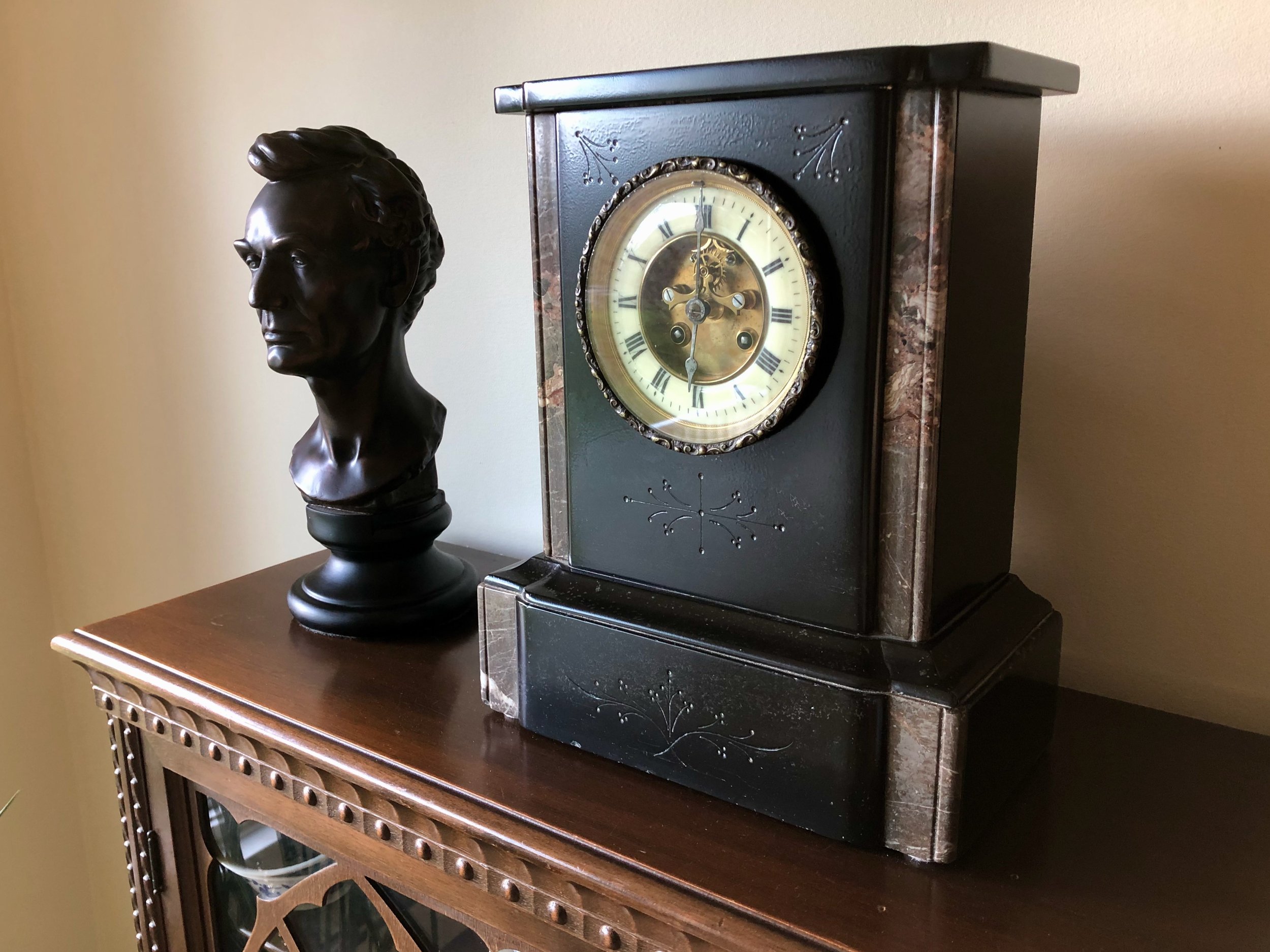
French marble clock with Abraham Lincoln, a contemporary.
While it is easy (and fun) to study the general subject of “time keeping”, researching clock devices in any depth is more of a challenge. Books on clocks tend to be either pictorial encyclopedias, manufacturer’s sales catalogs or repair manuals. A few general histories are out there, and I found Eric Bruton’s The History of Clocks and Watches to be a delightfully informative reference. But to dig deep into any particular clock the internet is probably the best option; spade that turf long enough and one can accumulate a good pile of consistent-ish information. There are also a few clock repair gurus on YouTube who share their knowledge of these once indispensable, now venerable relics with loving zeal (kinda like that high school Latin teacher) and I invite you to check out Time4clocks as an example. Those are my sources for the following tale.
The plot line is a comparison of clock cases, but the story begins with a desire to understand the history of my particular French marble clock, and for that we need to examine the clock works. That is where the maker and date can be established. Of the many clockmakers producing the distinctive pendule de Paris (clock of Paris) movements in nineteenth century France, mine was made by the most prolific: Japy Frères et Cie (Japy Brothers & Co.). According to this source, in 1806 the Japy brothers, three sons of the industrial pioneer and clock making giant Édouard Louis Frédéric Japy (1749-1812), inherited a first of its kind, single site manufacturing operation for clocks and all of their parts. This firm dominated Europe’s clockmaking world for decades before their over-diversification into products such as typewriters and bicycle parts nearly drove them into the ground. During their heyday, however, Japy Frères made a wide variety of strikingly beautiful timepieces, and among these are the family of so-called black marble clocks. Googling that descriptor gives you an idea of the diversity of production for just this one style.
As far as I can tell, my particular specimen dates to the 1890s. This was determined by inspecting the backside of the movement, ignoring those serial number-like red herrings stamped all about, and interpreting the logo that changed over time depending on which new clockmaking award the brothers chose to plug.

‘Clock of Paris’ movement backside (bell and pendulum removed)
Though certain features, such as the Brocot escapement and exposed count wheel, are characteristic of an earlier era the logo on my movement, declaring the “Gde Med. D'Honneur" (Gold Medal of Honor), was apparently used from 1888-1900. However, given the tenuousness of this dating method, my personal language barrier and the general hazards associated with internet sleuthing, it would not surprise me if it is a decade or two older than that.
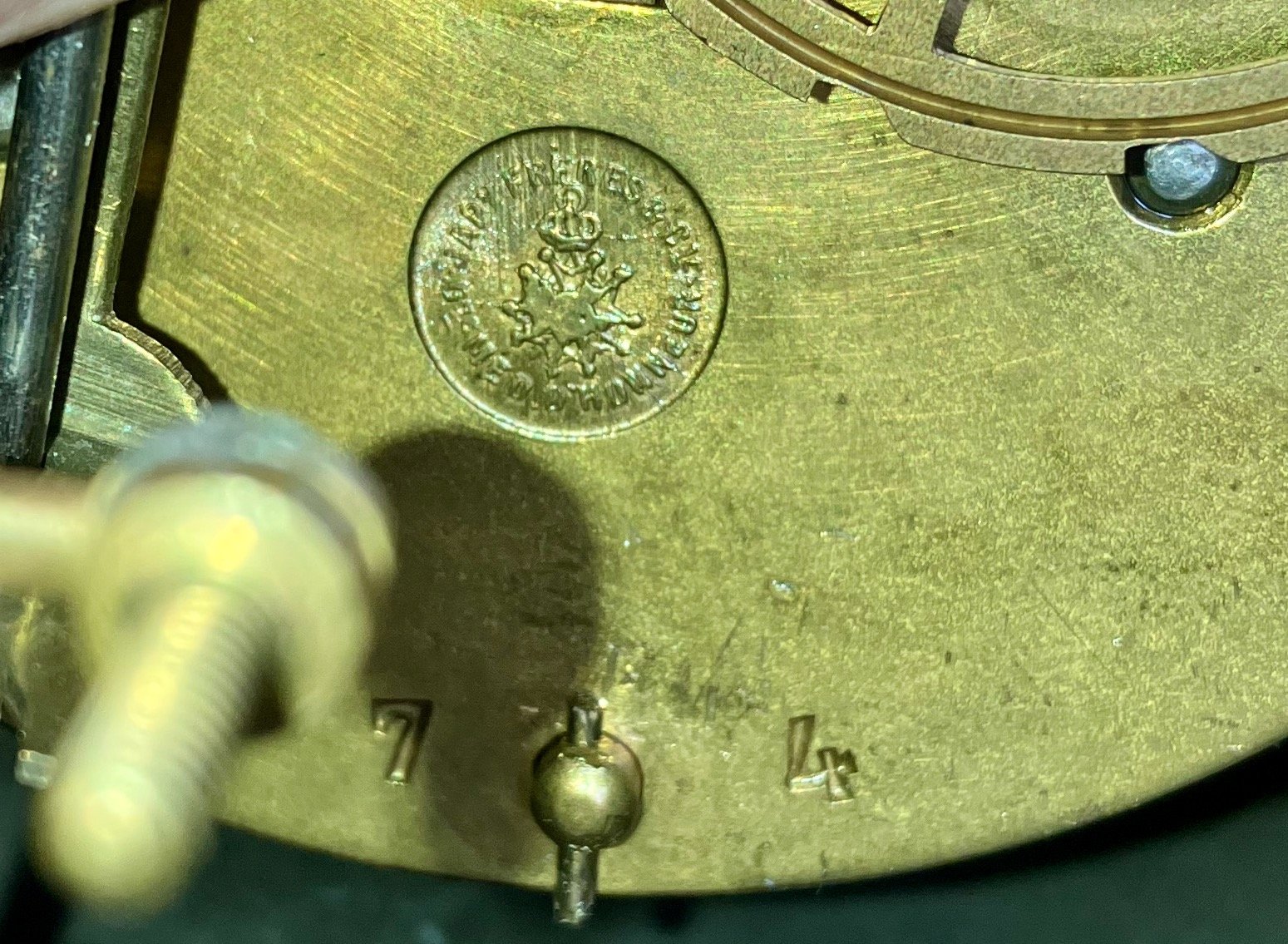
Logo close up
Black marble clocks were wildly popular in Europe and Great Britain. And as a nation of immigrants with a fondness for Old World tastes, they were sought after in the U.S., too. Somehow my clock made it across the Atlantic and, ultimately, to a clock shop in Hightstown, NJ where I purchased it in 2005. However, most nineteenth century Americans had to make do with the local fare. The so-called black mantle clocks, presumably a welcome diversion from the prevailing brown wooden cases, were top sellers and all of the big U.S. companies had their line-ups (e.g., Ansonia, W.L. Gilbert, Ingraham, New Haven, Sessions, Seth Thomas, Waterbury). And while some companies imported marble for these, most cases were made from substitute materials. To mimic the French stained marble (largely quarried in Belgium, as it turns out) those crafty Americans used a process called “japanning” to put a black enamel coating on either a wood or metal clock case. Seth Thomas also employed an early type of celluloid plastic, called “adamantine”, to veneer a flat black or even a fake, so-called “marbleized” finish to wooden cases. Resourceful!
After learning about my French clock and its influence on contemporaneous American designs it dawned on me that two of my other antique clocks fell into this same family. The first is a stout Ansonia metal clock, also acquired in New Jersey, that graced the mantle of our lake house there for many years. Purchased in 1998, it dates from the 1880s and was one of the many many black mantle clock designs produced by that firm, founded in 1850 by Anson G. Phelps. I had the 100-year old movement cleaned and oiled at that time and it is still running strong. The dial and hands have been replaced over the years, but that is not uncommon for heavily used clocks. On first glance it bears little resemblance to my bone fide marble clock but it does possess the characteristic brass rimmed, flat glass bezel, the telltale botanical engravings and it was, of course, black.
My Ansonia black mantle clock c. 1885
The movement is visible from the backside beneath the circular cover. Like all American varieties the works are less space-efficient than the pendule de Paris, but sturdy.
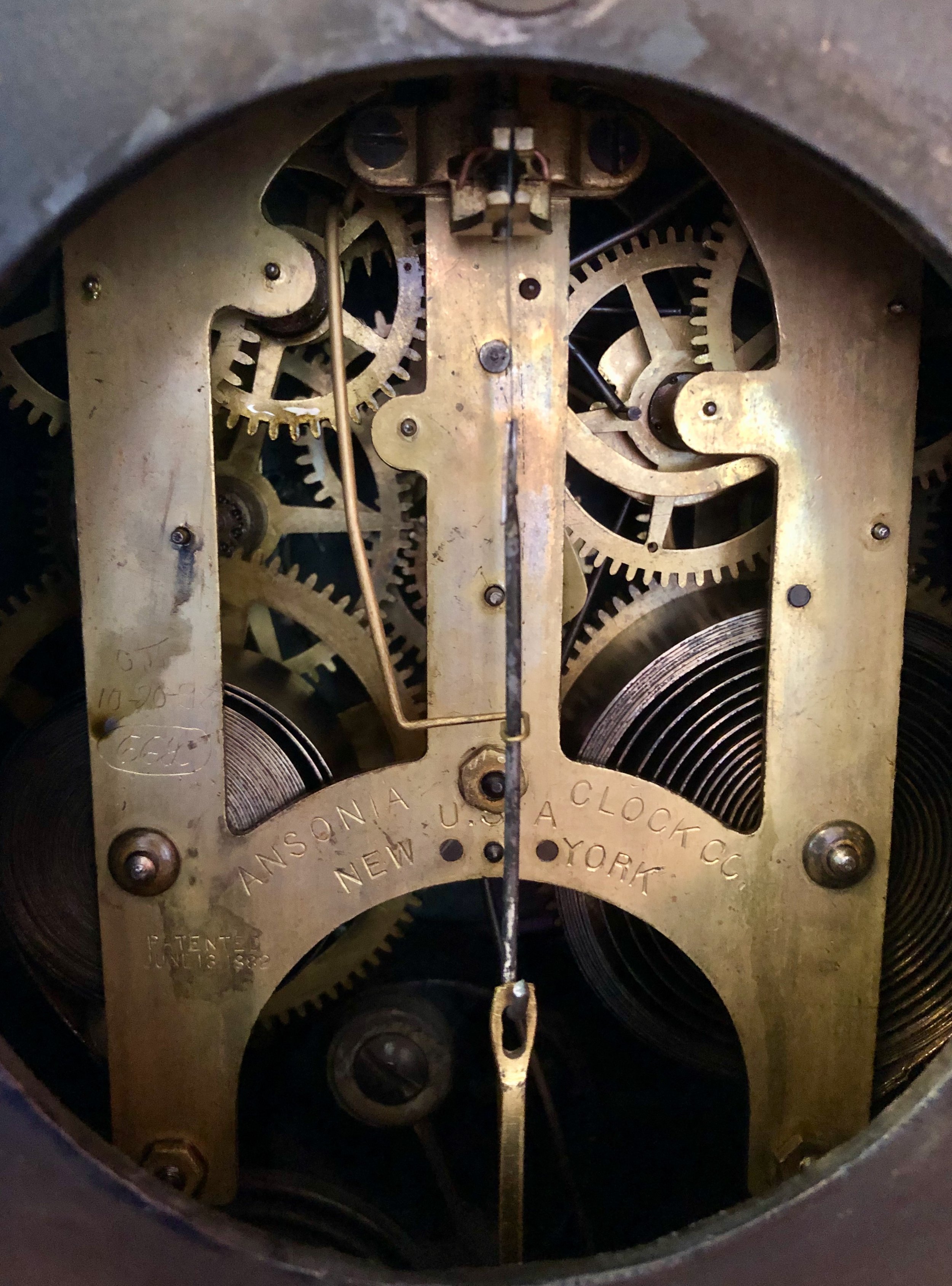
Ansonia movement, patented June 13, 1882.
For marketing purposes, many clocks were given names and this one, ironically, was called “Unique”. The case turned out to be a close copy of another one of Japy’s marble clocks. In fact, if you invert the top it is a dead ringer - in enameled iron.
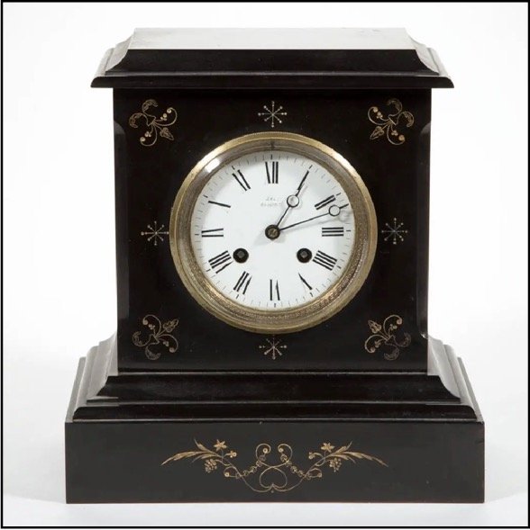
Japy clock c. 1860
(reproduced from liveauctioneers.com website)
The second American black mantle clock in my collection comes via Michigan and my departed Uncle Chuck’s estate. I wish I knew more of its provenance and whether he may have inherited it from an earlier family member but all I can uncover is its horological history. The tattered label identifies it as a clock made by the Sessions Clock Co. This Connecticut company was formerly the E.N. Welch Manufacturing Co., which lost so many assets during a series of factory fires that they eventually had to sell to a smaller firm and was renamed “Sessions” after the new head, William E. Sessions. Perusing the history of various clockmakers it seems that fire was a major “selection event” driving their evolution, worldwide. Apparently, Frédéric Japy’s successful legacy of co-localizing all operations to enhance productivity/affordability also made clockmakers more susceptible to sudden catastrophe.
Back to our story, this early Sessions clock has a black enameled wooden case that possesses fine engravings and an exquisitely ornate dial housed within a brass (or brass-like), flat glass bezel. As with similar clocks from that era, the case is loaded with other metallic gimcrackery. Some of this was meant to imitate bronze features gracing their French counterparts, but the rest appear to be an American fling with rococco-ism that probably merits further research to determine exactly what they were attempting to accomplish. Still, it is a stately looking object on my shelf with a dear familial connection and, unfortunately, a sprung mainspring.

My Sessions black mantle clock, c. 1905
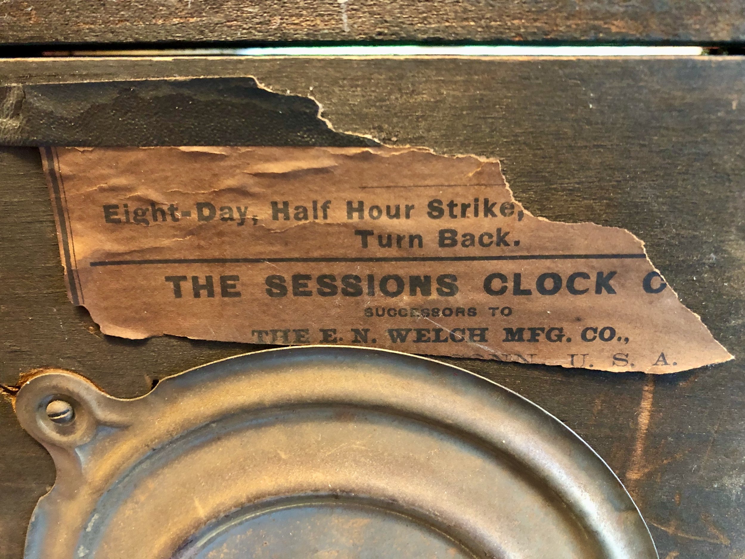
Remnants of the original label
Since the label still references the E.N. Welch heritage, I date the clock to near the corporate sale of 1903. A cursory Google search, once again, turned up its marble doppelgänger of a slightly earlier period.
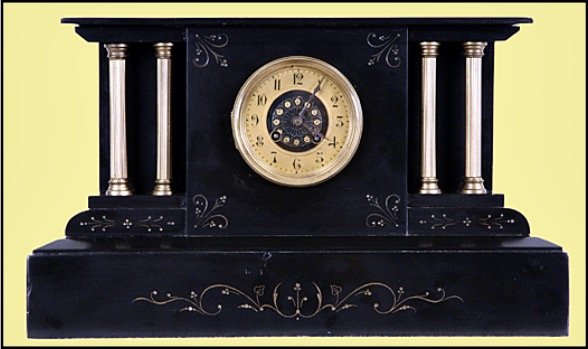
Japy clock c. 1880
(reproduced from harpgallery.com website)
So that is the story of three black mantle clocks of common pedigree. Variously produced some 120-150 years ago in France, New York and Connecticut, and after some traveling about they now all reside in my Massachusetts home. That’s quite a testament to influence if you think about it. The design of this French clock was so powerful that it was copied across the globe, spawning a multitude of facsimiles wrought from local materials and produced by the millions to be traded even more widely, yet all striving to be the black marble clock. Individually, these clocks are now treasured as heirlooms. Much like a beloved family recipe, they were selected to satisfy a long ago taste, enjoyed in their time, transported across international and state boundaries, and handed down for succeeding generations to partake. Bon appétit!
